• Listen to a special audio message from Bill Roper to the Hive Workshop community (Bill is a former Vice President of Blizzard Entertainment, Producer, Designer, Musician, Voice Actor) 🔗Click here to hear his message!
  • Read Evilhog's interview with Gregory Alper, the original composer of the music for WarCraft: Orcs & Humans 🔗Click here to read the full interview.

BTNStaffOfDarkMight

This bundle is marked as useful / simple. Simplicity is bliss, low effort and/or may contain minor bugs.
194769-albums4261-picture72399.png
194769-albums4261-picture72379.png

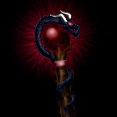
This is some kind of dark-shadow-demon-dragon-staff or that kind of shit... im not even sure what it is exactly :D
Anyway, have fun with it :p

EDIT: Reuploaded, cause of shitty quality.
EDIT2: Redefined, also uploaded in diffirent color shemes (purple, red, blue and green)
import them as BTN and DISBTN for each color.

Keywords:
Staff, Stick, Wand, Magic, Dark, Darkness, Purple, Violet, Red, Crimson, Blue, Frost, Green, Dragon, Black, Snake, Whelp, Sorcery, Demon, Might
Contents

BTNStaffOfDarkMight (Icon)

Reviews
03:24, 24th Jul 2013 enjoy: The small dragon is very hard to make out. I didn't even notice it until I saw the big version, and people in game probably won't have seen that version. If you could use more highlights and a lighter base color, I think...

Moderator

M

Moderator

03:24, 24th Jul 2013
enjoy: The small dragon is very hard to make out. I didn't even notice it until I saw the big version, and people in game probably won't have seen that version. If you could use more highlights and a lighter base color, I think it would pop out more though. :)

08:43, 9th oct 2013
enjoy: The details are hard to make out, and it's too dark. The icons needs much more highlights and midtones.
 
You clearly don't understand your flawed image, do you?
Look at it. It's already incredibly blurry as it is. What do you expect Button Manager, or any filter, to do with that? Magically sharpen and define the shit out of it?
Create defined base material first, then filters and software have something they can work with.

How's that done?
By creating more distinctive shading and highlights, while also using colours properly.
Look at the center of the icon. Black dragon + dark sphere. Result in the 64x64 sized icon: blending in with each other. Fixable by prementioned method.
 
I don't see anything about boosting saturation in my post, but okay.
With "using colours" properly, I meant that you can define stuff with using opposing colours (creates contrast, very handy method),
add motion by using different shades of colours for one object (thus making it more vivid), define stuff by using various shades of the same colour, etc.

What you did still doesn't define this well enough.
You need <very distinctive> shading, especially for the wand itself.
I can't even see any distinguishable light source. Light shines on the whole object, not just on the orb.
Use hard brushes. Soft brushes or airbrushes are a bad choice for creating anything that's supposed to be defined.

Additionally, you should try adding a lighter shade of colour in the middle of your background. It's rather monotonous and blunt at the moment.

I can work on a PSD-File with separate layers, showing you what this could look like and how it could be done, if you want. (Assuming you work with software that can open PSD-Files.)

Oh, and by the way, none of this is meant to suggest that this is "bad", but suggests methods which would make this look as good as possible.
 
Yeah i use photoshop, but usually i don't use layers, maybe i should...
And yes, i kinda screwed the wand a little bit, it needs definition, since in the red version it's color is similar to the orb's. I think it's better in the green version though.

Oh, and thanks for your time by the way. The critism is supposed boost the artist's skill, not his devotion :p
 
Top