Listen to a special audio message from Bill Roper to the Hive Workshop community (Bill is a former Vice President of Blizzard Entertainment, Producer, Designer, Musician, Voice Actor) 🔗Click here to hear his message!
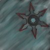
Yes i know it's hard to see the shuriken, but please. Dont be over roude of that. It's actually my fist icon and the second time i used Photoshop. I'm thanking 100% to NFWar for teaching me some. =D
Well. Remove the background firstly.
Second: Detalise edges with strong shading and metallic texture.
Third: Change the color of the edges to some metallic style...
there is one low quality example made in 2-3 minutes:
Dude that's anoying xD.
I think that your big picture was pretty great, but when it became a icon it turned from a knight in to a peasent.
Well yes use some darker colours and you've gotta practice keeping the "Background" away from the "Object".
Even though because this is your first icon, i say it's an okay work then but i woulden't download it because it's hard to recognize it's a shuriken . <---- i've also made a shuriken and this was my result ! Maybe it gave you some insperation, i dont know.
Even though it never got approved .......
Good Luck in your future iconmaking.
This site uses cookies to help personalise content, tailor your experience and to keep you logged in if you register.
By continuing to use this site, you are consenting to our use of cookies.