• Listen to a special audio message from Bill Roper to the Hive Workshop community (Bill is a former Vice President of Blizzard Entertainment, Producer, Designer, Musician, Voice Actor) 🔗Click here to hear his message!
  • Read Evilhog's interview with Gregory Alper, the original composer of the music for WarCraft: Orcs & Humans 🔗Click here to read the full interview.

BTNRipperSword

  • Like
Reactions: deepstrasz
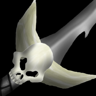
This is just a quick icon for the Ripper Sword model that I made. I haven't drawn an icon in years, so it's not exactly great. But I hope it's good enough to at least be worth using. I might make a better one in the future.

Here's the full-size version for those of you who need a closer look to help inspire new ways to insult me that you may not have been able to think of from the icon version.

152739-albums4597-picture61474.jpg


Keywords:
ripper, sword, item, weapon, blade, handle, hilt
Contents

BTNRipperSword (Icon)

Reviews
09:07, 1st Oct 2012 Apheraz Lucent: Neat idea, but the shape is a little unproportional, mainly those huge horns attached to the small skull, and thin blade coming out. This could benefit a lot from stronger shadows and higher definition of outlines...

Moderator

M

Moderator

09:07, 1st Oct 2012
Apheraz Lucent: Neat idea, but the shape is a little unproportional, mainly those huge horns attached to the small skull, and thin blade coming out. This could benefit a lot from stronger shadows and higher definition of outlines. BUT, it has a fitting model, so I'll approve it.
 
Only if it had some sort of a green glow...

As an ability version or something..

Just a suggestion. Anyways, I like it. It can be improved so I'll give 4/5.

This is an icon for a weapon attachment, not for an ability. Giving it a glow would ruin that. I do agree that it could be improved, but in other ways. When I've gotten back into the groove of making icons, I'll probably re-make this one.
 
Shape is nice, you need to make shadows here on skull on top, and more detail to get looking like a sword not a paper

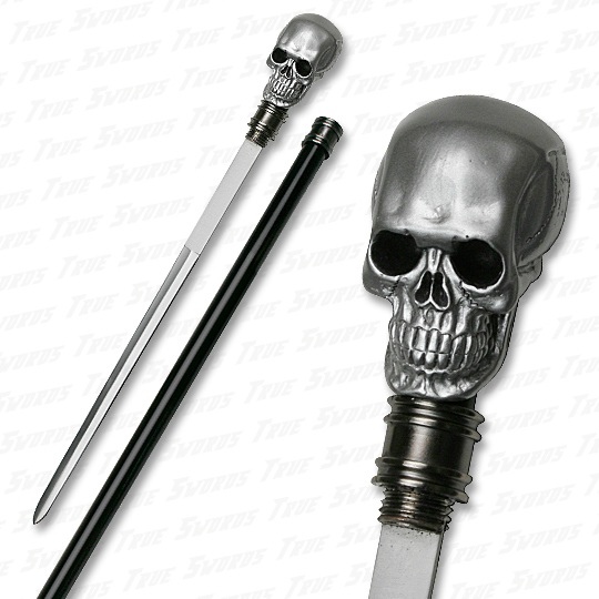
skull_head_sword_cane_41in_540.jpg


thmxth3%20image%20owned%20by%20tribalhollywood.com%20long%20leather%20mens%20necklace%20with%20skull%20and%20sword.jpg

The source of light is from the direction of the top of the skull, which is why the top is bright and the rest is shaded, and the top of the horns are bright.

You need to realize that light can come from any direction, not just the front, so don't try to tell me I need to make the top dark and the bottom bright, just because that's where the light came from in your particular photo...

The sword is an entirely different type of sword; it doesn't have a blood gutter, it has a seraded edge. If I made it look like the one in your picture, it wouldn't fit the model at all.

I do know that I could improve the blade, and I plan to do so, but not in the way that you suggested.
 
Level 49
Joined
Jan 20, 2010
Messages
3,032
the blade looks cylindrical. it doesn't look sharp. at all
the tusks lack sufficient definition. the way you detailed it in the large image doesn't look good when resized.
the way you shaded the skull makes it look plastic.
 
the blade looks cylindrical. it doesn't look sharp. at all
the tusks lack sufficient definition. the way you detailed it in the large image doesn't look good when resized.
the way you shaded the skull makes it look plastic.

Thank you, finally someone who points out flaws that actually exist. I'll work on adding sharpness to the skull (shading is a bit too smooth right now, gives it the plastic look). I'll make more contrast on the horns, since the details in the large image don't seem to show up when it's resized. The blade I've already planned to completely remake, I know that part looks like crap in pretty much every way possible.

Can't do it right now, though, have to leave in about 45 minutes, will be back in about 9 hours from then (going to college, Wednesdays are my longest days).
 
Top