Approved


Moderator
M
Moderator
18:11, 23rd Sep 2009
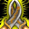
Zombie.: Unfortunately, attempts of shading can be hardly seen on the icon, that's why I'd recommend you redo the shading once it's resized to 64x64 aswell. It looks rather flat and the contrast between the highlight and the gray blade is a bit too high. More shading to the handle and the outer parts of the blade please.
28th Sep
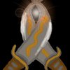
Zombie.: No changes made, rejected until updated.
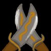
Zombie.: Unfortunately, attempts of shading can be hardly seen on the icon, that's why I'd recommend you redo the shading once it's resized to 64x64 aswell. It looks rather flat and the contrast between the highlight and the gray blade is a bit too high. More shading to the handle and the outer parts of the blade please.
28th Sep
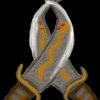
Zombie.: No changes made, rejected until updated.


")