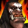
As I sayed, it need more work. You mised some details that makes it better than screenshot and those are fixable easy. I am not talking about shadings, but about shape.
1) One eye looks off from side because of wrap of model. Not hard to delete it and place your own.
2)Area above nose was too piched in, smudge it a bit and it looks better.
3)Lip must be defined because it is above uper jaw
4)More defining of lip by darkening blurry line of model skin
5)Big teeths are too plain. Smudge to give better shape.
6) Cmon... hair is not so liniar... model have this not icon :/ Smudge hair then
7) Shape of head, from right side where most fire is, is too liniar. Give it better geometry.
I wasnt talking about shading

But icon culd be better IF it wuld have some.
I am not trying to get you out from iconing... hell no. I am trying to explain some things and help you.


 Approved