Moderator
M
Moderator
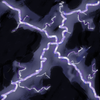
Sin'dorei300: It shows an improvement compared to the first variant. But it seems that u haven't watched carefully enough those tutorials that i've recommended to u.
Also, u could take a look at some real photos of lightning, it might help/inspire u.
Regarding the execution, the icon looks like a WIP.
All of the lines are about the same thickness, the same color, are too many and look somewhat unnatural.
U could use a wider range of colors to break the monotony and the execution should be smoother.
17:41, 3rd Nov 2014
Sin'dorei300: Awaiting update!


 Approved


