Approved


Moderator
M
Moderator
00:52, 9th May 2013
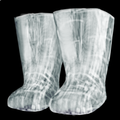
enjoy: They look more like glass than silver. You have done a really good job on these, but not very warcraftish, and I don't think I have ever seen someone draw a boots icon from this angle.
I would suggest changing the angle to side view.
Can you please upload a big image in the thread below, as proof that you made this?
10:41, 29th May 2013
enjoy: The small one looks more like a photo of glass boots. This really does not fit with the warcraft style. I only approve this, because 15 people have downloaded it so far, and some users seem to like it.
enjoy: They look more like glass than silver. You have done a really good job on these, but not very warcraftish, and I don't think I have ever seen someone draw a boots icon from this angle.
I would suggest changing the angle to side view.
Can you please upload a big image in the thread below, as proof that you made this?
10:41, 29th May 2013
enjoy: The small one looks more like a photo of glass boots. This really does not fit with the warcraft style. I only approve this, because 15 people have downloaded it so far, and some users seem to like it.