• Listen to a special audio message from Bill Roper to the Hive Workshop community (Bill is a former Vice President of Blizzard Entertainment, Producer, Designer, Musician, Voice Actor) 🔗Click here to hear his message!
  • Read Evilhog's interview with Gregory Alper, the original composer of the music for WarCraft: Orcs & Humans 🔗Click here to read the full interview.

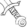
BTNhandle1

This bundle is marked as useful / simple. Simplicity is bliss, low effort and/or may contain minor bugs.
  • Like
Reactions: deepstrasz
This is my first Icon, Please help me to improve my skills and say Constructive Critism!

EDIT: Maded some small Updates, added Highlights
EDIT: Remaded icon, Looks better now?

Keywords:
handle
Contents

BTNhandle1 (Icon)

Reviews
11:26, 2nd Jun 2011 Pyramidhe@d: Thick black lines and crooked. Fix these. Also, it is much too simple and boring. 5 June 2011 Pyramidhe@d: ok. the lines are gone but it is still very simple and boring. You dont necessarily have to have a complex...

Moderator

M

Moderator

11:26, 2nd Jun 2011
Pyramidhe@d: Thick black lines and crooked. Fix these. Also, it is much too simple and boring.

5 June 2011
Pyramidhe@d: ok. the lines are gone but it is still very simple and boring. You dont necessarily have to have a complex object to make it look interesting. Better colour and shading makes all the difference.

9 June 2011
Pyramidhe@d: No changes made
 
Sugestions:
-Show blade (just a bit) and handle
-Handle dont have to go out of icon view
-Cloth on handle dont have to be all parallel. Give it some angles.
-Define which cloth layer is up to an other.
-Handle is too colorfull. Try to change the color to something greish.

Here is one small example of how the sword should be placed on icon.
 

Attachments

  • Simple Sword Sketch.jpg
    Simple Sword Sketch.jpg
    32.8 KB · Views: 194
Top