Listen to a special audio message from Bill Roper to the Hive Workshop community (Bill is a former Vice President of Blizzard Entertainment, Producer, Designer, Musician, Voice Actor) 🔗Click here to hear his message!
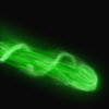
It really is a tad blurry. you should fix this. Try separating the colours of the ray by making the swirl around the ray brighter than the blast itself. and try to thin out the blast a little. bit.
Also, make a more creative BG, it ruins the icon and makes it look a bit childish.
Looks very nice, but can still be improved.
Ty changing the glow around the ray abit. Right now, the glow is a bit above the ray in the end. Lower it abit so it matches the ray, and perhaps thin the end out, so it looks like a beam-ball thingy that gets bigger.
It really is a tad blurry. you should fix this. Try separating the colours of the ray by making the swirl around the ray brighter than the blast itself. and try to thin out the blast a little. bit.
Also, make a more creative BG, it ruins the icon and makes it look a bit childish.
This site uses cookies to help personalise content, tailor your experience and to keep you logged in if you register.
By continuing to use this site, you are consenting to our use of cookies.


 Approved
 Download psd image