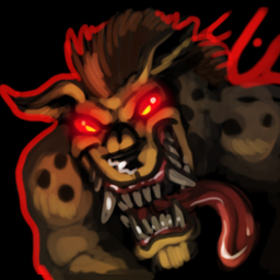
Even thought you could add up a little bit more of light areas, the overall appearance of the icon is nice.
However, the movement/positioning of the tongue is a little weird, and it seems that the blunt angle provided to make it lengthy, made it too lengthy and lost the visual appearance of the tongue.
All teeth could use some gradient light, as they appear quite pale and don't stand out in the icon itself, and they should. Try to make the eyes two little red light sources, reflecting just a bit on the fur, or add a new one over the head, or by the left side, or even in front of the character.
Try using some thin black lines on the fur and hair to make it look more realistic, you did a great job with colors.
And I think that the nose is shaded/lighted way too strong, meaning that the shading is too dark, and on the resized icon, it looks like a black smudge where a nose should be, giving an impression that the nose is actually positioned just bellow the eyes.
Other than that, you got some great skills in there, and the eyes look quite mean.


 Approved
") , as requested by afew people. Here you go.
, as requested by afew people. Here you go.