• Listen to a special audio message from Bill Roper to the Hive Workshop community (Bill is a former Vice President of Blizzard Entertainment, Producer, Designer, Musician, Voice Actor) 🔗Click here to hear his message!
  • Read Evilhog's interview with Gregory Alper, the original composer of the music for WarCraft: Orcs & Humans 🔗Click here to read the full interview.

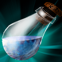
BTNGDBlPotion

Blue Potion for mana or something else

just for the record i drew this with mouse-pad

12446868.png
BTNGD-BlPotion.png


Thanks to "Vista sucks" for his advice for improving the icon.
12446898.jpg


Keywords:
mana, blue, potion, healing, regeneration, energy, boost, bottle, Golden, Drake
Contents

BTNGDBlPotion (Icon)

Reviews
I3lackDeath ApprovedDate: 2013/Mar/23 01:41:52 Reasons:Approved. [TR]Staff Contact Submission Rules
Looks a lot better. But the light reflecting off doesn't look look right.

icons_5726_btn.jpg


Reflection doesn't have to be white, like so.

i'm not the best artist - and long from crazyrussian. this icon is also a DC so i have to work with what i have - and this is what i've got so far
- i could also make a more materialiced BG, that might be worth it
 
Level 28
Joined
Aug 7, 2011
Messages
1,638
This is a lot better Drake, maybe you should add some blue color variation to the downer part of the fluid, maybe darken the right-down part, to make it look as if there's some sludge and to add some difference in the colors. And if you have the white glow on the glass of the potion on a different layer I suggest you make it a bit more.. hmm, less blurry, don't use that brush with blurry edges, use a normal circle on small opacity, it might turn out better.

Hmm..otherwise, it's really good now. I'll rate it for 5/5 :)

but aa, update the icon, cuz I still see it the same. (even after reloading the page)
 
NFWar created a great and compact tutorial for potions.
Unfortunately, his pastebin expired.

Do not change the background colour to a completely different one.
It will look as if it didn't belong to the potion at all.

Check out some potion icons we have in our Icons Section.
The surface of the liquid is always brighter than the rest --> because it reflects light.
Include some minor shading aswell. This will make the liquid look more natural.
The bubbles don't make much sense. If you really want to keep them, you should make them look more "random", not as static as they currently are (focused on one location).
Personally, I wouldn't include them. They don't really fit any potion, unless it's boiling.

Use softer shading on the glass reflections aswell.
 
Top