Moderator
M
Moderator
16:09, 19th Oct 2009
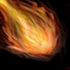
Pyramidhe@d: the middle yellow i think can be much brighter
Pyramidhe@d: the middle yellow i think can be much brighter

(1 ratings)
 Approved
 , hopes you like it


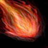
This more or less looks like messy lines in a shape that could somewhat resemble a fireball.
there is really something about this that i really dont like. it is mostly the fact that it looks very unlike fire. Fire isnt liney or scratchy like you had portrayed in this icon here, but it is a smooth soft powerful flame.
there is also too much flat. this doesn't look rounded off to be properly 3D. try adding some shading and highlights (around the edges possibly) to make it pop out.
You should also fix up the BG. the colour matches the icon, but it looks way random and scratchy like the fireball, and it could turn out so much better.
2/5 Keep Trying
~Dentothor
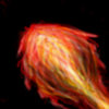
. and why did you remove the BG instead of changing it? it looks worse without it.you definatley made it more 3D, but its still a tad scratchy. looks more like a chicken drumstick.
And do not double post. use the edit function instead.
.... looks more like a chicken drumstick....
Maybe blend it out alittle. Also more yellowish in the fireball, I think.
3/5

Wow nice update you made. It looks fantastic now. I think it will match one of the spells in my rpg. Thanks alot for this pippo