• Listen to a special audio message from Bill Roper to the Hive Workshop community (Bill is a former Vice President of Blizzard Entertainment, Producer, Designer, Musician, Voice Actor) 🔗Click here to hear his message!
  • Read Evilhog's interview with Gregory Alper, the original composer of the music for WarCraft: Orcs & Humans 🔗Click here to read the full interview.
  • The Hive's 22nd Icon Contest: Creep Abilities is now concluded, time to vote for your favourite set of icons! Click here to vote!
  • ✅ The POLL for Hive's Texturing Contest #34 is OPEN! Vote for the TOP 3 SKINS! 🔗Click here to cast your vote!
  • ✅ The POLL for Hive's Techtree Contest #20 is OPEN! Vote for the TOP 3 FACTIONS! 🔗Click here to cast your vote!

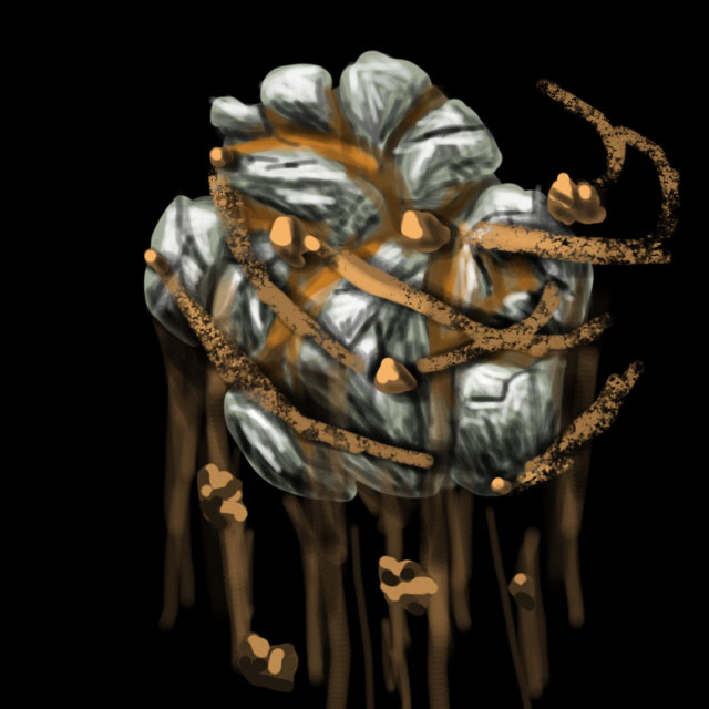
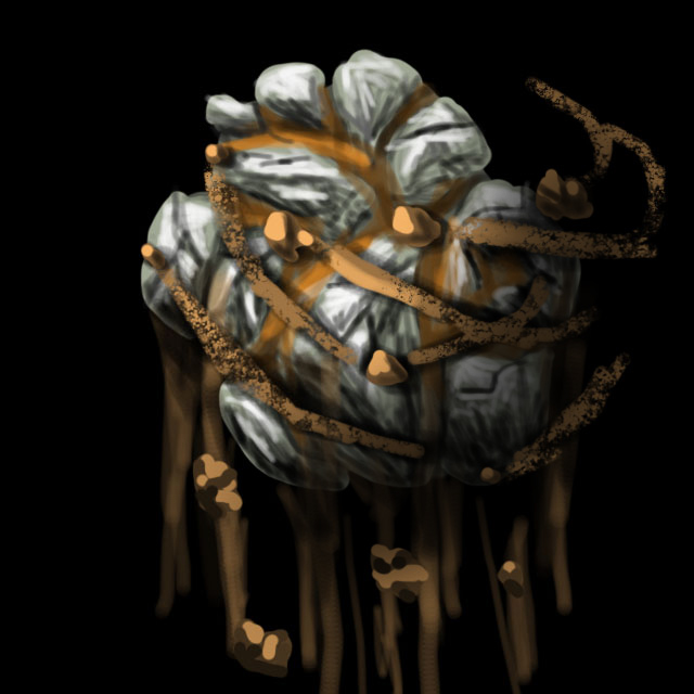
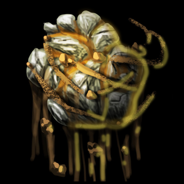
BTNEarthOrb

tried using a different technique in drawing this icon

Credits:
Stonneash

208383-albums5750-picture76122.jpg


Keywords:
orb, earth, magic, ball
Contents

BTNEarthOrb (Icon)

Reviews
11:57, 19th Dec 2013 enjoy: Big picture looks kinda bad, shrunk version looks wicked cool. I really like it, I don't think you should change it.
11:57, 19th Dec 2013
enjoy: Big picture looks kinda bad, shrunk version looks wicked cool. I really like it, I don't think you should change it.
 
It looks like it's... withering, in some way. Don't get me wrong, but you tried to represent the earth with dust and mud, which both do belong to the earth element, but it heavily deforms the concept of earth as the only rock-solid (no pun intended) element.

Execution is, well, messy. 64x64 is already quite small area to focus your eyes upon, so why distance the orb away?
The mud just made everything look weak and it also looks a little weird, mostly because distance killed details and blured the rocks, resulting in a smudgy cast of light sources and shadows.
I usually don't encourage people to use focus details (a single small detail that draws attention in this or that way), but since the colors are quite pale and neutral, a small bright-green sprout with a leaf or two would revive the icon.
 
Hey dude, I just did a quick draw over of your work to show you something.

You may, or may not like what I have done as it was a quick job and I dont have the original files..but....I hope its ok? :)

Personally, I recommend you draw some sort of glow (light shining out in a perspective/lines with a glow in the middle)

1. All of this is done with a simple computer mouse, it took me less than 3 minutes.
1.jpg

2. Add some black shadow fade, with a large soft brush on one side.
2.jpg

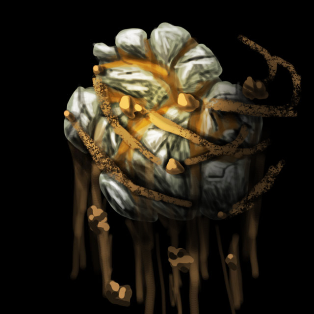
3. Add a soft big brush (yellowy orange) on a new layer on the other side like the shine of a sphere, then set that brush layer to overlay.
3.jpg

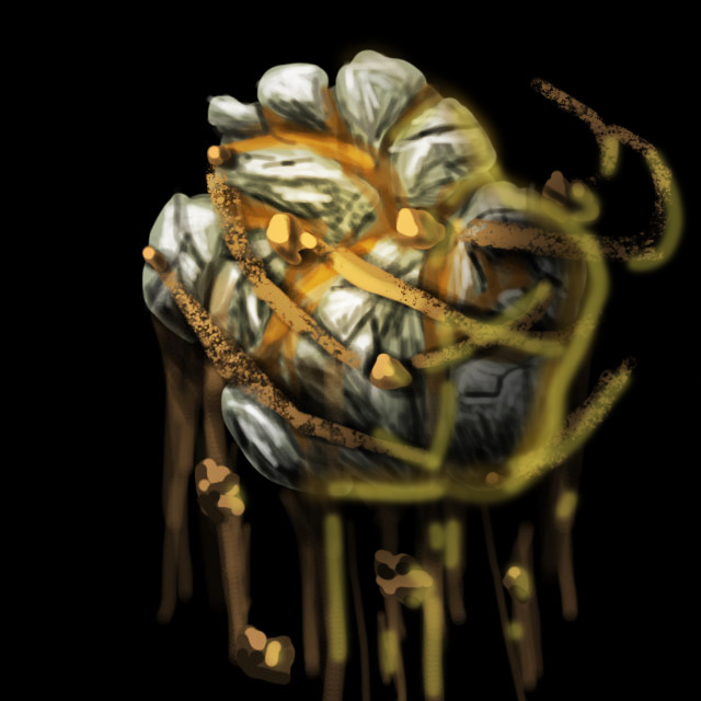
Then draw some reflective light so it doesnt fade into the background. Draw this on a different layer.
4.jpg

Re-adjust and put the artwork more into frame.
5.jpg


Shrunk Version
iconshow.jpg


Hope this helps :)
 
Hey dude, I just did a quick draw over of your work to show you something.

You may, or may not like what I have done as it was a quick job and I dont have the original files..but....I hope its ok? :)

Personally, I recommend you draw some sort of glow (light shining out in a perspective/lines with a glow in the middle)

1. All of this is done with a simple computer mouse, it took me less than 3 minutes.
1.jpg

2. Add some black shadow fade, with a large soft brush on one side.
2.jpg

3. Add a soft big brush (yellowy orange) on a new layer on the other side like the shine of a sphere, then set that brush layer to overlay.
3.jpg

Then draw some reflective light so it doesnt fade into the background. Draw this on a different layer.
4.jpg

Re-adjust and put the artwork more into frame.
5.jpg


Shrunk Version
iconshow.jpg


Hope this helps :)

Thanks, I'll consider using you recommendations on the next remake (Update)

First of all - zoom in a bit, to understand "what is happening" and then - do it clearer.:)
The big pic is not bad!:D
thanks, I'm glad you like it

It looks like it's... withering, in some way. Don't get me wrong, but you tried to represent the earth with dust and mud, which both do belong to the earth element, but it heavily deforms the concept of earth as the only rock-solid (no pun intended) element.

Execution is, well, messy. 64x64 is already quite small area to focus your eyes upon, so why distance the orb away?
The mud just made everything look weak and it also looks a little weird, mostly because distance killed details and blured the rocks, resulting in a smudgy cast of light sources and shadows.
I usually don't encourage people to use focus details (a single small detail that draws attention in this or that way), but since the colors are quite pale and neutral, a small bright-green sprout with a leaf or two would revive the icon.

I never considered adding focus details but I 'll keep in mind to use it in the next update/remake
P.S.: I'm glad your back :)
 
Back
Top