Moderator
M
Moderator
22:37, 26th Sep 2009
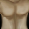
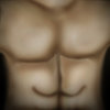
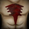
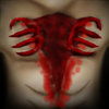
Zombie.: This is actually a very good idea, but the execution is way too lacking. The proportions of the person are messed up on the man, the injury's blood effect need a better color scheme, preferably add more emphasis on detailing the flesh and the guts. Above all, the demon needs something to make it recognisable, proper, more evil-looking red-black demonic claws, preferably making them larger and with a better shading as an addition. Either way, this won't get approved unless the demon is given more work.
5th Oct 2009
Zombie: No changes made, rejected until updated.


 Approved


