Approved
")


Moderator
M
Moderator
16:31, 10th Dec 2009
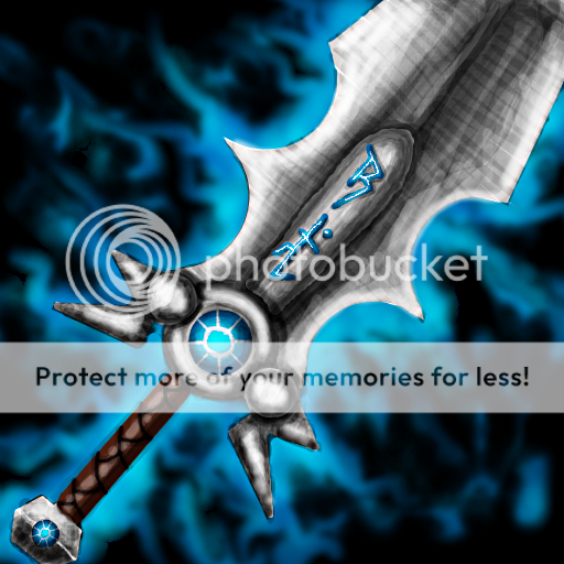
enjoy: I think you should define the blade alittle.
Also make the shading stronger, and then maybe the handle should be abit thicker. GJ
enjoy: As zombie suggested, I too think that you should remove some of the shading from the top part of the blade.
enjoy: Looks good.
enjoy: I think you should define the blade alittle.
Also make the shading stronger, and then maybe the handle should be abit thicker. GJ
enjoy: As zombie suggested, I too think that you should remove some of the shading from the top part of the blade.
enjoy: Looks good.