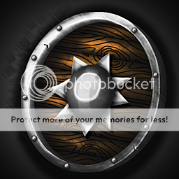
The perspective with the shield and the addon spiky thing doesn't really agree with eachother i think, like the shield has the perspective on the right side to be slightly bigger but the spiky addon thing does not, since it is slightly more pointed upwards. this is just a small fault. and also i don't think the spiky addon is centered right. Sorry for being so harsh

, but you truly are a master at making materials. The small faults like perspectives and positionings can be unappealing to the human eye, and irritate some people who are very sensitive about such things.
I give it a 3.5/5(rating 4) at the moment but i hope you improve these shields since they are of great quality and these little things keeps getting in the way
")
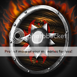
, keep the good work up!


 Approved
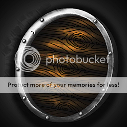


")