
 Approved


Moderator
M
Moderator
09:11, 12th Jul 2009
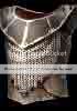
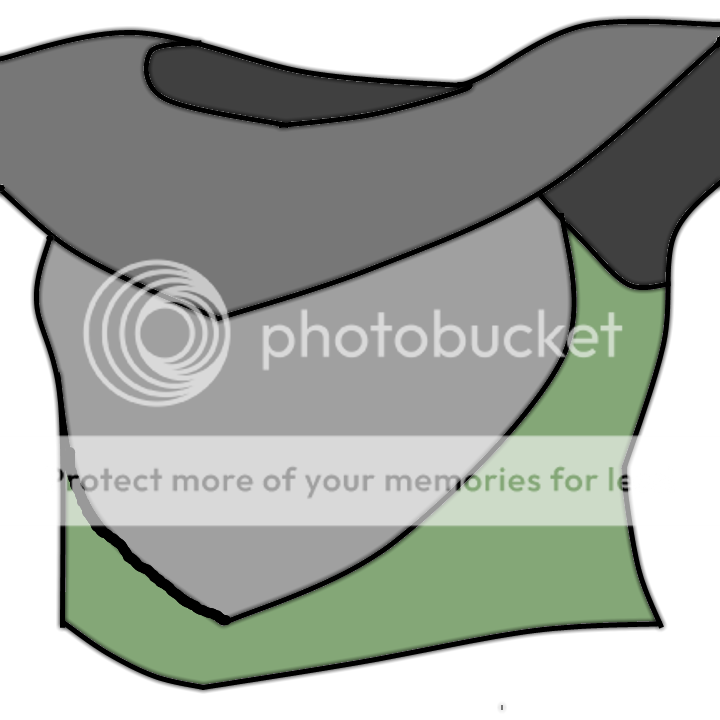
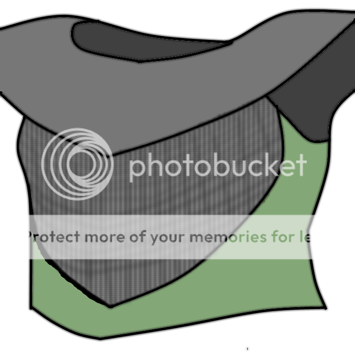
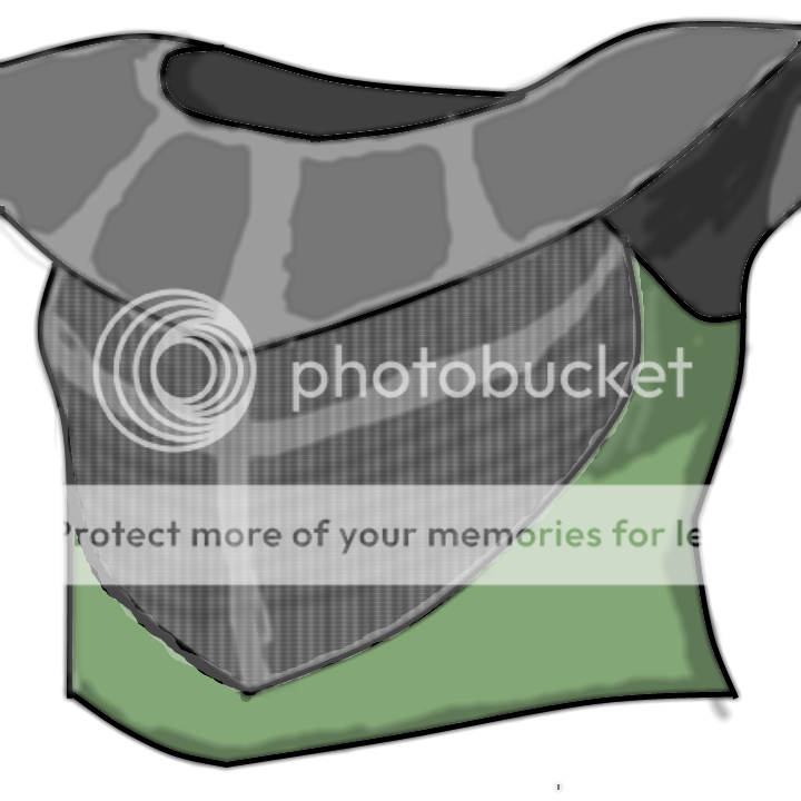
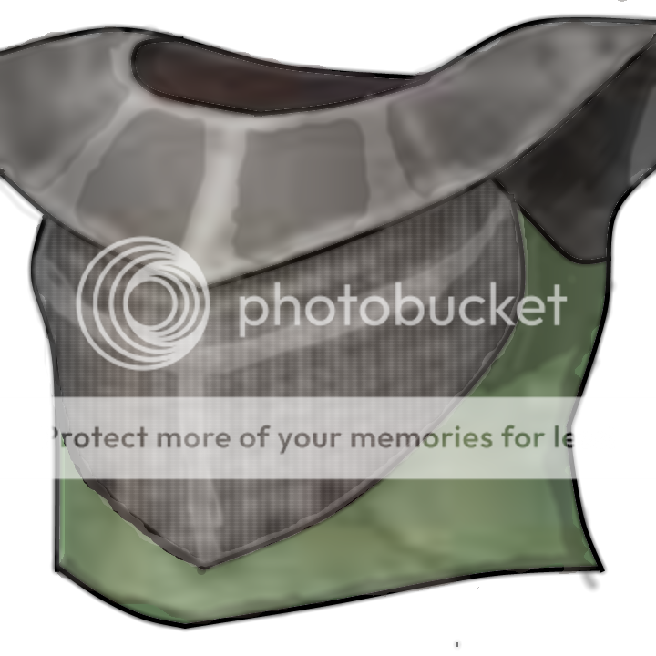
zombie2279: The outlines are traced, that does not suit my likes. The icon is mainly a result of fill tooling, then random brushes all over it, but hey. Remove the mess from around the outlines and overall, sharpen the whole icon. Detail the chainmail on the chest so it's actually visible and give the side a more brown-ish, grayish color. Afterwards, detail the highlights to be seen on top and around, it looks like plastic now, not metal. You could also add pieces of detail to it, the more it differs from the original, the better.
9:29, 19th Jul 2009
zombie2279: That, plus what I said in the comments section still stand.
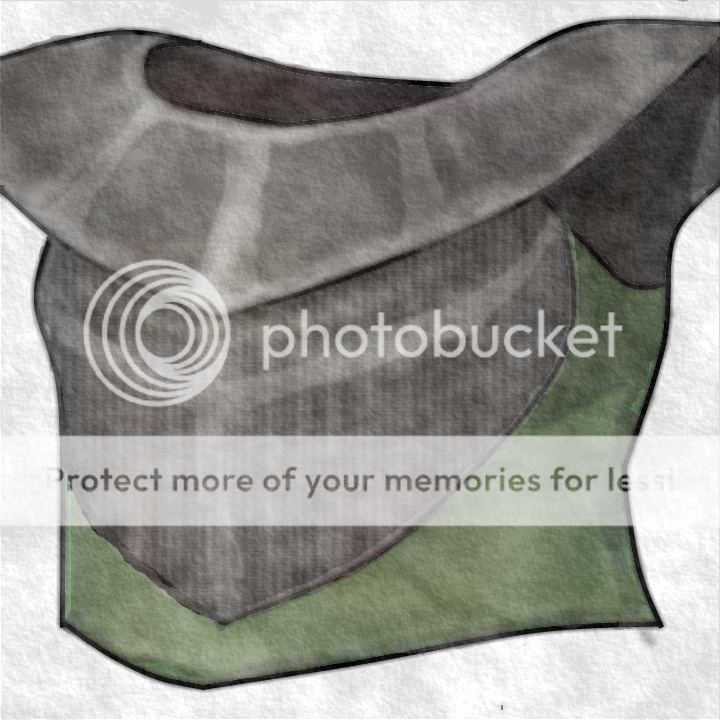


 .
.") .
.


