Listen to a special audio message from Bill Roper to the Hive Workshop community (Bill is a former Vice President of Blizzard Entertainment, Producer, Designer, Musician, Voice Actor) 🔗Click here to hear his message!
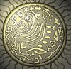
I pretty much like it aswell. It's an icon that gives out a feeling of simplicity and variative details at the same time. Can you please try variating with the color schemes perhaps, eg. adding more colors? It would sure boost the general level of detail. Make sure you have this one saved if it turns out to be bad.
Staying with this kind of monotone scheme may turn out quite useful.
Especially since it reminds to somekind of runic gravure on a stone plate or even a shield.
Having one version with a larger variety of colours sounds good as well zomb.
This site uses cookies to help personalise content, tailor your experience and to keep you logged in if you register.
By continuing to use this site, you are consenting to our use of cookies.


 Approved


")