Community
Maps
Tutorials
Gallery
Support Us
Install the app
-
Listen to a special audio message from Bill Roper to the Hive Workshop community (Bill is a former Vice President of Blizzard Entertainment, Producer, Designer, Musician, Voice Actor) 🔗Click here to hear his message!
-
Read Evilhog's interview with Gregory Alper, the original composer of the music for WarCraft: Orcs & Humans 🔗Click here to read the full interview.
You are using an out of date browser. It may not display this or other websites correctly.
You should upgrade or use an alternative browser.
You should upgrade or use an alternative browser.
NETownhall (Tiers 1, 2, and 3)
- Author(s)
- PMC Revenant
- Tags
- Fantasy, High Elf / Blood Elf, Human, Night Elf, Open Source, Building
- Size
- 23.73 KB
- Rating
-
(0 ratings)
- Downloads
- 19
- Created
- Apr 19, 2025
- Updated
- Apr 22, 2025
- Resources
- 3
- State
 Awaiting update
This bundle is marked as awaiting update. A staff member has requested changes to it before it can be approved.
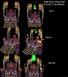
This is for the model without the model! All with tier 1 to 3!
Any feedback? Type away in the comments!
Model belongs to: @Lord_T
Model: Night Elven Town Hall
(UPDATE: Improved the icons!)
Keywords: Town Hall, Hunter's Hall, Hunter, Huntress, Tree of life
Any feedback? Type away in the comments!
Model belongs to: @Lord_T
Model: Night Elven Town Hall
(UPDATE: Improved the icons!)
Keywords: Town Hall, Hunter's Hall, Hunter, Huntress, Tree of life
Contents
NETownhall (Icon)

btn

disbtn
- Size
- 7.75 KB
- Uploaded
- Apr 19, 2025
- Updated
- Apr 22, 2025
NETownhallTier2 (Icon)

btn

disbtn
- Size
- 7.68 KB
- Uploaded
- Apr 19, 2025
- Updated
- Apr 22, 2025
NETownhallTier3 (Icon)

btn

disbtn
- Size
- 8.3 KB
- Uploaded
- Apr 19, 2025
- Updated
- Apr 22, 2025
Assets
- Joined
- Apr 10, 2022
- Messages
- 77
It is still in processAny permission to create this icon? If not it will be removed.
UPDATE: I got his approval
Attachments
Last edited:
deepstrasz
Map Reviewer
- Joined
- Jun 4, 2009
- Messages
- 20,241
It's a bit badly defined. If you don't know the model, you can't properly make out the image.
- Joined
- Apr 10, 2022
- Messages
- 77
I think they look fine! It still shows what the building is...It's a bit badly defined. If you don't know the model, you can't properly make out the image.
That how I see the other icons in the same way....
Not all icons have to be perfect, just as long it defines the unit
Last edited:
- Joined
- Jun 2, 2008
- Messages
- 11,645
Sweet.It is still in process
UPDATE: I got his approval
And yes it does, you dont need a full 360 of the building for each icon itself.I think they look fine! It still shows what the building is...
That how I see the other icons in the same way....
Not all icons have to be perfect, just as long it defines the unit
Also, yes they dont need to be perfect but need to be somewhat clear and not blurry to the eye. These 3 icons need different perspective's of the building and need to be better defined and clear. Right now they are quite blurry.
- Joined
- Apr 10, 2022
- Messages
- 77
These are similar to the Townhall, Keep and Castle of the human faction... Their all blurry but still identifiable... How can these icons be different?Sweet.
And yes it does, you dont need a full 360 of the building for each icon itself.
Also, yes they dont need to be perfect but need to be somewhat clear and not blurry to the eye. These 3 icons need different perspective's of the building and need to be better defined and clear. Right now they are quite blurry.
- Joined
- Nov 19, 2005
- Messages
- 7,615
Consider that just because the standard icons are blurry and cheaply made does not mean that your icons have to be blurry and cheaply made. You should always strive to improve over time. Don't compare yourself to something.These are similar to the Townhall, Keep and Castle of the human faction... Their all blurry but still identifiable... How can these icons be different?
- Joined
- Jun 2, 2008
- Messages
- 11,645
Also, instead of just copying this image which it seems you have and down sized them. Maybe download the resource and open it in war3veiwer, then screenshot it that way. Then you will probably get better results and a cleaner icon.
Attachments
- Joined
- Apr 10, 2022
- Messages
- 77
Screenshots from in-game are always better in my experience.Also, instead of just copying this image which it seems you have and down sized them. Maybe download the resource and open it in war3veiwer, then screenshot it that way. Then you will probably get better results and a cleaner icon.
- Joined
- Jun 2, 2008
- Messages
- 11,645
Whatever brings the best result for reviewing.Screenshots from in-game are always better in my experience.
- Joined
- Apr 10, 2022
- Messages
- 77
You guys are super strictly specific, aren't you...Awaiting Update again, please make them more cleaner and sharper because at the moment they are blurry and somewhat stretched.
- Joined
- Jun 2, 2008
- Messages
- 11,645
Its not really being strict its following the rules and/or the person reviewing the resource. If im not elaborating correctly let me know and i will go in more detail for you.You guys are super strictly specific, aren't you...


