It's fun to see icon artists upload packs like these, that center around fleshing out a single "hero concept", rather than the usual bundle of color swaps or whatever. (I love those too, just saying these are always cool to me).
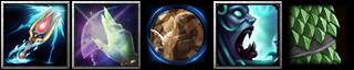
Nearly all of these winners to me; artistically sound, and some are even quite Warcraft-y IMO. I think I like the 'scream' & the 'scales' best for that, with the 'staff' a close 2nd (though is it a tentacle wrapped around it, fingers, or lightning?). The 'blink/glowy hand' is fine. The only one I dislike is the 'stonegaze', for the same reasons Gal mentioned: it was basically impossible for me to tell what it was without your explanation (the 'figure in stone' is a muted, off-center part of the composition), and it's further confused by the blue ring.
I think his point (& the one I share) is that if you wanted that blue circle to be interpreted as an eye, you did not succeed. He was offering suggestions for you to try to achieve success there, and I would encourage you to consider them as well. However it's ultimately just advice; take it or leave it. I don't have the skills to make such a change myself, nor the inclination.
If nothing else, I think that icon could benefit from a lot more clarity; currently it makes me think of a sort of "Sandstorm" icon (a hazy mess of brown with a figure roughly visible), which is cool too... but not what you were going for.
 Approved


 ️ Sailor Moon


