- Joined
- Jul 20, 2011
- Messages
- 1,279

(1 ratings)
 Approved
")


I always liked your style. : )
I like the new update, so I decided to tell something that would greatly improve the looks of it in my opinion.
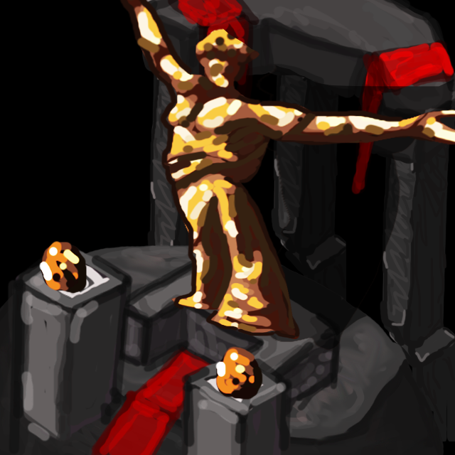
I would like to suggest adding some sort of cold backlight from "dark or perhaps unsaturated colors" zone to the stone material. And indeed some saturated frontlight (representing the main lightsource) from "saturated colors" zone; as I've always witnessed that such a material could always benefit from dynamic coloring, especially for a fantasy game. The temperature has the main role, creating some contrast. The overall image has a warm mood, so warm coloring should be a little more balanced than the backlight.
And you won't really need too much texture for icons, try focusing on shading, coloring & highlighting more than anything, because much details would get lost in the icon size, as San said. You'd just need to have a good definition, then you can proceed to the rest of the progress.
Best of luck, I like how this is going! Keep rockin'!
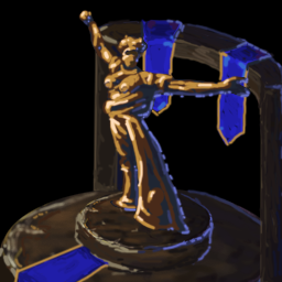
Well, perhaps something like these. I did some edit over your previous version:Which colors would you recommend exactly?
Oh wow. I really like that. I'mma give it a shot and see if i can make a second versionWell, perhaps something like these. I did some edit over your previous version:


But overall you're the author, you will decide which to prefer at the end. : )
Well, there should be some warm colors at front if there are some cold ones at back, for the purpose of contrast. Also, those blue flags look really flat and distracting.Oh wow. I really like that. I'mma give it a shot and see if i can make a second version
Updated:
attached. ty for the tips
No i really appreciate your tips, I've never played around with temperatures like that and this is def. helping me improve. I will try to implement that and give it a shot. honestly idk what to do with the team colored flags. they're pretty distracting i agreeWell, there should be some warm colors at front if there are some cold ones at back, for the purpose of contrast. Also, those blue flags look really flat and distracting.
One color cannot result a dynamic coloring. As you can see, there is transitions of colors in my example, so we don't have just one color. At back, soft transition from purple to blue types; at front, "purple to red, red to orange, orange to yellow" types. It is a game of temperature.
This result would also look good in the icon size, because there is a pure definition defined by a good coloring and lighting.
But these are not really necessary in this case, because you've these already approved. These are just some personal points that could perhaps be some motivation for the next works, as practice makes perfect! :]