• 🏆 Texturing Contest #33 is OPEN! Contestants must re-texture a SD unit model found in-game (Warcraft 3 Classic), recreating the unit into a peaceful NPC version. 🔗Click here to enter!
  • 🏆 Hive's 6th HD Modeling Contest: Mechanical is now open! Design and model a mechanical creature, mechanized animal, a futuristic robotic being, or anything else your imagination can tinker with! 📅 Submissions close on June 30, 2024. Don't miss this opportunity to let your creativity shine! Enter now and show us your mechanical masterpiece! 🔗 Click here to enter!

The Picture, take 2!

Status
Not open for further replies.
Level 36
Joined
Jul 1, 2007
Messages
6,677
Don't like how the light goes over the trees like that.

Revan, the way how one side of the sky is MEGAEXPLODELIGHTWTF and the other is just calm sky is a bit strange, otherwise nice, the grass looks a bit strange though (bad grass model).

Revan's sky is nearly perfectly realistic, actually. It's quite nice. It's just not really epic. And Jack, your camera flare doesn't look like a camera flare. More like a line of really bright fog on the path.
 
Level 5
Joined
Jun 8, 2008
Messages
122
Ragh! i always forget to remove those damn circles. Here it is, circle free.
 

Attachments

  • Contest_NEW DAWN.jpg
    Contest_NEW DAWN.jpg
    660.8 KB · Views: 234
Level 36
Joined
Jul 1, 2007
Messages
6,677
Wolle:
Your first terrain was quite nice and I liked the environment a lot (7.5/10)
Your second terrain wasn't so great to be honest, the white fog was crap and sun flares are really overrated (6/10)

raid100:
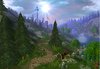
Very nice. The sun's a little off center but oh well, it's not like it has to be there, I just like it better that way :p
I love your environment but the choice of trees could've been better, or you could've at least tinted them to match the rest. (7.5/10)

Revan(rom):
I like your sun flare. The sky, however, doesn't really look too great. You need to work on skies, my friend, because there is certainly more to it than putting down a single doodad! ;) (7/10)

SimonKurciski:
Hmm... lots of random bits sticking out of eachother and doodads that don't really go to well together. You need to work on choosing the right doodads and then placing them well. (5.5/10)

Belgarath:
Not one of your best... there are so many random plants that don't fit in at all, there are huge ugly yellow grasses that don't fit in either. Also, there is no real background and if you can see the horizon line through the fog, that's bad. Also, that sun flare totally ruins it. SUN FLARES ARE NOT ALWAYS GOOD. (7/10)

bananaHUNT:
Pretty good I guess... but it doesn't really look underwater (which is what you were going for...?). It could use a more blue fog, more subtle light from above thingies (tint them like 10/10/25), and why can we see the sky underwater...? (6/10)

Nudl9:
(-1/10)

Ribenamania:
Some of your tree choices are ugly/don't go together. The environment is kinda bare, too. And I'm really starting to hate these sun flares... (6.5/10)
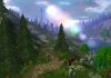
XereX:
Could use some distance fog, just to put things into perspective. You might want to cut down on the arches a bit, too (7/10)

3hg45435845g (or whatever your name is):
Cropping out the WE is a good idea. Otherwise... well... it's ok, but you have a long way to go. Just keep practicing. (5/10)
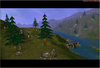
Ziggen:
Totally looks like something I would've made about a month ago :p
I love the sun and the huge tree in the background, and the ground clutter is quite nice too. The only thing I would say is to tint those bright green trees darker so they blend better with the pines. (8.5/10)
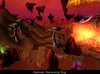
Keiji:
Hmm... I really like this, it has so much potential, but there are A LOT of minor flaws that really do add up. First of all, the fires on those torches are messed up (could put a fire doodad there). Secondly, the sky is kinda ugly. I think you need a stormsphere behind that, and some mountains in the WAY back that fill in that empty space. The ferns could be darker. Tile variation could use a bit of work (just because the tiles don't really blend naturally). Try to avoid really bright bits of fog, atmosphere should be a combination of very subtle things that add up to a masterpiece, not just a few things that stand out. (8/10)

Winner = Ziggen
2nd place = Keiji
3rd place = Wolle's 1st terrain + raid100


New theme coming soon.
 
Level 7
Joined
Mar 13, 2008
Messages
205
I made one, but it was crap compared to others, so I didn't uploaded it, and was lazy to make a new one. Anyway, Ill probably join the next one. Hope this thread lasts longer than Keiji's. And some rep for ~Void~, because he continued "tradition".
 
Level 36
Joined
Nov 24, 2007
Messages
4,386
NEW MAP HERE:

This one is just height and tiles, I decided not to place any doodads.

This is one of my best landscapes, btw ;)

OMG LIEK FORGOT TO ADD A PICTURE U NUB!

And to defend myself about the "lasting longer" firstly, the picture one, is the (not stickyed) thread with largest post count... <.< And secondly, people WANTED it to die out... therefor it did <.<

And for the second place, I can live with that :p I didnt actually use allot of time on it, hell I think I used more time THINKING about what I were to make than the actual terrain. :p
 
Level 7
Joined
Jul 9, 2007
Messages
306
well, this thread looks fun, so im gona give it a try.
this will probably be my WIP unless school deicdes to ick my ass soon...
please tell me how i can improve, this is still only my 3rd terrain ever....

the camera angel is the same.. the river just makes it appear to be different

oh and how do you guys get your screen shot to be so big o_O?
 

Attachments

  • river.jpg
    river.jpg
    275.8 KB · Views: 229
Level 9
Joined
Aug 23, 2007
Messages
465
o.k here's my entry for this one. An early morning image of crossroads in a valley type area. p.s very nice terrain this time Void.

And void, you may want to get another judge incase your entry ends up being better than ours and you don't want to give yourself the win, and so that the other can see entries that you may miss =D
 

Attachments

  • crossroads.jpg
    crossroads.jpg
    531.1 KB · Views: 224
Last edited:
Level 5
Joined
Jun 8, 2008
Messages
122
1920x1200 screen ftw! Anyways i think i have en idea for something to do with it, ive got one problem however: I cant change the sky box. has anyone else had this problem or is it just me?
 
Level 7
Joined
Jul 9, 2007
Messages
306
looks better, but the stars seem really out of place, there to sharp. stry blurrign them in photoshop or somthing.

anyways...any comments on my submission??? no? im feeling sorta neglected here, what should i do to improve it?
 
Level 36
Joined
Nov 24, 2007
Messages
4,386
You did the river very well (might be copying the idea over on my terrain.) But the choise of tree, I dont like, but that might just be personal, even though they dont fit, since the overall terrain is dirty and orange, and then there pops up green trees here and there, not good :p

Also, Its a bit TOO bare. But please man, dont EXPECT people to review your terrain, thats really Void's job and he will do it at the end of the week.
 
Level 19
Joined
May 1, 2008
Messages
1,130
here iz mine D:

EDIT: removed the sun flares
 

Attachments

  • picture 2.JPG
    picture 2.JPG
    98.2 KB · Views: 192
  • picture 2 2.JPG
    picture 2 2.JPG
    97.6 KB · Views: 228
Last edited:
Level 5
Joined
May 11, 2008
Messages
93
Oh fuck i had it almost done but then i clicked on fog and it was so big that my computer fucked up :ugly::slp::ugly: now all is gone :slp:
 
Level 36
Joined
Nov 24, 2007
Messages
4,386
here iz mine D:

FUCK man! Your stealing my idea! (well, your really not since I havnt posted mine yet) But it looks ALLOT like yours, still, I wont add those.. ehm.. "beutifull" sunflares or wtf their called :p

And now I have to rethink a new idea since... I cant come here with something that looks close to someone elses :(

Thinking... Found an idea! :p

And XereX, may I hint to you that your terrain looks awfully repetive, (and I dont like your choise of trees :p)
But you should add some sort of focus point, or more variety in the nature :p
 
Level 19
Joined
May 1, 2008
Messages
1,130
crap if the "sun flares" spoil the terrain i can delete them D:
but then i wont learn how to make them. Practice makes perfect...
 
Status
Not open for further replies.
Top