• 🏆 Texturing Contest #33 is OPEN! Contestants must re-texture a SD unit model found in-game (Warcraft 3 Classic), recreating the unit into a peaceful NPC version. 🔗Click here to enter!
  • It's time for the first HD Modeling Contest of 2024. Join the theme discussion for Hive's HD Modeling Contest #6! Click here to post your idea!

Texturing Competition #10 - Arcane

Status
Not open for further replies.
Level 14
Joined
Mar 7, 2005
Messages
804
That texture is still terribly messy and poorly contrasted. It hasn't improved at all since your first WIP in terms of what actually matters in textures for WC3.
 
Level 34
Joined
May 1, 2008
Messages
3,212
That texture is still terribly messy and poorly contrasted. It hasn't improved at all since your first WIP in terms of what actually matters in textures for WC3.
Oh well, everyone's got it's own opinion... (not that I like this one :p) anyway, too bad you won't finish your skin Mr. Goblin, now I won't have the competition :p (joke)

@markone: you sure you will finish you skin till the deadline?

@A.R.: are you finished with your submission?
 
Level 14
Joined
Mar 7, 2005
Messages
804
It's not an opinion. It's a quite objective analysis as to the composition quality of the subject matter, which is, in this case, quite poorly crafted. You should at the very least try to define your shapes better, right now you've managed to blur the lines between every section of the texture. Just look at your in-game shot and you can see where everything blends together into a blue-mass-of-sorceress.
 
Level 34
Joined
May 1, 2008
Messages
3,212
It's not an opinion. It's a quite objective analysis as to the composition quality of the subject matter, which is, in this case, quite poorly crafted. You should at the very least try to define your shapes better, right now you've managed to blur the lines between every section of the texture. Just look at your in-game shot and you can see where everything blends together into a blue-mass-of-sorceress.
Fine fine... but if you don't like it doesn't means everyone should not like it, now go ahead and make shit out of my skin, I'll be very grateful to you -_- ...

...not!
 
Level 14
Joined
Mar 7, 2005
Messages
804
I don't care who likes it and who doesn't, it isn't well-made. Regardless, I'm not "making shit" out of your skin, I'm telling you the honest to God truth. It needs work, and lots of it. I even suggested a good place to start with fixing it up by defining your shapes and work space. Once you've managed that, you should look into some contrast, since blue and a different shade of blue just doesn't cut it at all.
 
Level 14
Joined
Mar 7, 2005
Messages
804
...Well alright then, if you would rather shower him with false hope, all you had to do was say so.
Hawking said:
That's not true and you know it. Now start acting like a civilized human-being, Rising_Dusk, or just stop posting.
It is true; here, let me show you.

This is his first WIP.
This is his final submission.

I want you to look between those wraps and tell me if there is even a single improvement in what was started and what ended up being. Look very closely. Oh look at that, the only difference is that the WIP wasn't "done" yet. It's just as blurry, undefined, poorly contrasted, and has just as bad a concept as it started as. The face even follows the exact same bloody lines as the original sorceress, just with a nonsensical shading applied to it.
 
Level 14
Joined
Mar 7, 2005
Messages
804
Hawking said:
That was really unnecessary. And I apologize for what I've contributed to this argument. There are some things that can be changed, but let's not turn it into a big ordeal.
I like how you deleted the post that supported my comments and then kept your post ordering me to be a civil human being and claiming that I'm wrong and "I know it." Smooth. :p

You know, I gave a lot of feedback that Friky might want to read in one of my deleted posts. You should consider at least undeleting the part of one that has my comments in it. It also addresses your remaining remark that "it isn't better and I know it" (to which I proved otherwise). Just a thought. :)
 
Level 26
Joined
Nov 19, 2007
Messages
1,177
Units\Creeps\Revenant\Revenant.blp

Here is my Revenant of Purpleness.

A magical unit that possesses such magical abilities as 'Aura of Magicalness', 'Magic Missile', 'Magic Purple Spell', and the infamous 'Arcane Purple Monochrome Magic Projectile Launcher of Dark Magenta'

Not really too happy with how the thing turned out. The beginning was much better than the end. The team colour's also very vague from in-game perspective.

EDIT: Oh dear, forgot the texture.
 

Attachments

  • Revenant.PNG
    Revenant.PNG
    882.8 KB · Views: 705
  • revenant1.PNG
    revenant1.PNG
    706.6 KB · Views: 560
  • Revenant.blp
    89.9 KB · Views: 154
Last edited:
Level 14
Joined
Mar 7, 2005
Messages
804
Hawking said:
But you just seem to get a bit hostile about it.
I cannot emphasize how obvious me being hostile is. Trust me, I've not even come close in this topic, I've barely even scraped my normal disapproving feedback. It's been a long day. :<
 
Level 34
Joined
May 1, 2008
Messages
3,212
...Well alright then, if you would rather shower him with false hope, all you had to do was say so.

It is true; here, let me show you.

This is his first WIP.
This is his final submission.
Actually, that's not my final submission... but, this is. Look, Rising_Dusk... I think I understand you, you are actually trying to be good, no... not trying... you are being good and trying to help me improve my skin, thanks for that! You didn't mean to do anything bad or harm anyone... because of what you were saying and critisising my work, I had a MAD on you, but it's ok, I ''forgive'' you, lol :p

The point is... you were just helping and there's nothing bad about it. Am I right?

EDIT: @ike_ike: Your skin looks perfect and all that, but it's kinda dark ingame... I don't know, maybe? But I'm rating it 5/5 anyway ^^ and +rep
 
Level 14
Joined
Mar 7, 2005
Messages
804
Just a heads up, I didn't link to this because you decided in your infinite wisdom to not post the wrap inside of it. Besides, the two pictures are identical as far as feedback is concerned, just in the "final" one you lengthened the hair to cover up that nasty spot.
FriKy said:
You didn't mean to do anything bad or harm anyone... because of what you were saying and critisising my work, I had a MAD on you, but it's ok, I ''forgive'' you, lol :p
Are you going to improve your texture or just beat around the bush? I don't exactly care for forgiveness, since it's not my problem that you mistook my posts in the first place. I'm just giving feedback... Feedback that thus far has been ignored.
 
Level 34
Joined
May 1, 2008
Messages
3,212
Just a heads up, I didn't link to this because you decided in your infinite wisdom to not post the wrap inside of it. Besides, the two pictures are identical as far as feedback is concerned, just in the "final" one you lengthened the hair to cover up that nasty spot.

Are you going to improve your texture or just beat around the bush? I don't exactly care for forgiveness, since it's not my problem that you mistook my posts in the first place. I'm just giving feedback... Feedback that thus far has been ignored.
You know what now Rising_Dusk, I've had it! I don't care about you or your critisism anyway...
because you decided in your infinite wisdom to not post the wrap inside of it
What's that, are you insulting me? And you are like... 1:20 of people who doesn't like my skin, so I don't care, you've said enough about how bad it is! I myself think that this is my best skin so far! I don't care what you are gonna say in your next comment, but just know one thing: I don't care. Say whatever you want

EDIT: and I don't want to discuss any more about it
 
Last edited:
Level 14
Joined
Mar 7, 2005
Messages
804
Ugh... I swear, I give up. Fine, leave it as it is, do whatever you want. But just know that you'll never improve if you refuse to listen to your harshest critic.

For the record, I didn't insult you. You're blowing my comments out of proportion and taking them out of context, changing their meaning and connotations. It's very frustrating for me to see potential wasted because of attitude.
 
Level 18
Joined
Apr 15, 2004
Messages
1,396
I feel as if I have been ignored with my comments on the past 200 new textures.
I remember a time when people used to listen and actually improve their skinning quality instead of simply refusing to believe that their skin is not perfect.

this is why i am against ever saying cool skin thats awesome.
Those statements do not help the texturer they simply cause harm.


Seriously these NEW(and old) skinners should LISTEN to the crits. The work they are producing lately is subpar at best. Just because someone isnt saying you are awesome doesnt mean they are insulting you. It means they are trying to help you.
 
Dude... What have you done? Not listening to Dusk == not listening to a god. Seriously, if there is someone whose critic you should take it is HIS. However, he's got each of his points right. Those being:
1. The skin is too blue
2. The cape looks unnatural
3. Will look like a blob in game, cause warcraft doesn't like blurred lines, it needs black defined lines to look right, as you look from a large distance.
4. It IS blurry, looks as if you did work in 256X256. However, this is a thing that often tends to do look right in warcraft, for some odd reason. If you check other wc3 textures, you will notice how RIDICULOSLY SHARP they are. That's what you should go for. Also, the armor looks sort of bad cause you've used bluish white, and BLUE. You need to use more actual white and then put blue armor.
 
Level 14
Joined
Mar 7, 2005
Messages
804
HappyTauren said:
Dusk == not listening to a god
While I appreciate the support, likening me to a god is a type of flattery I do not condone. I'm just a dude on the internet like anyone else, I merely have very blunt and harshly objective criticism to offer people about their work.
HappyTauren said:
It IS blurry, looks as if you did work in 256X256.
For the record, working in 256x256 yields end-products that are the most successful in-game, since compression doesn't blur pixels together. Believe it or not, all of AR's work for DoE and AotZ 3.00 (Check the 3.00 topics, first posts) has been in 256x256. While 256x256 is king for in-game usability, it takes a very capable artist to use his work-space correctly and not over/under detail in such a small resolution, all the while maintaining definition of said details.

Regardless, that is beside the point of this discussion.
Traxamillion said:
Rising Dusk not everyone is Dio or Anemic Royalty or Pins...its not as easy for certain people to make a good skin..cut the kid a dam break.
This is where you are dead wrong. Success is achieved by force of will alone, not such abstract bullshit as "talent." AR's first texture was abominable, but thankfully he listened to my critique and took it into consideration. Look where he is now. Dio does the same occasionally. This sounds totally arrogant, I realize, but take it with a grain of salt. Ultimately, you need to be able to accept harsh criticism (Whether it's from me or anyone else that has powerful critique to offer), otherwise you will stagnate and wallow in your mediocrity until the end of days. I cannot emphasize enough how true it is -- Just look at half the artists at this site. The only "talent" you need is not being ignorant to the opinions of those who have been around the block a few thousand times more than you.
 
Last edited:
Level 21
Joined
Mar 18, 2007
Messages
2,247
Blah blah blah, bleh bleh bleh. I suggest all of you just drop this bullshit and move on.
This is going to get off-topic and rather unnecessary

Regardless, that is beside the point of this discussion.
There is no point to this discussion, as the thread is not titled "Rising_Dusk's meany pants critique"
It's his choice to listen to you or not, you don't have to bitch about it

Now carry on with the competition
 
Level 14
Joined
Mar 7, 2005
Messages
804
Last I checked, commenting on the artistic quality of an entry in a texturing contest was 'on topic'. Having meaningful discussion related directly, mind you, to the contest in the competition topic might spur others to try harder and output higher-quality entries. I suggest you quit preaching quietus upon this thread, since if anything, the discussion is promoting the opposite.

Besides, I'm quite content to leave this topic be, he clearly doesn't want my feedback and so will no longer receive it. It just happens that so many other people, yourself included, like to respond to the things I say. Funny how that works out.
 
oker here's an other Wip .. and here's my question... should i make him black or white?? :eekani: cause i really like the too of them... also.. should i work more on something or not?:confused:

Edit : btw.. i made the skin so it fiths with the model.. so don't tell me the ribs are not straite .....etc..etc.. <3
 

Attachments

  • ss0000434324.JPG
    ss0000434324.JPG
    40.1 KB · Views: 227
  • ss00232132100.JPG
    ss00232132100.JPG
    37.4 KB · Views: 234
  • felstalker copy.jpg
    felstalker copy.jpg
    104.5 KB · Views: 233
Level 14
Joined
Mar 7, 2005
Messages
804
Hawking said:
You should also consider removing some of the definition in the teeth and the "arcane horns" around his jaw.
Never remove definition, you should only be removing details, and only then if they're cluttering an area or detracting from the overall composition of the texture. It's also perfectly okay to detail the face area more than everywhere else, since you know, there is a portrait model.
 
Level 10
Joined
Jan 5, 2007
Messages
283
Just in time to have to panic a lot and probably not have enough time to finish, here's a new WiP of a new skin. I didn't like how the Spell Breaker skin started turning out, so I saved a variation of it and moved on.
Now I'm on to skinning the Warden, and basically all I have done so far is the face, the cape and the weapon. But not to fret, I still have a day or so...
 

Attachments

  • NEW WIP Warden.jpg
    NEW WIP Warden.jpg
    279.6 KB · Views: 289
Level 9
Joined
Jan 1, 2007
Messages
221
Black and green is just as arcane as blue and white, just not as common.

ive been away but about combats skin it not really arcane, arcane is either blue/pinky not green read about the Highelfs lore they use to feed from arcane magic till it ran out or they lost it ect then they converted to Fel Energy which they found was more powerfull ect thats why there eyes glow green now instead of blue and are called Blood Elfs so ur skins more of a Fel energy theme not really arcane =\
 
Level 34
Joined
May 1, 2008
Messages
3,212
Just in time to have to panic a lot and probably not have enough time to finish, here's a new WiP of a new skin. I didn't like how the Spell Breaker skin started turning out, so I saved a variation of it and moved on.
Now I'm on to skinning the Warden, and basically all I have done so far is the face, the cape and the weapon. But not to fret, I still have a day or so...
;( too bad you won't finnish it, and won't join the contest...
 
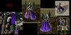
Second WiP... and it doesn't really look arcane at all any more. It's kinda ended up more like royalty or a valkyrie something... Oh well, I'll keep going and see how it turns out...

You need more colour variety. Try some silvers and such in the armor.

Let's start gathering final entries eh? Just to make sure nobody was missed.
Dio
A.R.
FamousPker49
FrIky
Communist Orc (No ingame)

Awesome. Thanks for that.

I might even gonna change my post where's my Final Entry... I made the sharpened version... tell me if this this (sharpened) version is better!

arcanesorceressst4.png

I'd say yes. But you should still play around with those highlights.
 
Status
Not open for further replies.
Top