• 🏆 Texturing Contest #33 is OPEN! Contestants must re-texture a SD unit model found in-game (Warcraft 3 Classic), recreating the unit into a peaceful NPC version. 🔗Click here to enter!

One Of the best wc3 drawings ever

Status
Not open for further replies.
Level 18
Joined
Feb 2, 2008
Messages
2,131
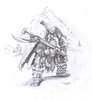
This drawing is made by my dad for me i asked hime and now i wana show it here after a long time below the drawing you can see he made it cause he wrote his initials under it. he made it frome a image of a wc3 paper anyway here it is hope you like it.
 

Attachments

  • Warr-craft 3 riffleman 2 ©ODPHoitinga aug 06.jpg
    Warr-craft 3 riffleman 2 ©ODPHoitinga aug 06.jpg
    759 KB · Views: 42,459

Deleted member 157129

D

Deleted member 157129

Not to sound rude, but it's not particularly good. Every sense of proportion and anatomy is thrown to bits. I mean, he's got an eye for detail, but there's not much quality beyond that. I mean, just look at the eyes for one. :/
 
Level 16
Joined
Nov 30, 2009
Messages
2,073
Well, some more things that I'd like to point out:
-The eye REALLY doesn't fit with WC3 Style
-The Shoulders and Face Proportions looks weird
-The cloak's ripped parts looks unnatural because of the same shape of the rips
-Hairy Face
-Nose is not flat enough for a dwarf
-Once again, the eye really don't fit WC3 Style

EDIT: Meh. Rephrased before this turns into off-topic starter.
 
Last edited:
Level 31
Joined
Sep 11, 2009
Messages
1,812
there is only 2 bad points in what i see. face and arms. rest is rly good.

hmm also, dead-man-walking, the way u say what is bad is insulting (well, if i would have done this drawing and someone would say me this, i would be insulted)

cuz pretty much all the drawing is good, except face and arms and hands.
 
Level 45
Joined
Jun 3, 2005
Messages
6,982
there is only 2 bad points in what i see. face and arms. rest is rly good.

hmm also, dead-man-walking, the way u say what is bad is insulting (well, if i would have done this drawing and someone would say me this, i would be insulted)

cuz pretty much all the drawing is good, except face and arms and hands.
Its called having an opinion and pointing out errors based on opinion. Its up to the artist to agree if they are plausible errors and IF they want to learn from it, or take it as an insult, because its "the best".
 

Deleted member 157129

D

Deleted member 157129

there is only 2 bad points in what i see. face and arms. rest is rly good.

hmm also, dead-man-walking, the way u say what is bad is insulting (well, if i would have done this drawing and someone would say me this, i would be insulted)

cuz pretty much all the drawing is good, except face and arms and hands.

If you take criticism offensive, then you'll never improve, because you live in a bubble where all your art is perfect and every time someone points out something they dislike about it, you go all out defensive and claim it to be a personal insult for the sake of hating. I became the artist I am today because I got some pretty harsh criticism on my art early on and followed the suggestions, or improved the part which wasn't appreciated. I still receive a lot of criticism, and I heed every bit of what they say, so that I can continue to improve. There really is nothing useful, from a skill developing point of view, in comments that point out how awesome the drawing is, if they don't point out what could have been better. It's of course joyful to listen to admirers as well, it keeps you going, it just doesn't make you a better artist.
 
Level 31
Joined
Sep 11, 2009
Messages
1,812
well. its rly not the best and im not defending this. im saying that when u say someone to improve something u dont say

-Pedoface Expression
-WTF with the Left Hand? It looks like Three instead of Five
-Have I said that the pupils suck?

yeah shiik i know. but there is a way to say things. this i think isnt a good way to. and BTW this isnt my drawing. just saying that the way he said what he wanted to say is offensive. and if u say dont take it offensive bla bla. sry but this IS offensive.

u dont need to say me that if i want to bla bla be an artist bla bla. cmon i know that.
 
Last edited:
Level 30
Joined
Sep 2, 2007
Messages
3,723
@kimbo and shiik, It's not what he said that's insulting it's the way he said it.
-Pedoface Expression
-WTF with the Left Hand? It looks like Three instead of Five
-Have I said that the pupils suck?
That's pretty offensive to me and it has nothing to do with being helpful, he's just bringing him down and trying to look all bad-ass. Besides, how does openly ranting about the artwork help (even if it was constructive) when his dad made this?

The only things I think need improvement are the right hand which should be bigger, (the eyes which should be more realistic and less... animelike)* and the right cheekbone which should be placed a little bit higher. Other than that, I like the drawing. The shading is pretty good. Gratz to your dad.
Edit: the second curve in the cloak should be toned down, because it doesn't look very natural the way it is right now, it should be darker. Also, note that the weapon is pretty damn well made.

*The way it is right now, it could be Disney artwork which, lets face it, is more succesful than any of the artwork ever submitted here. But if your dad was aiming for a realistic drawing, he should have gone for curvy eyes.
 
Level 16
Joined
Nov 30, 2009
Messages
2,073
Oh. Forgot some good things. The Rifle actually looks nice. The Hood and Shading were also proper. And the legs, despite being a little too long, is in nice position.
 
Status
Not open for further replies.
Top