Community
Maps
Tutorials
Gallery
Support Us
Install the app
-
🏆 Texturing Contest #33 is OPEN! Contestants must re-texture a SD unit model found in-game (Warcraft 3 Classic), recreating the unit into a peaceful NPC version. 🔗Click here to enter!
You are using an out of date browser. It may not display this or other websites correctly.
You should upgrade or use an alternative browser.
You should upgrade or use an alternative browser.
My Gallery of ART!
- Status
- Not open for further replies.

- Joined
- Jun 3, 2005
- Messages
- 6,982


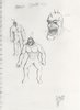
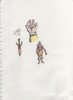
I think iv said this before, anyway, try to keep your proportions right, draw a sick figure with points(circles) as the joins and a a circle to define the basic shape of the head, and a triangle like shape for the chest, thus from doing this you can have an idea of what your doing, its post and it helps with gettin the proportions right.
like said ages ago.work abit more on the shading.
and for the last one, try to use a ruler for the bottom bit o.0 apart from that they are "ok", they lack many things.. but proportions are the main issue here atm.
like said ages ago.work abit more on the shading.
and for the last one, try to use a ruler for the bottom bit o.0 apart from that they are "ok", they lack many things.. but proportions are the main issue here atm.
More Art!
Finally gained the patience to upload some new drawings of mine! Enjoy!
~Craka_J
PS: Comments, Feedback, and Suggestions are appreciated!
Finally gained the patience to upload some new drawings of mine! Enjoy!
~Craka_J
PS: Comments, Feedback, and Suggestions are appreciated!
Attachments
- Joined
- Jun 3, 2005
- Messages
- 6,982
Hmm..gettin better ..but you still need to work on your proportions, anatomy is better yep.
You also need to work on your directional light more, your demon monster has conflicting light issues, the lights source is placed on random areas.
but like a said, a very good and VAST improvement. gj
You also need to work on your directional light more, your demon monster has conflicting light issues, the lights source is placed on random areas.
but like a said, a very good and VAST improvement. gj
^.^ Thank you!
Doh! You noticed my shading mistake on the demon lol; I drew it about 5 months ago, but felt like shading it today after I finished up on the Pirates picture. So since I was used to the lighting of the Pirates, I applied the same lighting to the demon by mistake, and the lighting from before was the opposite. I noticed this when I was redrawing the hands... but of course I was too lazy to fix it.
Glad to see that you like my work more and see the improvement ^^
~Craka_J
PS: I need some suggestions on what to fix or add in the Pirates picture. I kinda wanna work on it more.
Here are three new drawings of mine.
The scanner and .JPG format reduced a lot of the shading and details. But I think they still look pretty good. Feedback is appreciated, as usual.
PS: Did you notice how all of my characters are leaning in an odd direction? Usually in an opposite direction which they are standing. I do not know why I do this. Probably because I draw side ways kind of and hold the pencil oddly.
~Craka_J
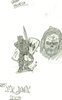
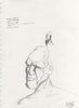
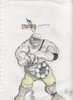
- H.W. Guy: Inspired by Team Fortress 2 and drawn with pencil. I am actually very proud of this piece. The arms and the mini-gun are in need of fixing up though.
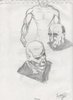
- Arabic/Russian Portrait: Well it isn't a real person. Made him up as I went along. I can't figure out if he is Russian or Arabic, but I think it came out pretty well. A lot of details need to be added to it though; especially shading! Drawn with graphite pencil.
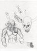
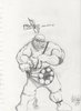
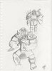
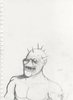
- Da Orkz!: Inspired by "Warhammer Online: Age of Reckoning", I love the Ork race and decided to create my own little Ork concepts. I made mine look a lot more consumed by chaos though. I am mostly proud of the faces of these two characters. The rest is... well I might fix them up.
The scanner and .JPG format reduced a lot of the shading and details. But I think they still look pretty good. Feedback is appreciated, as usual.
PS: Did you notice how all of my characters are leaning in an odd direction? Usually in an opposite direction which they are standing. I do not know why I do this. Probably because I draw side ways kind of and hold the pencil oddly.
~Craka_J
Attachments

Two new pictures!
Here are two new drawings that I made about a week ago. Hope you like them!
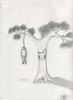
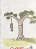
1) [Tree's Revenge]
Finally, this tree gets its revenge when a man hangs himself on the tree. Drew this out of bordom with a pencil and a shading stub. Didn't care much about proportions or anything like that, usually never do when I draw cartoons. But this seemed to grab my interest and I am kind of proud of it, so... vuala!
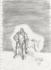
2) [Race Concept]
One of my most successful race concepts for an MMORPG I now work for. I will improve it more if the developers find it intrueging. I'm not too proud of the face with the beard though, any tips on what I can do to fix it and make it look better would be nice. This was drawn with the same ol' #2 pencil and a tiny bit of touch-ups with a shading stub.
Hope you like these! Critique on the race one is definately appreciated.
~Craka_J
Here are two new drawings that I made about a week ago. Hope you like them!
1) [Tree's Revenge]
Finally, this tree gets its revenge when a man hangs himself on the tree. Drew this out of bordom with a pencil and a shading stub. Didn't care much about proportions or anything like that, usually never do when I draw cartoons. But this seemed to grab my interest and I am kind of proud of it, so... vuala!
2) [Race Concept]
One of my most successful race concepts for an MMORPG I now work for. I will improve it more if the developers find it intrueging. I'm not too proud of the face with the beard though, any tips on what I can do to fix it and make it look better would be nice. This was drawn with the same ol' #2 pencil and a tiny bit of touch-ups with a shading stub.
Hope you like these! Critique on the race one is definately appreciated.
~Craka_J
Attachments
- Joined
- Jun 3, 2005
- Messages
- 6,982
The trees face is awesome and i see alot more improvement. Maybe you should do some more practice sketches, but this time facial expressions and structure and such.
- Joined
- Nov 12, 2007
- Messages
- 2,340


Dude, you know how to draw. Like, you have an "expression" when drawing, but your proportions are bad. Not bad. I prefer to say "non-trainned". I've noticed your progress in those updates, and Werewulf's done well by helping you. I've learned some things in this thread bcuz of Werewulf's replies!!
But I prefer drawing terrains, not persons. But, I like studying anatomy of the humans, and some times about other creatures (like orcs and taurens). So, when I'm going to draw a human, I have a sense of how-to-do-it. To improve the proportions and other things like these, study the anatomy of the things, and you will see how you will improve. What makes you a good terrainer is the observating. So do it to draw better dude!!!
But I prefer drawing terrains, not persons. But, I like studying anatomy of the humans, and some times about other creatures (like orcs and taurens). So, when I'm going to draw a human, I have a sense of how-to-do-it. To improve the proportions and other things like these, study the anatomy of the things, and you will see how you will improve. What makes you a good terrainer is the observating. So do it to draw better dude!!!
---I'm not from a country that speaks english, so there must be a lot of mistakes in my text above. Sorry if you couldn't understand. I'll do what I can to improve---


I know my proportions suck. I hate using rulers and setting horizon points when I draw. Though now that I am a Chief Art Director for a game, I have no choice now. 
I'm horrible at drawing structures and I am improving with landscapes, but I think that I am best with anatomy and getting better with shading.
Expect more drawings to be up soon!
~Craka_J
I'm horrible at drawing structures and I am improving with landscapes, but I think that I am best with anatomy and getting better with shading.
Expect more drawings to be up soon!
~Craka_J
- Joined
- Nov 12, 2007
- Messages
- 2,340
No dude, your proportions did not suck. They're good. You don't know how horrible most peaple usually draw proportions. So, if you prefer drawing anatomy, you must not think "Oh, my proportions sux", you must think "ah, I'm better than much more peaple!". What really matter is if you like your draws.
As I said, your proportions are good, but can be better. So you hate using rulers, huh? Thats great! Yeah, I'm telling you the truth. Peaple that uses ruler for everything aren't so good when drawing a line with a "free hand". And, if you don't use ruler, your lines must be good. I know this because the teachers teach us to use the ruler as less as possible.
No problem if you think your draws are bad. You can use this feeling to improve. Just keep drawing everytime dude. Doesn't matter if you are a Chief of the "3D Enviormental Terraining", or something like that, nothing must stop you. There is no reason to stop improving. So keep drawing!!
Thanks for your awesome compliments and encouragement, /Naze! To be honest, you are right about the fact that I am as great as I am and almost never use rulers (Unless drawing buildings) because just think of how proportionally correct my drawings will be then?
The way I shade my drawings is my own style. I know there are millions of artists who dispise things like shading with a shading stub, but I like to because it actually improves the look of cartoons and I just really like its effects on the drawings I make. Some pictures, yes, it is horrible to use. But since the shading stub is very smooth on pictures, it is also easier to erase. So sometimes I use this as a place-holder for real shading I guess.
Thanks for the feedback and commentary guys!
~Craka_J
- Joined
- Nov 12, 2007
- Messages
- 2,340
(You can call me only Naze, if you want... "\Naze" is too long! =])
It was just my mind that said : "Make clear that he is good when drawing!".
Hehehe...
So, you are improving with landscapes, huh? Good. I like drawing terrains. Sorry, I prefer drawing terrains, landscapes, halls, etc etc. But, drawing terrains or anatomy, what matter is the observation. This is the essence. You are an exellent terrainer because of the observation! I saw you and other guys in an argument about fog, and there I could see that you are a good observer. So, you are good when transfering the terrain to the computer, and I am good when doing it with a pencil and paper.
But remember man, the important to never stop drawing and try to look, study, observate, and all the other pathetic blah blah blah you usually listen to. The last part is not much important, but observation and trainning is.
So keep praticin'!!
--(I would like to post one of my projects, but I don't know why, all the cameras in my house stopped working today! I think it is because I need them, because if I don't, it would work..... Murphy...)--
Four new concepts
As promised, I have uploaded two new concept art pieces. One of which was inspired by a fan-art picture I saw and I think that it is a bit too obvious to be accepted, but what the hell... it was fun drawing it.
The other I drew of a very detailed facial picture of the new race being included in the game called the "As'sher' race. I believe it will be a playable race.
The shading on these drawings seems to be very proportional, so I'm proud of that. Still working on the details of both of them, especially the As'sher one.
[Edit]:
Forgot to upload another two concepts I've done that were accepted and will be used. They still need some details done to them, but if they're already accepted, why bother? I drew them naked so that in the future I can draw armor concepts on them. That is also why the body isn't very detailed and the shading isn't that dark.
The FBO drawing impressed the developers very much, and these two drawings are the drawings that made them promote my art position to Chief Art Director. Can't wait to see what they do after I show them my real skills.
Hope you like them! If you have any suggestions, feel free, as usual, to tell me what is on your mind.
Thank you very much in advance;
~Craka_J
Note: The quality has been reduced a lot. Not sure why. Looks a ton better IRL.
Attachments
Last edited:
- Joined
- Jul 19, 2006
- Messages
- 2,307
The First Concept: 3.5/10
I don't understand it, it really isn't a clear picture, and the background is blurry and questionable.
The Second Concept: 5/10
The face is messed up, I don't mean the spikes (which are artistic) I mean the cheeks which are unnaturally spikey and boney... not good looking.
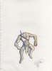
The Third Concept: 6.25/10
The front is good, but the back's spikes are unnaturally... left-hanging. That makes a very strange figure right there.
The Fourth Concept: 4/10
Unclear, small and distant. It doesn't seem to be a real drawing, the side view is strange, the race is satyr or has an accidental look that relates it to a furry half-breed.
I don't understand it, it really isn't a clear picture, and the background is blurry and questionable.
The Second Concept: 5/10
The face is messed up, I don't mean the spikes (which are artistic) I mean the cheeks which are unnaturally spikey and boney... not good looking.
The Third Concept: 6.25/10
The front is good, but the back's spikes are unnaturally... left-hanging. That makes a very strange figure right there.
The Fourth Concept: 4/10
Unclear, small and distant. It doesn't seem to be a real drawing, the side view is strange, the race is satyr or has an accidental look that relates it to a furry half-breed.
- Joined
- Nov 12, 2007
- Messages
- 2,340
Ho-ho-ho, dude!!
That was what I talked about!
Nice proportions, but you still have to practice it. But this post compared to the first post of the thread... Well... this one rocks! No, sorry, this one smashes!!
But your proportions still need to be worked. I think you trained a lot, because you current proportions are extremely better then before. You only did few things "wrong". In the first one, the legs are to big to the size of the guy. At the second, Scyth-Master already said what is wrong. At the third one, the their hands are too big, and the spikes are unnatural. (As Scythe-Master said). The last one is good, the only thing is that the guy is too far.
I am really impressed! Keep drawing!!
@Scyth-Master: Well I am doing race concepts, not human portaits. The proportions of the face were bent a bit because that is how I meant them to look. Though now that I look at the cheek on the left, it does look too boney, especially compared to the other one. I'll fix it ASAP.
I've done some major detail additions to the drawing so far. I'll probably post it again when it is complete or when I think it is complete or perhaps even in dire need of assistance.
Was the first drawing really that horrible? A 3.5 is a pretty bad rating. The quality was reduced by the website I believe. But the picture is much more clear at my Deviant Art page here. I recommend you check out the drawings you may think is hard to see, there.
@\Naze: Thanks for the compliment, once again.
I have focused a lot of attention on practicing my shading proportions and I am still trying to get muscle tone proportions done correctly, but muscles change a lot when they move so it makes studying biscepts and abdominal muscles a bit harder. I don't study muscles in a book. I usually go on Google images and search up sketches and stuff like that, or of course, look at Samwise's art. He's one of my favorite artists!
My greatest problem with drawing is the back view of people. A few posts ago, people have said that the position of faces and my characters are very general and are not very creative poses. I'm trying to get a bit creative, but some how my mind just won't allow it... *sigh* some day my work will become more interesting
Proportional-wise, my greatest flaw is with the feet, legs, and back for sure. My stomache, chest, and abdominal skills aren't that great, but I am improving.
I'll try to draw a more interesting drawing soon, possibly after I finish the second uploaded drawing. So stay tuned!
~Craka_J
- Joined
- Jul 19, 2006
- Messages
- 2,307
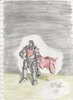
Yeah, it was that bad. Sure you have a cute banner... or sideways cape... in the background, but the bottle-looking hammer was completely 2-dimensional, which doesn't fit in with the rest of the picture. The knight's armor-type is completely impossible to figure out. It seems like his belly is showing, but he has iron shoulder pads? It's not a good picture... at all.
- Joined
- Nov 12, 2007
- Messages
- 2,340
Oh, I forgot to rep you, Craka. +rep!
First off, to explain what he is wearing:
And of course, he wields a warhammer. The warhammer actually IS 3D. Probably need to check the deviant art picture to notice it better. But it most certainly is no where near the shape of a bottle.
~Craka_J
- Shoulder pads (Plate) and the shoulders are connected to each other. There is also a neck guard attached as well.
- Platemail chest piece with a tabard (Which forms into a cape in the back) covering it.
- Platemail bicept and forearm guards. No, he is not wearing gauntlets.
- Sash.
- Upper leg guards cover platemail leggings, knee guards, and greeves.
- Leather cowl on head.
- Chainmail under armor.
- Spikes on shoulders.
- Note attached to his left (Your right) shoulder pad which contains information of whom he serves, his duties, and so on, proofing that he is a loyal and dedicated warrior.
And of course, he wields a warhammer. The warhammer actually IS 3D. Probably need to check the deviant art picture to notice it better. But it most certainly is no where near the shape of a bottle.
~Craka_J
- Joined
- Jul 19, 2006
- Messages
- 2,307
Unfortunately Craka, if you have to point out the things in the picture because they're not clear enough to see... that means it's low quality or too small and blurry. Maybe both. The hammer does look like a bottle, on both pages, it looks like a Pandaren bottle. The funny thing is... at first I thought it was a bottle because... because well he looks hammered.
- Joined
- Nov 12, 2007
- Messages
- 2,340
Was the first drawing really that horrible? A 3.5 is a pretty bad rating. The quality was reduced by the website I believe.
~Craka_J
I think that you got that bad rating because of these things:
-That "sky" (or fog) is really terrible
-I'v already said that the size of teh legs and the hands are strange.
I was out of time when I posted that replies above, then here is my complete reply:
Shading: Your shades are so much better, but they still need to be worked. Try to make the shades larger, it will look better.
Proportions: Much better too, but they still need to be worked. But, I've already said that, you pratice proportions observing&drawing. Try to put something on a table (it can be an apple or an toy), and try to draw it exactly how do you see the object. Or, in class, try to draw the head of the guy who sits in front of you... But hide it! If the guy sees the draw he is going to kill you!
Anatomy: Very good. The muscles, bones, skin, etc looks very good. But some spikes doesn't looks natural. They look like pieces of bladed plastic on the back of strange dudes.
Well thats it. Keep Drawing!!
The lead game developer ordered me to add spikes to the head and back, just like the way I did. Though, they are out of place on the back. I will probably have to redo the back entirely.
I noticed the legs were larger than the body about 40 minutes after I started drawing this. At first, it pissed me off. But it kind of made the guy look bulkier, which I thought was cool, so I didn't bother to fix it.
One of my problems with drawing is abnormally large hands. I'm starting to break this habbit (Or so I thought) but apparently not well enough.
Thanks for the feedback.
~Craka_J
- Joined
- Nov 12, 2007
- Messages
- 2,340
well... you noticed your mistakes and you're trying to repair tehm. What do you want more??? You're doing it right!
- Joined
- Jul 19, 2006
- Messages
- 2,307
This has nothing to do with the website or the scanner the other pictures are clear as a bell and I can even see erase marks on these. I see that you want this one to be the best, because you keep pushing little facts about your doodle. If it's not good, then admit it, fix it, or ignore it. Make a newer, better version. If it took you the longest of all of them (and that's why you're suprised) then that's probably because you were experimenting with different shapes and sizes. I'm sorry, the first one did not impress me.
I know for sure it is not my best. In fact, it is FAR from my best. Though the cape is probably my best 'flowing cape in the wind' drawing. The rest is rather... disproportional. I never said it was good. Besides, did it for a concept. I admit that there are some bads to this, but there are goods such as the cape and shading of course. The second drawing took me the longest actually. Mainly because some fucking girl smudged it hard with her hand and I had to redo almost all of the details in the face and remove the smudge marks. God that pissed me off more than anything.
Anyway, I think I've said all that I could about that first drawing. Oh, the background, right. The background was just something I did to take up space and make the character the main focal point. The horizon line is disproportional as well, but was supposed to designate his posture or something... yeah, I failed at that one, lol.
~Craka_J
- Joined
- Jun 3, 2005
- Messages
- 6,982
the main point of gettin a concept of a race isnt just to draw it, rather portray it in a form where its shape and form is clearly visable and obviously, the focus on the concept of you are drawing.
Its best suggest you do side and front concepts for more technical uses, and I mean not just some sketches, I mean a proper organized concept sheet.
Its best suggest you do side and front concepts for more technical uses, and I mean not just some sketches, I mean a proper organized concept sheet.
If only I had the money for a tablet and Adobe Photoshop... then I'd be able to color these and make them look a lot better.
You are right though. And because of that, I will fix these concepts a lot more. The paladin one I will not pay much attention to though since all of this negativity about it makes me not want to touch it anymore.
~Craka_J
You are right though. And because of that, I will fix these concepts a lot more. The paladin one I will not pay much attention to though since all of this negativity about it makes me not want to touch it anymore.
~Craka_J
- Joined
- Jun 3, 2005
- Messages
- 6,982
Here are some concept sheets, a style like this im suggesting.
http://gaming.monstersandcritics.com/archive/gamearchive.php/Warhammer_Online%3A_Age_of_Reckoning/9616/imagescreen/51
http://gaming.monstersandcritics.co..._Online:_Age_of_Reckoning/9616/imagescreen/54
http://gaming.monstersandcritics.co..._Online:_Age_of_Reckoning/9616/imagescreen/57
You dont need a tablet, you can simply scan, use the pen tool to create a clean lineart, and then create a fill.
- Joined
- Nov 12, 2007
- Messages
- 2,340
Ohh, that is a great example of anatomy and proportions. You can see the muscles and the bones under the skin of those creatures, and that is what brings the feeling of "living creature" to the image. Werewulf's example is just great.
- Joined
- Jul 24, 2005
- Messages
- 312
Here are some concept sheets, a style like this im suggesting.
http://gaming.monstersandcritics.com/archive/gamearchive.php/Warhammer_Online%3A_Age_of_Reckoning/9616/imagescreen/51
http://gaming.monstersandcritics.co..._Online:_Age_of_Reckoning/9616/imagescreen/54
http://gaming.monstersandcritics.co..._Online:_Age_of_Reckoning/9616/imagescreen/57
You dont need a tablet, you can simply scan, use the pen tool to create a clean lineart, and then create a fill.
AWSOME! AWSOME ! By the way with tablet u can draw sketches and do coloring , add more details in Corel Painter which will increase ur work speed and quality . By the way if u are using tablet , then it is highly recommended to use Corel Painter for digital art drawing . Photoshop is good for photo manipulations .
Another Update! [Colored Pics]
As promised, here are some more drawings. One of which is new, the others are the same old old ones, but I colored them with color pencils. It's been about three or more years since I colored with color pencils so be nice.
Hope you like them! Critique is appreciated.
~Craka_J
As promised, here are some more drawings. One of which is new, the others are the same old old ones, but I colored them with color pencils. It's been about three or more years since I colored with color pencils so be nice.
Hope you like them! Critique is appreciated.
~Craka_J
Attachments
- Joined
- Nov 12, 2007
- Messages
- 2,340
Well, you already had your critiques, and I am not going to say them again!
And, you upgraded well at the shading! That is really nice!
About the last one, the head and the clothes of the guy are just really nice. It is a large improvement since the first one! + rep for you!
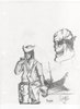
Today I am full of time, so I wanted to make a bigger explanation of what to improve, and what is cool. So, here are the attached image!
Remember I am here only to help!
And, you upgraded well at the shading! That is really nice!
About the last one, the head and the clothes of the guy are just really nice. It is a large improvement since the first one! + rep for you!
Today I am full of time, so I wanted to make a bigger explanation of what to improve, and what is cool. So, here are the attached image!
Remember I am here only to help!
Attachments
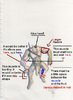
Wow picture is really helpful. Thank you for pointing everything out like that and explaining it briefly, it helps me a lot.
I will probably try to fix and finish this drawing. It all depends if the concept gets accepted by the lead developers. Though... I'm Chief Art Director so I guess I am allowed to approve my own work for the game.
~Craka_J
I will probably try to fix and finish this drawing. It all depends if the concept gets accepted by the lead developers. Though... I'm Chief Art Director so I guess I am allowed to approve my own work for the game.
~Craka_J
- Joined
- Nov 12, 2007
- Messages
- 2,340
Wow picture is really helpful. Thank you for pointing everything out like that and explaining it briefly, it helps me a lot.
I don't know why, but the pictures I've been uploading are becaming the worst quiality I've ever seen...
I will probably try to fix and finish this drawing. It all depends if the concept gets accepted by the lead developers. Though... I'm Chief Art Director so I guess I am allowed to approve my own work for the game.
~Craka_J
lol you are the chief
Oh, and, you don't need to redo the drawing, that was just to show you, not the errors, but the things that look wierd, so you can try to avoid them next time.
Well thanks for the help. This will certainly help me keep my eyes peeled for any errors I may make along the way, and I can fix them before I upload them to the public.
I have to draw an elven styled structure now for one of the new races being implemented into the game. Wish me luck! I usually suck with architecture.
~Craka_J
I have to draw an elven styled structure now for one of the new races being implemented into the game. Wish me luck! I usually suck with architecture.
~Craka_J
- Joined
- Nov 12, 2007
- Messages
- 2,340
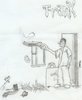
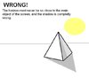
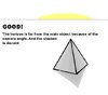
Well... Good luck! About archtecture, it is important to keep your eyes open for spacial errors! And the most important thing is the horizon, taht most peaple makes errors when drawing it. An image is much better then 1000 words. See the attachment. You know that, but as you said that you sucks on archtecture, it is good to have a review 
Attachments
- Joined
- Nov 12, 2007
- Messages
- 2,340
This problem is easily solved. With the observation! Get a pic of a building from google, or other search site, and see the horizon angles (wich decides what the angles of each building is) lol
Another Batch
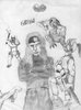
Here's another batch of drawing/sketches I made. On my DeviantArt profile I have added more elaborate explanations about what drawing is in their descriptions. I recommend you guys take a look at them over there, as the quality is probably better there.
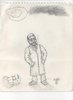
1) Sketch of my dog while she was asleep on a folded blanket on my bed.
2)A series of cartoons I drew while I was bored in school. Mainly a practice for noses, mouths, and eyes.
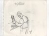
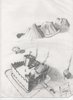
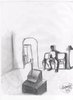
3)Practiced drawing shadows and lighting. Some of it has bad proportions on the man, but I think it's good. The rest of the house was rushed and I didn't bother fixing any of the bad proportions.
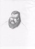
4)Practiced drawing beards. Mouth looks deformed.
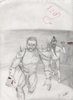
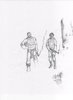
5)Tried seeing how good I am with modern army drawing.
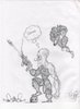
6)Inspired by the armor of the characters in Unreal Tournament 3. Practiced drawing guns and armor.
~Craka_J
Here's another batch of drawing/sketches I made. On my DeviantArt profile I have added more elaborate explanations about what drawing is in their descriptions. I recommend you guys take a look at them over there, as the quality is probably better there.
1) Sketch of my dog while she was asleep on a folded blanket on my bed.
2)A series of cartoons I drew while I was bored in school. Mainly a practice for noses, mouths, and eyes.
3)Practiced drawing shadows and lighting. Some of it has bad proportions on the man, but I think it's good. The rest of the house was rushed and I didn't bother fixing any of the bad proportions.
4)Practiced drawing beards. Mouth looks deformed.
5)Tried seeing how good I am with modern army drawing.
6)Inspired by the armor of the characters in Unreal Tournament 3. Practiced drawing guns and armor.
~Craka_J
Attachments
- Joined
- Nov 26, 2006
- Messages
- 11,136


You have a dA account too? It seems everyone has one nowadays.
- Joined
- Nov 12, 2007
- Messages
- 2,340
Wow, it doesn't look like the artworks of the same guy at the first post, if you understand me
Well, you noticed all you errors, and thats good, you know where to focus on.
You should work more on your weapons, the last draw is.... crappy.... Idk.... meh, you got it.
I liked the 5th one.
Well, you noticed all you errors, and thats good, you know where to focus on.
You should work more on your weapons, the last draw is.... crappy.... Idk.... meh, you got it.
I liked the 5th one.
- Status
- Not open for further replies.
Similar threads
- Replies
- 8
- Views
- 1K
- Locked
- Replies
- 158
- Views
- 16K