- Joined
- Jun 15, 2006
- Messages
- 2,651


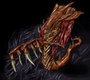
the arms look strange( how the Hydralisk holds them).
Oh but the Baneling looks awesome
Oh but the Baneling looks awesome


Might wanna try redoing him./QUOTE]
... cmon, u rly think i just though or wanted of remaking him? totaly wrong, too much time to do, u rly doesnt know the time it takes to do a drawing.
why would i want to make an hydralisk exactly like a real one? would just be a waste of time.


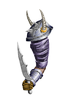
closer to us, but it looks like it's pointing downward./QUOTE] its actualy the both at the same time
so, i'll cut a bit of the Upper arm, I'll make the Lower Arm bigger, (The Bracer too), I'll Make the Hand Bigger (even if i wouldnt make the lower arm bigger, i would have to make it bigger), I'll change the place of the handle in the hand, and will remake the blade.
Seriously, idk, but the hands looks like weird to me.. anyway, if u find something weird on it, just say it plz.
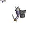
New Wip.
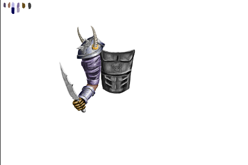
Im slowly advancing, but maybe, someday, i'll finish it.


kola, the techniques you possess to make your drawing are incredible. The shadings, the materials, the contrast, it's perfect.i know that the proportions are wrong, but i draw things and i try to make them with good proportions but if they are wrong, i can just make the sizes good when i resive everything. all parts are different layers.
so, i'll cut a bit of the Upper arm, I'll make the Lower Arm bigger, (The Bracer too), I'll Make the Hand Bigger (even if i wouldnt make the lower arm bigger, i would have to make it bigger), I'll change the place of the handle in the hand, and will remake the blade.


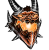
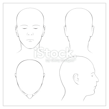
no, a circle then put the chin below it
look at your face, is it an egg?
egg has no edges, but humans does, look at your skull == is it even an egg?


Your human heads look very much like non-changed eggs.
WhereWolfTherewolf:
Well thats what the human skull looks like, but I'm pretty sure for the original base before adding edges to it they use an upside down egg - at least that's how every book I've seen on drawing a human face showed the initial sketches to look like
my line of art is at animes and mangas
well, that means our line of art is not same
manga art tech is using the real human skull + face, if they want to make a cool guys face they make it like a perfect faced handsome human, now that's unreal!