-
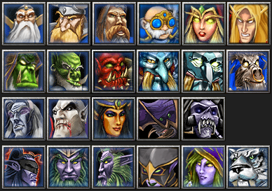
🏆 Texturing Contest #33 is OPEN! Contestants must re-texture a SD unit model found in-game (Warcraft 3 Classic), recreating the unit into a peaceful NPC version. 🔗Click here to enter!
-
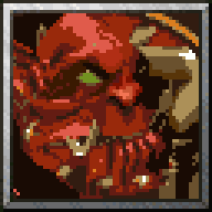
BTNKargathBladefist

- Author(s)
- Scias
- Size
- 41.75 KB
- Rating
- Downloads
- 440
- Created
- Jan 29, 2018
- Updated
- Feb 17, 2018
- Resources
- 2
- State
 Approved
This bundle is marked as recommended. It works and satisfies the submission rules.

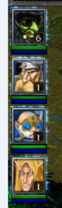
Mister_Haudrauf requested me to make a icon for his model Kargath Bladefist, so here is my attempt.
I'm not sure if I made his head look too wide or something, I was trying to fix it when I already finished polishing, but whatever change I did didn't seem to make big difference. I think there's a bit of a issue with the icon reading more as a strength hero and the model looking more as agility, might be more of a issue with the blue border than without, since the image feels more filled with it.. Or it might be just me.
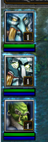
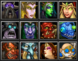
Here's process image:

Process image in 192x192 size:
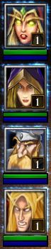
Edit: some minor changes

I'm not sure if I made his head look too wide or something, I was trying to fix it when I already finished polishing, but whatever change I did didn't seem to make big difference. I think there's a bit of a issue with the icon reading more as a strength hero and the model looking more as agility, might be more of a issue with the blue border than without, since the image feels more filled with it.. Or it might be just me.
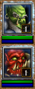
Here's process image:
Process image in 192x192 size:
Edit: some minor changes


Assets
")

")