• 🏆 Texturing Contest #33 is OPEN! Contestants must re-texture a SD unit model found in-game (Warcraft 3 Classic), recreating the unit into a peaceful NPC version. 🔗Click here to enter!
  • It's time for the first HD Modeling Contest of 2024. Join the theme discussion for Hive's HD Modeling Contest #6! Click here to post your idea!

Need advices / CnC

Status
Not open for further replies.
Level 7
Joined
Aug 17, 2012
Messages
256
Hey guys,

I'm a beginner terrainer and cinematic maker. And this time, i wanted YOU to comment and criticize, and give me some advices on how to improve my terrain. :ogre_haosis:

If you want, you can throw in a simple comment as well :wink:

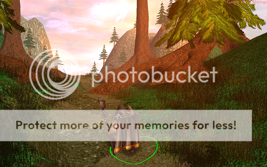
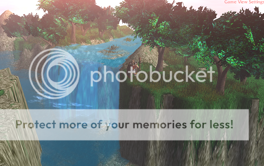
The first one is focused mainly on fog / lighting effects (practicing), and it's called A Mage's journey.
ter1_zpsd9a2f6bf.png


EDIT: Added the second one, pretty much like first
ter2_zpsa46a91bc.png

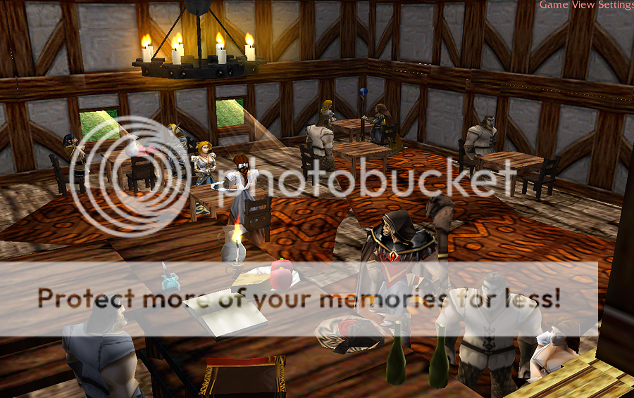
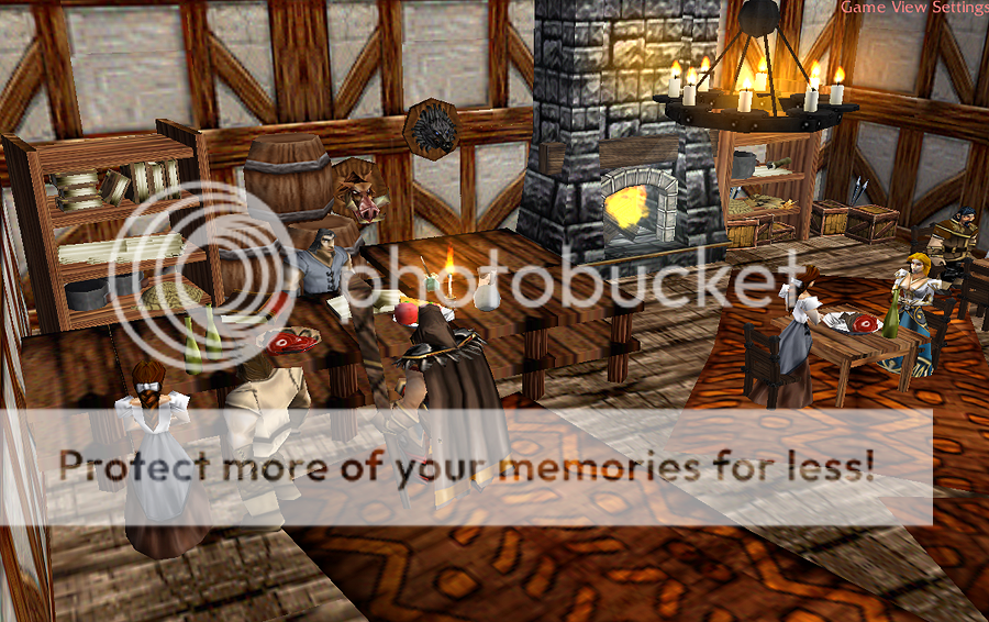
The second one is focused mainly on indoors, it's a tavern (2 screenshots) and its called A Mage taking a break from a journey.
1_zps7a37a9c5.png

2_zps36f0e0d2.png


Credits:
to UTM
me
 
Last edited:
Level 51
Joined
Dec 8, 2008
Messages
4,358
Well lets see. It's pretty good for the start, but there are a few things:

In the first pic, make the mountains not such smooth hills, form them with rocks, or even better, create them completly out of rocks. Experiment with bushes and stuff, it will make them look more natural. The trees are also sticking out of the hills, more variation and better placement would be good.
The bar is way to broad for being a bar, there are to few windows (IMO, that's a personal taste) and the height proportions from the people and the decorations somehow don't match.

That's what I can see atm, I'm no pro terrainer but I hope I could help you a bit. It's a very good start.
Second, more vegetation in the foreground, bushes, small/bigger rocks, flowers, anything that makes the scene more interesting and fills it with live.
Third, the end of the world feeling. Add more layers of mountains in the distance, which go darker and darker. Now, it looks like as if the end worlds behind the green hill at the right side and after the road.

2nd pictures: Although there are douzends of tavern-terrains out there, I quite like this one. You have to keep an eye ona few things though.
Doodad variaton, you've combined pretty realistic looking wood floor with "horrible" looking desks at tthe bar and another wood colour for the desks. Then suddenly a totally dark and realisitic wood for the chairs. The different colours and shades clash somehow.
 
Level 7
Joined
Aug 17, 2012
Messages
256
Well lets see. It's pretty good for the start, but there are a few things:

In the first pic, make the mountains not such smooth hills, form them with rocks, or even better, create them completly out of rocks. Experiment with bushes and stuff, it will make them look more natural. The trees are also sticking out of the hills, more variation and better placement would be good.
The bar is way to broad for being a bar, there are to few windows (IMO, that's a personal taste) and the height proportions from the people and the decorations somehow don't match.

That's what I can see atm, I'm no pro terrainer but I hope I could help you a bit. It's a very good start.
Second, more vegetation in the foreground, bushes, small/bigger rocks, flowers, anything that makes the scene more interesting and fills it with live.
Third, the end of the world feeling. Add more layers of mountains in the distance, which go darker and darker. Now, it looks like as if the end worlds behind the green hill at the right side and after the road.

2nd pictures: Although there are douzends of tavern-terrains out there, I quite like this one. You have to keep an eye ona few things though.
Doodad variaton, you've combined pretty realistic looking wood floor with "horrible" looking desks at tthe bar and another wood colour for the desks. Then suddenly a totally dark and realisitic wood for the chairs. The different colours and shades clash somehow.

Thank you for the long review, i really appreciate it :wink:
I totally agree with the bar thing, i rushed it a little and hasn't thought about the windows, only when started it :O
About doodad variation, i think it doesn't matter when the wood furniture doesn't match the flooring, but i agree with the part the desk and chair colors, and i must tell you i hasn't find any cool looking chairs other than a few in B2M and UTM ones :O

Thank you again, and this helps me actually. :ogre_hurrhurr:
 
Level 30
Joined
Nov 29, 2012
Messages
6,637
For a beginner, its quite an amazing terrain. For your first screeny, it is quite good but the only problem is the grasses. Looks unfitting and also dont spam that much the grass.. Now, lets move on to the second and third screeny, Everything is awesome but the way you put the rags are quite messy. Dont spam them too much... it looks bad.

The only problem in your terrain is you spam doodads that much. I suggest dont spam it. Put the right amoun of doodads and thats better. Overall, this is a good terrain, good luck!
 
Level 7
Joined
Aug 17, 2012
Messages
256
For a beginner, its quite an amazing terrain. For your first screeny, it is quite good but the only problem is the grasses. Looks unfitting and also dont spam that much the grass.. Now, lets move on to the second and third screeny, Everything is awesome but the way you put the rags are quite messy. Dont spam them too much... it looks bad.

The only problem in your terrain is you spam doodads that much. I suggest dont spam it. Put the right amoun of doodads and thats better. Overall, this is a good terrain, good luck!
I've got to agree on this one, the grass feels kinda unfitting on that tileset :O

Thank you for the comment, i'll try to improve and then again i'm going to do another terrain soon :ogre_hurrhurr:

EDIT: Added another terrain :>
 
Last edited:
Level 11
Joined
Apr 22, 2011
Messages
630
I love it, good job on the interior. I wont repeat what the other's said, the guys up already told you what need's to be fixed.

Keep on It, and maybe add more HD models from B2M, or tiles maybe, to make that grass fit with the surrounding environment.

Overall its a well made terrain for a beginner, I really want to see more thou.

+rep
 
Level 7
Joined
Aug 17, 2012
Messages
256
I love it, good job on the interior. I wont repeat what the other's said, the guys up already told you what need's to be fixed.

Keep on It, and maybe add more HD models from B2M, or tiles maybe, to make that grass fit with the surrounding environment.

Overall its a well made terrain for a beginner, I really want to see more thou.

+rep

Thank you marko, and i guarantee you'll see more, either here or if you'll watch my cinematic later on. :ogre_hurrhurr:
 
Level 16
Joined
Sep 19, 2011
Messages
829
Oh really?! The other users are right, It's quite good for a beginner but it could receive more loving work from you, however leaving it like this could be considered as a first try test which is not a bad thing but for the Eyes of the spectators it's screaming for more detail. Anyhow I Like the Interior and the light and sky is a bit above average.
Be sure to Buzz me like a maniac when you finish it (send me a message). I don`t usually have the time to check out other projects but I should probably do that before I retire.
 
Status
Not open for further replies.
Top