AI Generated icons need to be somewhat in the style of warcraft 3 to be in a "approvable" state.
Hey Panda,
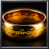
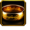
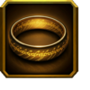
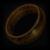
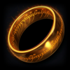
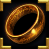
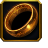
I get that you're trying to maintain a consistent visual standard, and I respect that. But many of the icons I’ve submitted, including some recently rejected ones, imo still follow core elements of the Warcraft III aesthetic: framing, contrast, lighting, and clarity. This newer version of my ring icon (attached) was tweaked with hue and saturation adjustments to better match that look. Is this closer to what you're expecting?
I’m happy to revise things when there’s clear direction, but it’s difficult to do so when the feedback is vague. Saying an icon isn’t “in style” without specifying why doesn’t help contributors improve.
Also, I want to push back a little on the idea that AI icons in the AI section must perfectly emulate the Warcraft III style. The very existence of that section
implies that some stylistic variance is expected—and welcomed. After all, we already have a “main” section for works that aim to perfectly match the aesthetic. We also have a “ported” section, which is often
literally just copy-pastes from other games or art, and a huge number of those don’t fit the Warcraft III style either. I don't think anyone will ever moderate all 240+ pages of that, and understandably so; it’s a space for experimentation and variety.
On top of that, the AI and ported sections consistently get fewer views and downloads than the main section. That alone shows people turn to them when they want something more experimental. Otherwise, the message becomes: “Make icons nearly identical to the main section, but expect a fraction of the visibility.” Why would anyone choose that?
Usability does matter, of course, but not every map uses the classic WC3 look. Some deliberately push visual boundaries, and sections like AI and ported should support that flexibility.
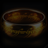
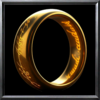
For the Lord of the Rings icons, I wasn't trying to replicate the WC3 style perfectly. I was aiming for a blend, capturing Warcraft's icon structure while still keeping the recognizable look of the film characters. Most LOTR games and adaptations are based on the films, so I imagine map creators would
prefer that look over just another Kael’thas-style repaint or a flat movie/model screenshot.
Also, just to be clear: generating usable AI icons like these is not as simple as typing “draw X.” It takes prompt engineering, refining, and post-processing. I spend around 30 minutes to an hour on each icon set, tweaking glow, color balance, cropping, and style to make them game-ready. It's less time-consuming than traditional painting, yes, but it's not just a one-click process. There's still skill involved, and I put a lot of care into how these come out.
Marking them as
Restricted instead of
Useful/Simple feels way too harsh, especially when you compare them with what’s been accepted before. I’m not asking for a free pass, but I just want clear, fair criteria that respects both artistic effort and the value AI-generated content can bring to the modding scene.
Also, just to note: there are clearly AI-generated icons sitting in the Reforged section
right now. If strong stylistic conformity is the bar for AI submissions, that bar isn’t even being applied evenly.
Listen to a special audio message from Bill Roper to the Hive Workshop community (Bill is a former Vice President of Blizzard Entertainment, Producer, Designer, Musician, Voice Actor) 🔗Click here to hear his message!
Read Evilhog's interview with Gregory Alper, the original composer of the music for WarCraft: Orcs & Humans 🔗Click here to read the full interview.

 Approved