- Joined
- Jul 19, 2008
- Messages
- 39
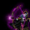
I don't know to make my icons look blizzard made. Some icons looks great but next to war3 icons they look weird. How can I improve my icons so they will fit into war3 theme and won't look strange. If that can help you, I use gimp to make my icons.
My icon is attached to the post. (Its for an english/art project)
Blizzard's icons:
http://www.hiveworkshop.com/forums/...lashheal-54716/?prev=t=14&r=200&d=icon&page=5
http://www.hiveworkshop.com/forums/...lingaura-54645/?prev=t=14&r=200&d=icon&page=5
http://www.hiveworkshop.com/forums/...tishadow-54647/?prev=t=14&r=200&d=icon&page=5
Blizzard's-like:
http://www.hiveworkshop.com/forums/icons-541/btndarksphere-94258/?prev=t=14&r=200&d=icon&page=3
http://www.hiveworkshop.com/forums/icons-541/btnhawkaspect-117343/?prev=d=icon&r=200&t=17
Great but not blizzard's style:
http://www.hiveworkshop.com/forums/icons-541/btnresurrect-114671/?prev=t=14&r=200&d=icon&page=2
http://www.hiveworkshop.com/forums/...grade_fo-57286/?prev=t=14&r=200&d=icon&page=4
Thanks and sorry for my bad english, im from quebec, but if you need french translation for your map i can help


