Listen to a special audio message from Bill Roper to the Hive Workshop community (Bill is a former Vice President of Blizzard Entertainment, Producer, Designer, Musician, Voice Actor) 🔗Click here to hear his message!
Definition: The Ability of an Icon to be indistinguishable from the other icons in Warcraft III. Grade: 6/10 D Note: The Icon doesn't stick out too much and fits decently
Usability
Definition: The Ability of an Icon to be serve a purpose of high demand and low supply, or multiple low demand instances. Grade: 2/10 F Note: The Icon only features BTN and DISBTN, cutting down the many ways it can be used. I suggest maximizing usability by adding the rest of the borders since icons of a specific person already have such limited usability when they can only be used for this one unit and maybe a couple spells
Grade: 4/10 F Note: Use some of blizzards icons as a reference to your target
Artistic Scale
Perspective
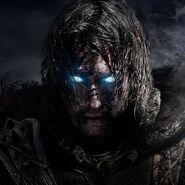
Definition: The scale of how well the Artist has utilized perspective to add depth and definition.
Grade: 8/10 B
Note: Classic Straight on show is nice, though I am a bigger fan of shots that are slightly off at an angle to better define the nose and other features
Aesthetic
Definition: The scale of how well the Artist has utilized colors, shadings, outlines, and other tools to best present the subject.
Grade: 6/10 D
Note: The colors are great, I do think the shading and outlining deserves more attention
Grade: 7/10 C
Note: Looks decent.
Stonneash's Note: Nice work! Hope to see more of your work soon.
This site uses cookies to help personalise content, tailor your experience and to keep you logged in if you register.
By continuing to use this site, you are consenting to our use of cookies.


 Approved