• 🏆 Texturing Contest #33 is OPEN! Contestants must re-texture a SD unit model found in-game (Warcraft 3 Classic), recreating the unit into a peaceful NPC version. 🔗Click here to enter!
  • It's time for the first HD Modeling Contest of 2024. Join the theme discussion for Hive's HD Modeling Contest #6! Click here to post your idea!

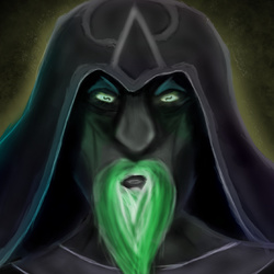
Corrupted Mage

This bundle is marked as useful / simple. Simplicity is bliss, low effort and/or may contain minor bugs.
My first icon here. Hope you like it.

Here is the big version:

kuPed.png
Previews
Contents

Corrupted Mage (Icon)

Reviews
GhostThruster
not too bad for a first icon. work on your shading, try to give him a visible light source. try to also give the face some proper form. the way it's drawn right now makes it look like it's composed of 2d shapes. google some references of faces, and...
San
San
Author is inactive, icon goes to substandard. Check out Ghost's suggestions and the tutorials if you wish to improve. The same applies to the other Infernal icons.
Level 3
Joined
Dec 4, 2015
Messages
11
Well, processed as in I could upload .tga files. 64x64 px dimensions?

I am kinda new to drawing Warcraft style. I think it at least looks inhuman, if not undead.

It can't stretch because I guess I put the preview image to be the full image, not the cropped one. I will fix that now.
 
Level 10
Joined
Dec 19, 2015
Messages
692
First download this- The button manager. http://www.hiveworkshop.com/resources/button-manager-v1-8-2.66317/
The perfect tool for icon processing.

And a suggestion for this, work more on the lips, they look like a black hole in the icon. And that green-ish glow on the left side, add those as well to the right side, it might look better.
Lookie here
1.PNG

Here are the processed ones.
 

Attachments

  • UndeadMage.zip
    15.5 KB · Views: 71
Level 3
Joined
Dec 4, 2015
Messages
11
I guess, I have done it properly now?

But, somehow it got all noisy and blurry when I exported from that button manager. That is weird.

P.S

Added some colors to fit in the new concept. Rendered a little more, highlights and lipless.
 
not too bad for a first icon.

work on your shading, try to give him a visible light source.

try to also give the face some proper form. the way it's drawn right now makes it look like it's composed of 2d shapes. google some references of faces, and work on that. the nose is particularly flat-looking.

set to awaiting update
 
Top