Approved


Moderator
M
Moderator
13:12, 2nd Oct 2009
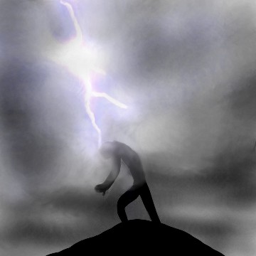
Zombie.:The background and the effect are of decent quality, but seriously...
I'd advise complete reworking of the guy that was thunderstruck, preferably showing his face in perspective as the thunder hits him. Since I know reworking like that takes a lot of effort, at least try to zoom in on the guy, give it better impact effects on and around him, not just a blur and at least add him some highlights.
enjoy: No changes made. He needs highlights, and the figure is out of proportions. Rejected.
Zombie.:
I'd advise complete reworking of the guy that was thunderstruck, preferably showing his face in perspective as the thunder hits him. Since I know reworking like that takes a lot of effort, at least try to zoom in on the guy, give it better impact effects on and around him, not just a blur and at least add him some highlights.
enjoy: No changes made. He needs highlights, and the figure is out of proportions. Rejected.