• 🏆 Texturing Contest #33 is OPEN! Contestants must re-texture a SD unit model found in-game (Warcraft 3 Classic), recreating the unit into a peaceful NPC version. 🔗Click here to enter!
  • It's time for the first HD Modeling Contest of 2024. Join the theme discussion for Hive's HD Modeling Contest #6! Click here to post your idea!

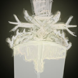
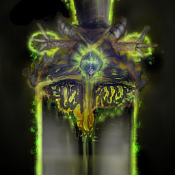
BTNDeathBringerSword

This bundle is marked as useful / simple. Simplicity is bliss, low effort and/or may contain minor bugs.
Name

~~ Death Bringer ~~
Story

People know very little about this sword, but the rumors says when killed with this
sword by the carrier it will drag its souls to the weapon and charge its energy so
the power of the sword increases. The soul may not rest in peace until the carrier is dead.
WIP's
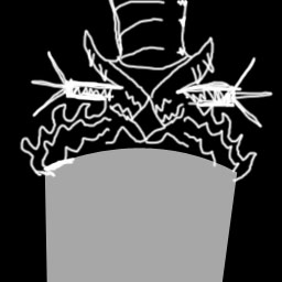
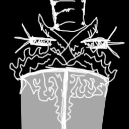
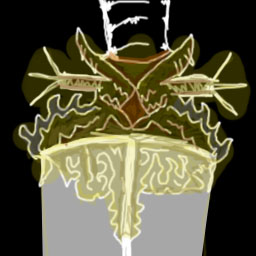
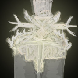
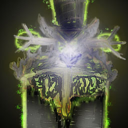
469023.jpeg
469024.jpeg
469025.jpeg
469027.jpeg
469028.jpeg
469030.jpeg
474033.jpeg
Log

v1.0: Release.
v1.1: Gave it more shade in the middle.
Credits
Army-of-Pandas for suggestion, zombie2279

Keywords:
Olyvian, Death Bringer, Souls, Soul Reaper, Death Carrier, Death Lord
Contents

BTNDeathBringerSword (Icon)

Reviews
08:34, 19th Aug 2009 zombie2279: The usual, high-level distortion and blurryness, in this case the weird highlight effect is the cause and the messy handle part. Yet again, it overall needs more contrast and outline thickening, and you should divide...

Moderator

M

Moderator

08:34, 19th Aug 2009
zombie2279: The usual, high-level distortion and blurryness, in this case the weird highlight effect is the cause and the messy handle part. Yet again, it overall needs more contrast and outline thickening, and you should divide different parts so they won't blend into each other. I also recommend you completely rework the highlight on it, so it would be less messy.


8:38, 27th Aug 2009
zombie2279: Yet again, looks worse and much messier. Add more contrast to the outlines so the parts can be distinguished, then individually shade and highlight them. Try to use a more visible color scheme for the handle overall, it blends in with the background too much. Also, try adding a glow, so the whole thing is more visible, which also should remove a large part of the mess in the bg.

29th Aug 2009
zombie2279: No changes made, rejected until updated.
 

The Panda

Icon Reviewer
Level 57
Joined
Jun 2, 2008
Messages
8,912
Too add to my suggestions, This would be good if you decreased the size of the overall sword and then make it so we can see it. After that make the blade of the sword more see able so it looks more like a sword instead of some staff thing. Then, make the whole sword object straight instead of slanting, that would make it better, and look more use able or something. Also, the gold effect around the middle of the sword at the moment needs too be removed by the fact it does nothing too make this icon look better. (Just telling you) and also the glow either dim it down a bit or make it into the backround instead of overlapping the sword.
 
Top