Listen to a special audio message from Bill Roper to the Hive Workshop community (Bill is a former Vice President of Blizzard Entertainment, Producer, Designer, Musician, Voice Actor) 🔗Click here to hear his message!
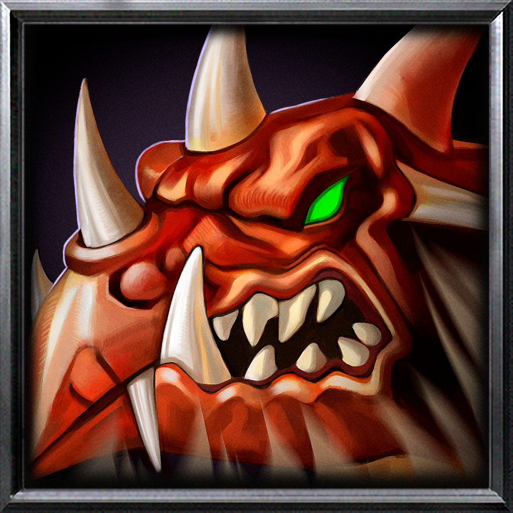
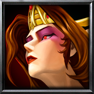
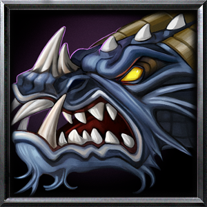
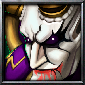
It's not when you put them side by side and at the same side you can tell they were drawn due to small detail differences
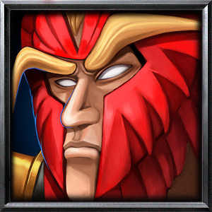
There's also other icons such as the knight one which in classic warcraft 3 they were done just taking a screenshot of the knight portrait (probably cause they didn't have the budget), while here they were completely hand drawn which in my opinion is much better.
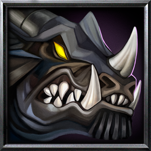
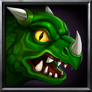
Also: we finally got a whelp icon from blizzard, this was the icon in warcraft 3:
It kinda makes me sad that they didn't do this for the original release of reforged, we could have had so many icons that were rushed originally in wc3 and or done taking a 3d screenshot and instead gotten them hand drawn
yeah it probably had some tracing done, but it wasn't using AI scaling, also my bad there was an unused whelp icon (ingame) for ranked ladder, weird that it wasn't in the game but w/e.
This site uses cookies to help personalise content, tailor your experience and to keep you logged in if you register.
By continuing to use this site, you are consenting to our use of cookies.