- Joined
- Jul 9, 2008
- Messages
- 36
This will be my last thread I make. I will just add terrrians onto this one. Only been terrianing for about a week now this is what I could come up with. This is just all of my terrians stuck into one thread. How do u make a showcase link?
------------------------------------------------------------
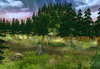
Picture 1 - A Pathway in the Forest ( first terrian updated a few times)
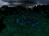
Picture 2 - Dark Forest (alright I guess)
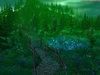
Picture 3 - The Lonly Path in The Creepy Forest ( Was meant to be Creepy Forest updated turned out to be something different)
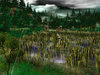
Picture 4 - What a bad day... ( Second terrian updated also)
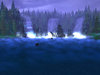
Picture 5 - (Third Version) The Three WaterFalls (Changed camera angle a little bit, added a sunken ship, a few more rocks, a blue fog(idk), and a few more trees.)
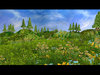
Picture 6 - Wild Prairie (not finished) (Trees - bad, good?)
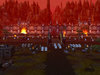
Picture 7 - Orc Fortress (humans finally using there technology)
------------------------------------------------------------
EDIT: My girlfriend made me remove everything wc3 from my comp.I lost all my maps and pics maybe by summer ill terrian again. Well i guess i just play xbox360
 . I know they werent great but serously
 i needed a reality check and needed to take a break from wc3.

------------------------------------------------------------
Picture 1 - A Pathway in the Forest ( first terrian updated a few times)
Picture 2 - Dark Forest (alright I guess)
Picture 3 - The Lonly Path in The Creepy Forest ( Was meant to be Creepy Forest updated turned out to be something different)
Picture 4 - What a bad day... ( Second terrian updated also)
Picture 5 - (Third Version) The Three WaterFalls (Changed camera angle a little bit, added a sunken ship, a few more rocks, a blue fog(idk), and a few more trees.)
Picture 6 - Wild Prairie (not finished) (Trees - bad, good?)
Picture 7 - Orc Fortress (humans finally using there technology)
------------------------------------------------------------
EDIT: My girlfriend
made me remove everything wc3 from my comp.I lost all my maps and pics maybe by summer ill terrian again. Well i guess i just play xbox360. I know they werent great but serously i needed a reality check and needed to take a break from wc3.Attachments
-
 Terrian1.jpg507.2 KB · Views: 212
 -
 TerrianForest1UPDATED.jpg291.5 KB · Views: 232
 -
 TerrianForest2.jpg425.9 KB · Views: 174
 -
 TerrianFarm1UPDATE.jpg589.2 KB · Views: 217
 -
 TerrianWaterFall2UPDATE.jpg214.1 KB · Views: 159
 -
 TerrianPrairie1.jpg521.4 KB · Views: 136
 -
 Terrian OrcFortress1.jpg365.1 KB · Views: 133
Last edited:


") . That tutorial helps with a few things also - good link
. That tutorial helps with a few things also - good link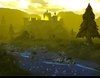