- Joined
- Jun 7, 2007
- Messages
- 2,395


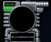
So yeah, this is the cover. Time to do the top frame, buttons and dialog borders.


")


 ))
))


Dentothor, that looks awesome! But there's one thing I noticed. The eagle and many of the other details near it look very blurry and, well, kinda bad. I think it would be better if you could make it a lot more defined, sharp - if you see what I mean. Atm it looks too sketchy. If you're not doing that already, I suggest you first sketch it with a 'pencil', then go over it with the pen tool(try to be as accurate as you can) and finally color it(select only the shapes you want to color, and color inside them).


Dent, that looks great! So wait, you're allowed to compete or what?
being able or not to compete, he is still able to make an UI and post its wips here.Dent, that looks great! So wait, you're allowed to compete or what?
Dent, that looks great! So wait, you're allowed to compete or what?
being able or not to compete, he is still able to make an UI and post its wips here.
heheh, I just said he's allowed to make itI never questioned his ability to make a UI anywhere in my post.

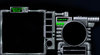
I think thats actually the char screen
whoops my bad, i thought the arch to the right was the char screen
 In between the icon slots you could make some magicy fire or somthing.


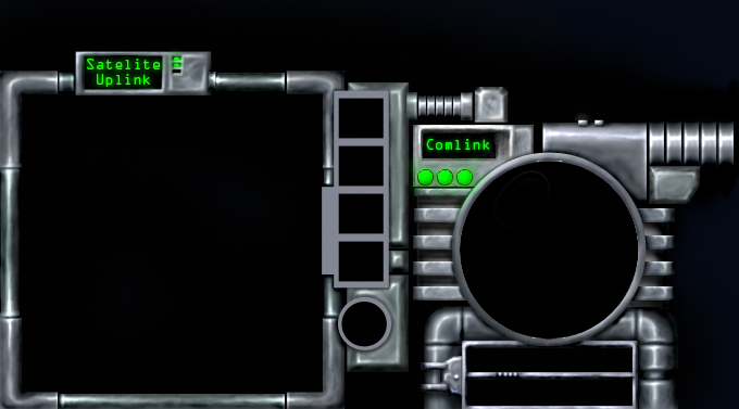
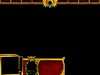
Here's yet another preview. I'm mostly done with this side of the UI. Just gotta add a few more details and some shading to the button holders to the side of the mini map.
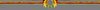
A bird. I want to go into more depth, but it might end up looking bad. if i have time at the end, ill jazz it up a bit.@Dentothor, try to play with highlights a bit more. And tell me one thing, is that a bird or a phoenix, down there, up from the portrait ,,hole"?
Denth, that looks awesome so far. But there's one thing that bothers me - the details are really bland, really rough - they look kind of bad, especially compared to the awesome-looking golden frames. The gems have to be a lot more shiny, a lot more glowing and saturated, so that they look like precious gems. The bird and chains are just really rough and mostly blurry, it would be awesome if you could touch them up a bit.


I see only gold, red and green in there, Denth. I know that those are Blood Elven colors and that those really fit their theme, but a lil' touch of other colors won't hurt, right?
For an example, it would look nice if that bird down there has sapphire blue eyes. Like one of those:
Try spicing it up a bit (;
blue would ruin the colour scheme horribly >.<


/\SIF, add a nice blue or green glow to the bottom of your UI and it will come together very nicely


 ?
?