Community
Maps
Tutorials
Gallery
Support Us
Install the app
-
🏆 Texturing Contest #33 is OPEN! Contestants must re-texture a SD unit model found in-game (Warcraft 3 Classic), recreating the unit into a peaceful NPC version. 🔗Click here to enter!
-
🏆 Hive's 6th HD Modeling Contest: Mechanical is now open! Design and model a mechanical creature, mechanized animal, a futuristic robotic being, or anything else your imagination can tinker with! 📅 Submissions close on June 30, 2024. Don't miss this opportunity to let your creativity shine! Enter now and show us your mechanical masterpiece! 🔗 Click here to enter!
You are using an out of date browser. It may not display this or other websites correctly.
You should upgrade or use an alternative browser.
You should upgrade or use an alternative browser.
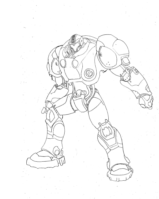
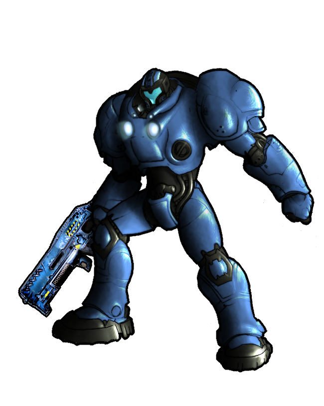
Starcraft 2 Terran War pig (Marine mercenary)
- Status
- Not open for further replies.
- Joined
- Feb 25, 2009
- Messages
- 2,004
Gud. Me liekz.
- Joined
- Sep 26, 2010
- Messages
- 629
Gud. Me liekz.
Gud. Me liekz yar liekziahing. Tahanaks.
- Joined
- Jan 17, 2010
- Messages
- 6,110

 - Second Place")


Look cool, will you add colors maybe,shadows and so on?
- Joined
- Oct 14, 2006
- Messages
- 4,162


Some of the armor pieces look flat and 2D, try making them more 3D. Looks good nevertheless, keep it up!
- Joined
- Oct 14, 2006
- Messages
- 4,162
Looks wonderful but the gun sticks out too much, try to do something about that.
- Joined
- Sep 26, 2010
- Messages
- 629
Looks wonderful but the gun sticks out too much, try to do something about that.
I know, yea.. I just copy'n'pasted it there so you could see why the hands aren't finished. I'll be balancing it later.
- Joined
- Dec 17, 2008
- Messages
- 312

I have attatched my suggestions, whether you utilize them or not is none of my concern; they are based on my techniques in art and you may choose to study from them or ignore them. I know this piece is unfinished, but most art doesn't change much this far in. I try to avoid the feel-good-era, hence my pre-critique message ^.^
- Some of the highlights are from different light sources where the right arm (from our view) suggests that there is only one main source of light (not counting the chest mounted lights here). Light reflection should only apply to the subject as well, for there is no environment.
- Form is bad in some spots; if you are trying to depict the War Marine as a solid SC2 figure (the marine) you may want to try and tune him up a bit - right now, as I said via PM to you, it has a cartoony look - which you, I guess, denied. Any further comments on this statement from others would be appreciated.
- The helmet really needs some work. The line perspective is very wrong based on the angle. I have attached a basic suggestion via lines (you will have to adjust accordingly if you do make changes)
- The underarm plate or w/e it is on the right is just... it shouldn't be there. Also, the chest seems small and arcs incorrectly based on the basic SC2 marine suit, I made appropriate suggestions with blue lines.
- Why do some areas look extra sharp (referring to pixels)? Intentional or a pre-final-edition issue?
- The gun is a recolored CnP. I suggest using one of the following: 13 x 13 grid (squares) on a printed sheet or use the pen tool and do basic form of the weapon first (heck, make the CnP larger and trace it - doesn't matter it's not the focus of the picture). See a Starcraft 2 marine on google to get a sense of the proportions.
The stance is extremely familiar. Did you "borrow" it from somewhere?
Attachments

- Joined
- Sep 26, 2010
- Messages
- 629
Eheh, the greenies you added are not highlighted because They are shadowed. They can't be highlighted if there's no other light source. at least 80% of that what you "Greened" isn't possible to be highlighted (Look at it a while... you'll get what I mean). The right leg (His right leg) Isn't shaded yet the way it should be, I'll get to shade it later.
The blue parts at the back actually aren't like you drew them. Here's a real render which I based this drawing on.
The pic Actually after taking a look onto the in-game one, it's like you said. I'll not edit it though, too lazy =)
I agree with the gun; It really needs to be bigger, and I'll make it bigger.
I'll fix that leg as well.
I'll not edit the helmet, It looks perfect the way it is (For me). it is not from the same angle as your one. You should understand that this is a real drawing on a real piece of paper, this is not that easy to correct. I'll maybe try to Warp the yellow parts a little.
The stance just came to my mind ^^
Oh, and I "Denied" your comment (Call it like that) because this isn't supposed to be realistic. It wasn't intended to be drawn "realistic", it was comic-book style. And they are supposed to be drawn simple. The coloring finishes the job, but until i get a tablet, I can't do some intense coloring and shading.
I hope you don't get this comment the wrong way ^^ but yes, it has some flaws here and there and I'll try to make'em better.
Last edited:
- Joined
- Jul 31, 2010
- Messages
- 5,246

It looks like an Accretia from RF Online if you know that creature
- Status
- Not open for further replies.
Similar threads
- Replies
- 15
- Views
- 30K