- Joined
- Jun 11, 2007
- Messages
- 969
Hey! =D
Here are some of my drawings. They are all WoW ones. They are not "painted of", though some armors are inspired by those of WoW.
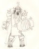
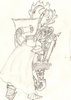
1. A glorious Draenei Paladin
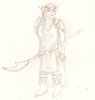
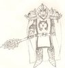
2. Female member of the Blood Knights, a Blood Elf Paladin.
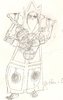
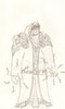
3. A Undead Priest... Yeah, forsaken still do tha holy stuff.
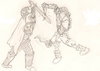
4. A fight! Human Warrior vs Undead Rogue =D
5. Another one! Human Warrior vs Undead Death Knight
6. Human Death Knight, Arthas style
7. Another Death Knight, Blood Elf
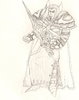
8. Beware... of the Orc Warlock!
I know they ain't the best, shading isn't great, but personally I do see improvements in each picture. I will probably color on of these some day ^^
Here are some of my drawings. They are all WoW ones. They are not "painted of", though some armors are inspired by those of WoW.
1. A glorious Draenei Paladin
2. Female member of the Blood Knights, a Blood Elf Paladin.
3. A Undead Priest... Yeah, forsaken still do tha holy stuff.
4. A fight! Human Warrior vs Undead Rogue =D
5. Another one! Human Warrior vs Undead Death Knight
6. Human Death Knight, Arthas style
7. Another Death Knight, Blood Elf
8. Beware... of the Orc Warlock!
I know they ain't the best, shading isn't great, but personally I do see improvements in each picture. I will probably color on of these some day ^^
 The_Grapist