
Moderator
M
Moderator
19:11, 15th Jul 2008
Werewulf: Sorry, but the shading on this is too basic and it looks plain and poorly done.
Werewulf: Sorry, but the shading on this is too basic and it looks plain and poorly done.
(3 ratings)
 Approved


Positive Comments
[+] Probably the best clown model at the Hive. All the rest are terrible.
[+] You managed to add in SOME shadows.
Negative Comments
[-] No Highlights.
[-] Go darker with the shadows.
[-] Terrible colour scheme. Even for a clown.
[-] Very messy.
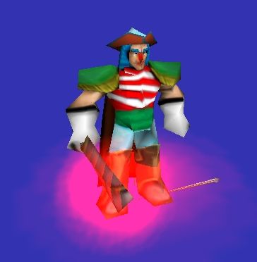
Comments: Oh dear something based off an anime game..
Overall Rating: 2.8/5

Positive Comments
[+] Probably the best clown model at the Hive. All the rest are terrible.
[+] You managed to add in SOME shadows.
Negative Comments
[-] No Highlights.
[-] Go darker with the shadows.
[-] Terrible colour scheme. Even for a clown.
[-] Very messy.
Comments: Oh dear something based off an anime show..
Overall Rating: 2.8/5


[+] Probably the best clown model at the Hive. All the rest are terrible.
You do know that now I'm going to have to change that
Omfg, I can't stand this "Agree with you Hawkwing" shit anymore. You wrote that in all your posts lately. It's like Hawkwing is your master/mentor and you're his worker/slave.Agree with you Hawkwing, this needs a lot more reworking. But......Wow! The best cown i've ever seen! (rate imaginary (my rate) 5\5) Hive workshop rate: 3\5 keep up and you might get this aproved. (if yo work harder)
Omfg, I can't stand this "Agree with you Hawkwing" shit anymore. You wrote that in all your posts lately. It's like Hawkwing is your master/mentor and you're his worker/slave.
Anyway, this skin looks kind of weird, probably due to the odd color scheme. The colors don't seem to match.
Btw, you don't need to adapt it perfectly to the anime one, make it look as good as possible with a different color scheme. Maybe another version of the skin if you prefer, but it's your choice.
 . It's not Captain Buggy if he is going to chance the colour scheme, it's some random pirate then. I think the idea of making this anime skin is to make it look like the real Buggy as much as possible.


Man, its Buggy. He is a bad pirate captain, that can detach his body parts and bring them back, and he got killed by a crazy man that caries 3 blades(one in his mouth). One Piece FTW!
This skin should die just like the character.
Ok, it didnt seem like jokeHonestly. HT is totally right. There is no team colour. You've put shadows where highlights should be. Also, you don't have enough shadows. The colours are terrible and from what I can see you used burn and dodge.
Plus, it's only a joke. You don't have to take it to heart.
This texture has both pro's and con's so read through it and fix up whatever people said was wrong. Perhaps then you will get a good rating and an approval on it.
Hey buddy, your skin seems to be nice, but what you really need is to read some tutorrials about making some realistic lookin' cloths. and also learn how to add sharper details and shadows.
BTW......nice 4\5
pp