• 🏆 Texturing Contest #33 is OPEN! Contestants must re-texture a SD unit model found in-game (Warcraft 3 Classic), recreating the unit into a peaceful NPC version. 🔗Click here to enter!
  • 🏆 Hive's 6th HD Modeling Contest: Mechanical is now open! Design and model a mechanical creature, mechanized animal, a futuristic robotic being, or anything else your imagination can tinker with! 📅 Submissions close on June 30, 2024. Don't miss this opportunity to let your creativity shine! Enter now and show us your mechanical masterpiece! 🔗 Click here to enter!

Minas Tirith - The White City

Status
Not open for further replies.
Yeah I know the actual city sucks shit. If anyone wants to try their hand at making a better city, but not environment, you can tell me and I'd consider giving you the map. I think my environment is all good.
 

Attachments

  • The White City.png
    The White City.png
    2.4 MB · Views: 519
Level 19
Joined
May 1, 2008
Messages
1,130
the city looks like a balrog of mordor squashed it 1337 times
the lights from above look bad and those rocks are oh well
what i like about this terrain is the ground and the fog xD
you used high rezz tile?
 
Level 15
Joined
Jun 11, 2007
Messages
969
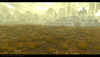
Well the concept is nice, but excecution is lacking. :eek:
The ground level, hills and such, looks very very well. So doesthe fog, excellent.
Tho the grass you've putten there needs some work. Instead of putting it completely random, try putting some bunches of grass here adn there. Also, make a smaller version of the same grass, and put it around the current grass, to 'hide' the 2D shapes you see.
And the mountains in the back could use some work, well first of all, mountains usually doesn't consist of round stones (Maybe they do in LotR? cant remember heh), but also you have to make heights here and there, mountains ain't a straight line.

Ohh and the Light from Above, try making them twice as big, but reducing the colors, making it fade more. ^^

I won't comment the city, since you self said it isn't great, Though I do think it's kind of nice, except for the gate and the main castle :)

Heh, sorry if I were hard, but just trying to help you out :)
 
Grass is just like that, randomly placed in spots near Minas Tirith. It's the kinda tufts you get in rural areas of New Zealand :/ Using small versions of the same grass looks like ass, I'd know. I've tried using that before. The mountains, yeah... I can't be fucked raising all those damn stones, I might just ditch the whole doodads and use the good old raise tool. I thought it might be a nice change. I just used massive fat ones. The lights are actually as low in colour as you pretty much can get, without having an entire lack of colour, making them bigger always makes them seem so... fat.

No high res tiles here FYI. Just grasses.
 
Level 34
Joined
Sep 6, 2006
Messages
8,873
I don't like the grass. Whether or not it's accurate doesn't matter, it doesn't look good. Also, I'd raise the camera angle slightly, the ground textures are ugly that close.

Work on the city, raise the camera, and make the grass much smaller.
 
Level 19
Joined
Oct 29, 2007
Messages
1,184
The scaling of the grass goes wrong in long distance. What maybe would look good is tinted shrub var 1 or the Bush 4 from UTM sunken into the ground around the grasses to create a better transaction between grass and no grass.
 
Level 17
Joined
Nov 18, 2008
Messages
1,538
Yeah, you need to scale down the grass as it gets closer to the city. That one closest looks to be half the size of the wall.
Those little narrow lights don't look to great either.
The mountains are meh.
The city is alright.

Overall a nice concept, just need some touch-ups.
 
Level 18
Joined
Feb 2, 2008
Messages
2,131
i siriously dont like it. to be honest i dont get the feeling its Lotr terrain after all. The mountains behind the city dont look good. just a bunch of huge rocks. the city itself looks ok but i still think it could be inproved. but after all im not a good terrainer myself so this is just my oppinion.
 
Status
Not open for further replies.
Top