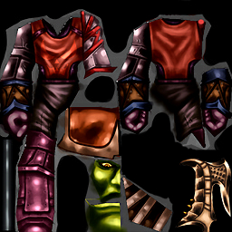
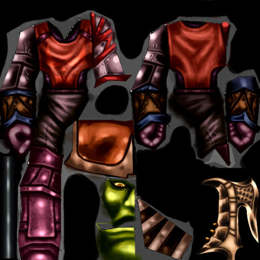
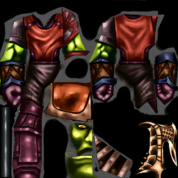
Whilst generally well painted I feel this one loses a bit of the charm from the simplicity of the shaman texture you made, this one quickly feels more cluttered and does not read quite as well at distances.
The concept is however really neat and I dig the design, if you go back to touch this one up my biggest feedback would be to avoid blacks!
Shadows are rarely black and should be avoided, especially on skin and cloth. It should instead be more saturated and a slightly darker verision of the same colour, much like you did with the back tabard on this texture. It is important to avoid contrast overload.
But overall a good texture with a nice concept, the metal parts are well executed and read properly in-engine!


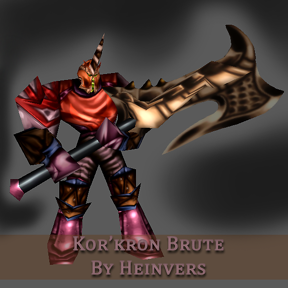
 Approved


")


