• Listen to a special audio message from Bill Roper to the Hive Workshop community (Bill is a former Vice President of Blizzard Entertainment, Producer, Designer, Musician, Voice Actor) 🔗Click here to hear his message!
  • Read Evilhog's interview with Gregory Alper, the original composer of the music for WarCraft: Orcs & Humans 🔗Click here to read the full interview.

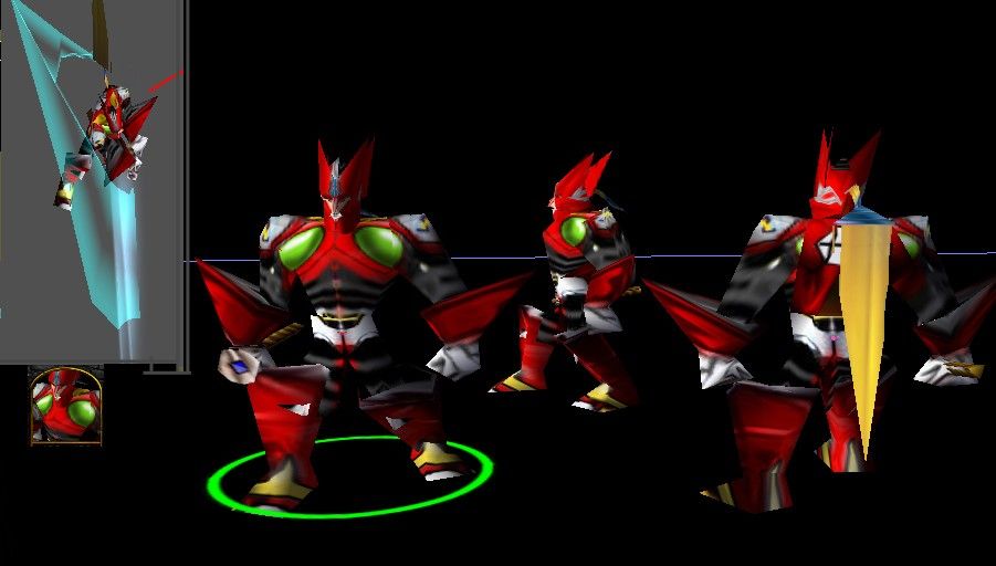
Zero

Keywords:
zero, space, suit, arcade, game, red,
Contents

Zero (Model)

Reviews
» Wolverabid « Date: 19th of September, 2007 Approval status: Approved Rating: (9) Excellent! Main points: [x] The model is stable and functions properly in Warcraft III. [x] The model displays properly in Warcraft3 Viewer. Notices: [-]...

Moderator

M

Moderator

» Wolverabid «

Date: 19th of September, 2007
Approval status: Approved
Rating: (9) Excellent!

Main points:
[x] The model is stable and functions properly in Warcraft III.
[x] The model displays properly in Warcraft3 Viewer.

Notices:
[-] This model includes no team color.
 
Level 8
Joined
May 15, 2004
Messages
406
i havn't played the game but this is a well done model, shame its got nothing to do with warcraft wich meens it kindof goes unused unless someone uses it for there custom map, even than it might not be played.
 
Level 4
Joined
Sep 10, 2004
Messages
65
Umm when i went to put it on my map the attack animations were off... Way off... There was just a giant rectangle coming out of his hand and When he was spinning there was a collection of random particles in one of the corners of his spin. There needs to be some smoothing out needed. and his hair is a little weird, too flat. 3/5
 
well it looks like i got some competition with my old zero model. its nice but for a few things. the points on his arms and legs are majorly overstretched, his face looks terrible, sory it just does, and the gems in his chest are oversized, most likely due to wrapping. overall its okay, i have to say that you know your megaman.
ps. blademaster is not a very good chouce for zero, animations are good, but basic model would go better w/ sigma
 
Level 12
Joined
Mar 11, 2004
Messages
600
Umm when i went to put it on my map the attack animations were off... Way off... There was just a giant rectangle coming out of his hand and When he was spinning there was a collection of random particles in one of the corners of his spin. There needs to be some smoothing out needed. and his hair is a little weird, too flat. 3/5

GG, you imported the file you shouldn't import the only texture needed is Textures\Zero.blp the others come with the game, but Darky's script doesn't recognize them, so Mc ! imported a black texture of 2KB for them.
 
Level 2
Joined
Aug 28, 2004
Messages
25
he doesnt look like Zero at all, like i said on wc3campaigns.
you oversized his legs, arms and helmet.
do a search on google and get yourself a nice pic of Zero.
 
Level 2
Joined
Feb 11, 2005
Messages
9
Its dreadful :cry: -9999999999/1 :cry: his chests t big legs are bigish and his face is all wronge and his shoulders are suppsoed to be squares being a super fan of zero i really hope u can make it better :roll:
 
Level 1
Joined
May 7, 2008
Messages
2
OMG, NOT ZERO
Ok this is a good model, but you need to make it WAY thinner. Zero is thin and lithe, this thing reminds me of a terran marine. If you make it thinner it would be great, but not a massive, hulking, biomechanical wrestler.
 
Top