• 🏆 Texturing Contest #33 is OPEN! Contestants must re-texture a SD unit model found in-game (Warcraft 3 Classic), recreating the unit into a peaceful NPC version. 🔗Click here to enter!
  • It's time for the first HD Modeling Contest of 2024. Join the theme discussion for Hive's HD Modeling Contest #6! Click here to post your idea!

Texturing Contest #18 - UI

Status
Not open for further replies.
I could finish mine tomorrow, an extension about just some hours would be awesome,
that I can work and finish it tomorrow. I certainly want to participate this time!

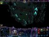
So here's my last progress, added the blue dragon and added the upper part of the UI.
I just need to add details to the upper part and edit it a bit to finish my UI!
Hopefully tomorrow and just in time (with some hours extension?)

Dude looks epic, dont be afraid to make the blue dragon hang over the map a bit
 
Level 38
Joined
Jan 10, 2009
Messages
854
91295d1287466696-texturing-contest-18-ui-67chromeuiwip_03.jpg


-edited post to add a screenshot ^^

All right, here's my UI before I forget
 

Attachments

  • 67chromeUI_Tile02.blp
    146.5 KB · Views: 779
  • 67chromeUI_Tile03.blp
    140.5 KB · Views: 745
  • 67chromeUI_Tile04.blp
    72.2 KB · Views: 687
  • 67chromeUI_TimeIndicatorFrame.blp
    31.2 KB · Views: 696
  • 67chromeUI_Tile01.blp
    135.4 KB · Views: 819
  • 67chromeUIInventoryCover.blp
    72.3 KB · Views: 732
Last edited:
Level 18
Joined
Mar 7, 2005
Messages
824
I'm done with my UI, but I can't make it to work in Wc3.
I've saved the right parts as .tga files (worked in wc3, as I tested them, but the transparent parts didn't work), then saved them as .blp file via Image Extractor, but I won't work. I saved them via Photoshop CS5 and 24bit/pixel as .tga and converted them later... Damn it :(

isn't it 32 bits/pixel for transparency? haven't done wc3 modding in ages so correct me if I'm wrong
 

Deleted member 157129

D

Deleted member 157129

I'm done with my UI, but I can't make it to work in Wc3.
I've saved the right parts as .tga files (worked in wc3, as I tested them, but the transparent parts didn't work), then saved them as .blp file via Image Extractor, but I won't work. I saved them via Photoshop CS5 and 24bit/pixel as .tga and converted them later... Damn it :(

Do you still have the .psd? If you do, save it as 32-bit TGA, with no RLE compression, and then convert it to BLP.
 
Level 18
Joined
Mar 7, 2005
Messages
824
Months ago I once tried to made some simple custom UI, but I just forgot how to do it, lol ^^
Beside of that I also forgot the Alpha Channels and was wondering, why the Corners aren't
transparent -.-'' and I wasn't sure if the settings were 24bit or 32bit.. however..

I finally managed to create the required files and everything is working now..
Maybe I'll change the InventoryCover, when I find some freetime for it. For now I'll
leave it at that dragonhead, that pops out of the dark cave.

Thanks for your fast help ;)

So here's my entry (when I'm not changing the InvCover):
- Screenshot
- Required Files
- Testing Map

*edit* updated the DragonCave UI, TimeIndicatorFrame now works fine!
 

Attachments

  • DragonCave UI.JPG
    DragonCave UI.JPG
    283.3 KB · Views: 29,294
  • DragonCaveUITile01.blp
    143.3 KB · Views: 610
  • DragonCaveUITile03.blp
    121.5 KB · Views: 549
  • DragonCaveUITile04.blp
    53.4 KB · Views: 539
  • DragonCaveUITile-TimeIndicatorFrame.blp
    41.2 KB · Views: 601
  • Texturing Contest #18 - DragonCave UI.w3x
    545.6 KB · Views: 652
  • DragonCaveUITile02.blp
    137.8 KB · Views: 561
  • DragonCaveUITile-InventoryCover.blp
    70 KB · Views: 563
Last edited:
Months ago I once tried to made some simple custom UI, but I just forgot how to do it, lol ^^
Beside of that I also forgot the Alpha Channels and was wondering, why the Corners aren't
transparent -.-'' and I wasn't sure if the settings were 24bit or 32bit.. however..

I finally managed to create the required files and everything is working now..
Maybe I'll change the InventoryCover, when I find some freetime for it. For now I'll
leave it at that dragonhead, that pops out of the dark cave.

Thanks for your fast help ;)

So here's my entry (when I'm not changing the InvCover):
- Screenshot
- Required Files
- Testing Map

one of the best I've seen yet :)
 
Level 38
Joined
Jan 10, 2009
Messages
854
Looks pretty sweet Tr!KzZ, darn you for doing a really similar theme though >:D

The time frame needs some transparency on the edges though, If you have time go back and move the alpha channels back enough so that they won't go over the button and gold icon. I don't remember exactly how far they need to be pulled back (and hope I didn't pull mine back to far as well XD)

Really like the rock style you've done on that though.
 

Deleted member 157129

D

Deleted member 157129

Yeah, like Chrome said, you need to make sure the TimeIndicator doesn't cover the gold icon and the Log button. I hope you get time to change the inventory cover, because it looks a bit diminishing on the whole concept.
 
Level 18
Joined
Mar 7, 2005
Messages
824
Looks pretty sweet Tr!KzZ, darn you for doing a really similar theme though >:D

The time frame needs some transparency on the edges though, If you have time go back and move the alpha channels back enough so that they won't go over the button and gold icon. I don't remember exactly how far they need to be pulled back (and hope I didn't pull mine back to far as well XD)

Really like the rock style you've done on that though.

I didn't want to make a better cave/dungeon style UI, than you.. It's just that I like how
my caves looked like and I think I was good at it, so I choosed this style for the UI. Also
because it's my second try to make something like this in photoshop, and therefore it looks awesome, or? :)

Darn, didn't noticed that button problem.. was already thinking, if that black parts to the left
and right of the IndicatorFrame are necessary, but forgot about that later on.
I think I'll find some time to do this small changes.. It's a bit annoying, that Wc3 uses those
strange placed stuff.. it's kinda strange to find the right positions of those Frames, to make
them look good and not wrong in place with edges here and there..
However I might update this tomorrow and upload the fitting file ;)

Hope to see more entries, and that you'll be able to finish your UI ShiiK!
Good luck to everyone and thanks for that hint, hehe :)
 
Level 18
Joined
Mar 7, 2005
Messages
824
@Dentothor
Same opinion here, the Buffs will look a bit weird with that background, you should change it.
I would also add some more details to the right part of that UI, it looks too blank for me.
Add some engraved bird or whatever to it, just some more detail would be fine!
It looks pretty cool and it's the best UI for BloodElves so far!!

Oh an I've found some seconds to fix the Button Problem of the TimeIndicatorFrame..
Updated my post with all the attached UI files!
 

Deleted member 157129

D

Deleted member 157129

Yes, Dentothor, you're interrupting the Status bar and I also think the "inventory" text will be awkward on that leaf (or whatever it is). Looks pretty cool so far, though.
 
I'm basically done, I just have to add alpha and slice the texture.

Edit: There we go:

Edit 2: New files

WC3ScrnShot_120710_001527_01.png
WC3ScrnShot_120710_001605_03.png
 

Attachments

  • UndeadUITile01.BLP
    173.8 KB · Views: 2,396
  • UndeadUITile02.BLP
    144.5 KB · Views: 2,031
  • UndeadUITile03.BLP
    231.3 KB · Views: 2,056
  • UndeadUITile04.BLP
    126.5 KB · Views: 2,021
  • UndeadUITile-InventoryCover.BLP
    114.9 KB · Views: 2,074
  • UndeadUITile-TimeIndicatorFrame.BLP
    40.1 KB · Views: 1,977
Last edited:
Level 15
Joined
Oct 16, 2010
Messages
941
@ Tr!KzZ

Looks great and i'm especially impressed that you did it in such a short amount of time. I wish you had added a background for the ability section and not just kept it blank and I also didn't like how the green dragon was centered in the inventory (you should have done 6 different slots or made the green dragon bigger) but again overall I think you did a very nice job ^-^

@ Dentothor

Great idea and great implementation. I love how you overlap the texture at some points to give it a more 3-dimension look, it really adds alot to the UI. My main complaint is the texture is too bright and not detailed enough. I wish you had given it a more worn look overall (like you did with the bar above the minimap - that's one of the best looking parts).

@ Pyramidhe@d

I wish you had done more with the unit stats section (the bottom middle w/ the experience bar and all that). Realizing that you need to keep that area pretty monotone so people can read it easily, I still think you could have added more detail to it and made it match the general ruggedness of the rest of the UI.

Also around the clock you have two blue marks (top right and top left) that cut off abruptly. I'm guessing that's where the clock texture cut off but on the actual in-game UI the background continues on so it looks weird. Hard to see what I mean when it's so big but here's a screenshot:

UItemp.jpg

In general the UI is fantastic. It looks like you put alot of work into it and it turned out brilliant. Plus I know quite a few mapmakers with tank/tech maps that would find this extraordinarily useful.

@ 64chrome

*drool* Love the idea and you did such a great job on those stars. You really do get the 'magic' feel from this UI and i'm sure lots of mapmakers could find use for this (would be great for dungeon-crawler type maps). There are a few areas that are a little blurry (very top right) but it's not that noticable. I think you should have split the inventory vertically as well (or not done it horizontally so it would atleast be consistant) but that's more of a preference. The level of detail is just incredible (the grooves and intricate textures on the rock around the portrait for example).

My main complaint is that while the UI is brilliantly done, it really doesn't fit WC3 graphics. Which impairs it's "usefullness" somewhat.

Also I think you should consider uploading a map with all the textures already imported so people don't have to do it themselves.

@ Shiik

I never did get to see your WIP since you removed the images, but you'r such a great 2d-artist that I hope you decide to finish it in you'r spare time ^-^

@ Kwaliti

A very clean and well-done UI; nothing to complain about. I like what you did with the portrait and also the claws around the time indicator. You did an excellent job on the packed snow and icicles as well. There were a few 'boring' areas that you could have done alot more with (the border around the menu's and player resources).
 
Last edited:
Level 18
Joined
Mar 7, 2005
Messages
824
@Raven0
Thanks for your post! Yes, I had not much time. I wanted to join and finish it fast and good to still join the contest. At the end we had an extention, but unfortunately I had no time to edit it further.. I wanted some Cave style and therefore some dark parts. I don't liked the idea to add lines or something to make the areas for items or abilities, because for a Cave or Dungeon Map it could be usefuller, when this stays black. You could add icons without borders for it, like passive icons, that would look cooler with that. As for the dragon, it's my second time to skin,texture, color or how you want to call it, and I'm no Pro at it.. I tried to make some shiny dragon that looks out of that cave and is only dimly seen. But I couldn't made it like I wanted to be, but due to the lack of time later on I couldn't edit it more :/
But I think it's still cool and useful for some people ;) My most important point was to join this contest.. wether my entry looks good or not.

(maybe I can edit it, when I find some time, like adding some background to the inventory, etc. but I have no time to do it before the deathline)
 
@ Pyramidhe@d

I wish you had done more with the unit stats section (the bottom middle w/ the experience bar and all that). Realizing that you need to keep that area pretty monotone so people can read it easily, I still think you could have added more detail to it and made it match the general ruggedness of the rest of the UI.

Also around the clock you have two blue marks (top right and top left) that cut off abruptly. I'm guessing that's where the clock texture cut off but on the actual in-game UI the background continues on so it looks weird. Hard to see what I mean when it's so big but here's a screenshot:

View attachment 93681

In general the UI is fantastic. It looks like you put alot of work into it and it turned out brilliant. Plus I know quite a few mapmakers with tank/tech maps that would find this extraordinarily useful.

If i did something with the exp bar, it would still be there when you have a normal unit selected.
the blue thing you see all over the place is rust. copper rust. should be green, i chose really blue green for some contrast.
thanks for feedback.
 
Level 15
Joined
Oct 16, 2010
Messages
941
Too bad none of you made an AoE indicator.

Well I think people wanted to do the best job possible on those they would actually be submitting, which were:

UITile01.blp
UITile02.blp
UITile03.blp
UITile04.blp
UITile-InventoryCover.blp
UITile-TimeIndicatorFrame.blp

There's also the menus, the cinematic UI, and ofcourse, the AoE indicator. But it takes ALOT of work to make a UI, I hope people add on to theirs to include more parts (like the AoE indicator) but I wouldn't be surprised if they didn't.
 
Level 18
Joined
Mar 7, 2005
Messages
824
The problem is, that not everybody that showed us some WIPs, or even was working on an UI for this contest, continued working on it.. some dropped out, and other don't had the time to finish it..

With more work effort they could have made it. I've done mine also within a short time, because I wanted to participate and worked a lot on it.. but meh, 4 is better than none, or? :)

BTW, what's up with Denothor? He nearly finished his UI, why didn't he upload or finished it just in time? :/
 

Deleted member 157129

D

Deleted member 157129

I lost inspiration to finish mine. Not really a problem of time.

Dentothor was not allowed to participate due to being black listed.
 
Status
Not open for further replies.
Top