• 🏆 Texturing Contest #33 is OPEN! Contestants must re-texture a SD unit model found in-game (Warcraft 3 Classic), recreating the unit into a peaceful NPC version. 🔗Click here to enter!
  • It's time for the first HD Modeling Contest of 2024. Join the theme discussion for Hive's HD Modeling Contest #6! Click here to post your idea!

[TerrainChallenge] - Dr.House vs. M0rbid -

Status
Not open for further replies.
Level 23
Joined
Dec 20, 2009
Messages
1,907
Well, Dr. House challenged me, so here we go:

The Hive Workshop

Challenge


Challenge Arena Rules:
  • Challenge results must be bug-free.
  • Copy and paste techniques are not permitted.
  • No exports from other games are acceptable.
Challenge Theme: Within the Forest

Subject: Terraining


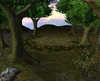
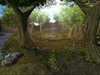
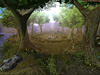
Theme: Creating a terrain that gives the feeling of being in a forest and creating the atmosphere of untouched nature.


Challenger: Dr.House


Opponent(s): M0rbid


Challenge Duration: 14


Proposed Reputation Award: 15


Challenge judging: Keiji, Fladdermasken


Imports allowed: Every ressource from wc3c.net and Hive. Imports from other websites need to be provided with a link. Rips are not allowed.
 
Last edited:
Level 23
Joined
Dec 20, 2009
Messages
1,907
Well i decided to give you a first WiP to get some action into the contest.

Note: It's very early, and many things do certainly lack right now, however I felt like showing a bit :p

184486-albums3456-picture40985.jpg
 
Both are using the same pack of doodads and skins.
I don't really see the challenge in that.

M0rbid's entry is somewhat spammy, as said before.
Yet I like the background, the shape of the mountain side.

Dr.House's entry reminds me too much of my one old terrain.
The background is flat, actually, It does not even exist.

Ratings so far...
M0rbid - 6 /10
Dr.House - 3 / 10
 

fladdermasken

Off-Topic Moderator
Level 39
Joined
Dec 27, 2006
Messages
3,688
Both are using the same pack of doodads and skins.
I don't really see the challenge in that.
I don't really see how you reached that conclusion.

Are you implying the challenge would be more fair if one party had access to more superior tools than the other?
Them using the same tools only implies that the challenge is fought on equal terms,
and that the judging will be based on how skillful the terrains are executed rather than how appealing the models are.

All in all, I'd say this is as fair as a challenge could possibly be.
 
Level 23
Joined
Dec 20, 2009
Messages
1,907
What fladdermasken said....

Anyways. Seems like I am finished. Changed alot to fit it into the theme better, even though I somehow gave up a better idea for this. What some have called messy is nature and especially forest environment for me, btw. This is supposed to not look organized or man crafted. It's inspired by the many walks I already had in my life through the swiss mountains during autumn :) Anyways, enough of the talk. Take a look yourself.
184486-albums3575-picture41132.png
 
Level 7
Joined
Jan 10, 2009
Messages
211
Well i think that light is pretty ok and foreground looks like its suppose to be in nature. But i still got a feeling that humans have done something to the forest. Thats because, those backround trees are all same size, so it makes me think, like humans have but the seeds in the ground same time. So if you could change tree sizes and maybe add some more tree types, it would look even better. Cause, it seems, that you have mixed forest not only an one type forest.

Anyway, lovely work, but needs some minor changes. I hope it helped.
 
I don't really see how you reached that conclusion.

Are you implying the challenge would be more fair if one party had access to more superior tools than the other?
Them using the same tools only implies that the challenge is fought on equal terms,
and that the judging will be based on how skillful the terrains are executed rather than how appealing the models are.

All in all, I'd say this is as fair as a challenge could possibly be.

There is never ~more superior~ tools, everything depends on the creators skills.
For examble, one might need extremely high quality textures and models to create a epic terrain, while the one does it with the original textures and models that are provided with no extra download.

~Also, Morbid, Nice background mountain, looks a lot like real.
 
Level 36
Joined
Nov 24, 2007
Messages
4,379
Why are you even adressing the matter of "superior tools" when that is both a small portion of his argument, and a highly personal matter? >.>

The BASE of his point is that them using the same kinds of doodad makes them fight on equal terms, only meaning that the challenge isn't only just fair, it's also more challenging for them both to create something unique that doesn't look like the other one's entry. In all honesty, fladder could've excluded the "superior tools" part and his point would still be the same.

There is no use in attacking one persons view on doodads, when you SHOULD adress the very situation at hand itself... >.>
 
Level 18
Joined
Feb 2, 2008
Messages
2,131
I was so stupid to make a mistake about the end date i thought it was next thursday xD anyway here it is my final submission turned out wurse than i expected but its rather my first time making terrain with the high res pack and actually making a terrain with a sun in it anyway i hope you people like it. (Sorry if its disapointing)
 

Attachments

  • HighResChallengeDRHouse.png
    HighResChallengeDRHouse.png
    1 MB · Views: 250
*Sighs* To be honest that background looks even worse now.
Forgot to mention last time that the river should have a lot more of things, it looks rather dead to be a river, even the circle has more life than it!

How to improve background... Mountains after mountains after mountains, for examble. Or perhaps a magical location surrounded by mountains.

OR then you can use more trees to hide the background and raise the hill so it goes just and just behind the trees.
 
Level 18
Joined
Feb 2, 2008
Messages
2,131
*Sighs* To be honest that background looks even worse now.
Forgot to mention last time that the river should have a lot more of things, it looks rather dead to be a river, even the circle has more life than it!

How to improve background... Mountains after mountains after mountains, for examble. Or perhaps a magical location surrounded by mountains.

OR then you can use more trees to hide the background and raise the hill so it goes just and just behind the trees.

I am sorry but could you plz keep your feedback infront of you as if seen to much posts of you which are not supportive imo so i would really appriciate if you let the Judges handle this.
 
Level 36
Joined
Nov 24, 2007
Messages
4,379
Right, I'm done with my judgements, and apparently I am also posting them right here, job well done both of you.

I find myself liking your terrain quite much, the lighting is well done and the natural aspect of this terrain is outstanding. However, I find the branches and leaves up top in the terrain to be far too close to the screen, same goes for the ground texture of the brown tiles you used, I know its “high Res” but that doesn’t mean it looks good from all distances, and that most certainly doesn’t count for a close inspection of the texture, as of right now that part of the terrain just looks messy and disturbing. Other than that I don’t really like the transition from fog to sky, the colours are really contrasts to each other, and don’t flow over in a smooth way, like they should. I know that’s a small portion of the terrain, but all little details count. Apart from that I really think you’ve made a crammed up terrain, I’d like to see a little more open terrain with more going on in it, but then, I won’t consider that when judging.


This terrain is most certainly an improvement of what I’ve seen of you earlier, so I’ll give you some props for that. I also have to say that you did a very nice job at the lighting aspect of this terrain; it feels very livid and realistic. However, you’re background screams “end of the world,” less so in the final version than in the prior final one, but still, you should REALLY consider working with more layers of mountains than simply one, and more dynamic fogs. I guess the doodad placement is alright, though I would love to see more tree variation and a little more elevated landscape, as of right now I feel it’s a little too flat of a sort. I also don’t get what the deal with those small rocks in the background is, I mean, they just look like their floating and really are just in the way. Oh and on a personal note; I’d suggest not using units in your terrains :)


Seeing as this appears to be a 100% judgement's contest, I'll post who my winner is and if fladder has a different opinion about who the winner is, we will probably talk in private and come to some kind of agreement.

The winner in my book is M0rbid, mainly cause his terrain is more appealing, and fits the theme just a tad more than Doom's.
 

fladdermasken

Off-Topic Moderator
Level 39
Joined
Dec 27, 2006
Messages
3,688
Right, here's my judging.

Dr. House
I must say that this could've been 'more' than it ended up being, as the chosen angle is nice, the models are chosen with care and the lighting is excellent.
The obvious flaws however really degrades the general appeal, sadly I might add.

Where as the lighting fits and enhances the terrain, the rays are abruptly blocked by the foreground doodads, as clearly seen on the left-bound tree in the foreground.
While this is normally considered a minor flaw, this is very noticable and therefore becomes eyesore.

The background definitely lacks depth, which is a clear setback.
I see small rocks, apparently floating.
While this might be personal, larger scaled rocks would look much more realistic and generally more appealing.

I also must confess that this isn't an imagery I'd consider as 'untouched nature'.
I might be mistaken, as it is fairly hard to make out, but I believe I'm seeing a fireplace in the center of the terrain.

What I want to commend you for in general is a great use of lighting, well placed shrubbery and a good angle.
M0rbid
This definitely looks appealing, but I must stress that it isn't flawless.

Firstly, I'd say you're using too much color gradients in the foreground, believe it or not.
On mixing birch, chestnut and pine, the color variation is slightly overwhelming.
Add to this equation the tints of the fern doodads, which just doesn't fit the overall imagery at all,
and the brown leaf tiles which also doesn't look appealing I'd say.

It might just be me, but I'm sort of getting color epilepsy.

Secondly, I'd say the background level of trees ends too abruptly, making it look seemingly unfinished and/or undetailed.
I'm also not overly happy with the choice of tiles in the background, as they don't really blend well and becomes very much noticable.

Commendable is of course the lighting, it just completely enhances the imagery and gives it a much more realistic appeal.
The angle is also very interesting I'd say.

Your interpretation of the theme is clear, I have no words to add to that.
Overall, I would like to commend both of you for providing us with good terrains and an interesting challenge.
I do hope this will inspire other similar events in a 'not-too-distant' future.

M0rbid's entry was better and he is the winner as far as I'm concerned.
House, great job regardless and better luck next time. It was a very clear improvement in comparison to your earlier work.
 
Level 18
Joined
Feb 2, 2008
Messages
2,131
Thanks to both Judges for the judging and i definitly think it will inprove my terraining skills. Bit sad i lost but if i were in your position i would definitly picked M0rbid as well. O and if allowed i would like to inprove this terrain and eventually post it in the terrain section. And last but not least +rep for both Judges as they did there job perfectly.

Edit: Also thanks to M0rbid as this actually inspired me again in terraining.
 
Level 23
Joined
Dec 20, 2009
Messages
1,907
Allow me to add my 5 pence aswell.
Firstoff, I wanna thank you two judges, I really appreciate your effort, also I liked the way you pointed the things out, and hell yes, after reading this I really recognized what I did miss out to do in my terrain - and hopefully one day, it will help me to improve on those issues. So thanks for that.
Second a congratz to Dr.House. In my opinion this terrain is really an improvement and I would like to see you working this out more and also thanks for being part of the challenge itself, I would like to see more users being "tough" enough to challenge other users like you did.
'nuff said.
Thank you
 
Status
Not open for further replies.
Top