Community
Maps
Resources
Tutorials
Gallery
Support Us
Install the app
-
🏆 Texturing Contest #33 is OPEN! Contestants must re-texture a SD unit model found in-game (Warcraft 3 Classic), recreating the unit into a peaceful NPC version. 🔗Click here to enter!
-
It's time for the first HD Modeling Contest of 2024. Join the theme discussion for Hive's HD Modeling Contest #6! Click here to post your idea!
You are using an out of date browser. It may not display this or other websites correctly.
You should upgrade or use an alternative browser.
You should upgrade or use an alternative browser.
Sketches!
- Status
- Not open for further replies.
- Joined
- Apr 2, 2013
- Messages
- 3,954

Re-opened by request.
- Joined
- Sep 17, 2010
- Messages
- 2,737


My entry for the last concept art contest:


This was the second batch of concept art for Kyrbi0's troll race, some sketches of buildings, units and summonables:
.jpg")
.jpg")
.jpg")
.jpg")
.jpg")


A simple doodad made for a friend (was meant to be used as the base for a logo):

Thrall the Lich King:


This was inspired by two things, Pulyx's King arthas: World of Warcraft Tribute- King Arthas Menethil , and this thread also: [lore] How would YOU have continued the story after TFT?
I enjoyed doing this one, so i'm gonna keep drawing more "what if" characters
I deleted them (The bird and the orc) :c but i promise to upload them again XDWaer da birdie?
This was the second batch of concept art for Kyrbi0's troll race, some sketches of buildings, units and summonables:
A simple doodad made for a friend (was meant to be used as the base for a logo):
Thrall the Lich King:
This was inspired by two things, Pulyx's King arthas: World of Warcraft Tribute- King Arthas Menethil , and this thread also: [lore] How would YOU have continued the story after TFT?
I enjoyed doing this one, so i'm gonna keep drawing more "what if" characters
Last edited:
- Joined
- Jan 12, 2010
- Messages
- 1,771


From some point of view these are great pieces, but can you give a little more effort and accuracy? Maybe start sketching with a hard pencil and then when you figure out your design - use liner marker for having clear image? This technique is used by most of tattoo masters for paper sketching.
- Joined
- Sep 17, 2010
- Messages
- 2,737
Usually i do that, i always tried to keep my line clean, but since last year i have been unemployed, and i used whatever i had at hand to make my last sketches (cheap office pencils and pens), now that i have a new job i will make sure to buy some decent stuff and to take proper time to make some quality pieces :'(From some point of view these are great pieces, but can you give a little more effort and accuracy? Maybe start sketching with a hard pencil and then when you figure out your design - use liner marker for having clear image? This technique is used by most of tattoo masters for paper sketching.


.jpg")
- Joined
- Nov 12, 2007
- Messages
- 2,340


And some results:
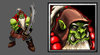
Hey those are some great icons! Why do you say you they aren't ready?
Also, I may be wrong, but the icon border looks too thin on the orc. You could use the Button Manager to resize and add icon borders to them, it is the easiest way to properly format them. The rat could benefit from a more... enthusiastic shading, so it emphasises the feeling of depth (highlight his nose/teeth/mouth while making his ears/hairs/neck darker), as it looks kinda 2d at the moment. The other icons, however, are looking great. Specially the orc. I loved the way you chose to represente the Geist.
Also some digital inking i'm making for a comic:
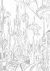

Beautiful linework. Makes me want to see a full coloured scene from you someday =P
- Joined
- Sep 17, 2010
- Messages
- 2,737
@Naze thanks! :'3 the reason why the rat looks that bad is because i tried a different paintig method for each one (and then i forgot the steps XD), i'm still struggling with the digital paint techniques, and what i mean with not finished is that i didn't start making the other icons yet (garithos, the elf paladin and the death knight; and the ancient of lies is a total mess u_u).
About those scenes, the coloured version is really awesome, but i'm not painting on that project, just inking, but i hope to learn more stuff about painting (also this is the first time that i draw landscapes, and it's been a pain in the ass finish them), so far i have inked 15 pages, but i can't upload more stuff for now Xp
About those scenes, the coloured version is really awesome, but i'm not painting on that project, just inking, but i hope to learn more stuff about painting (also this is the first time that i draw landscapes, and it's been a pain in the ass finish them), so far i have inked 15 pages, but i can't upload more stuff for now Xp
Roland
R
Roland
Bery Nice.. Draw me. XP
- Joined
- Sep 17, 2010
- Messages
- 2,737
...like a french girl?Bery Nice.. Draw me. XP
Roland
R
Roland
Nein! Nein! Draw me with a tuxedo and behind me is the corpse of Rodrigo Duterte! D:<
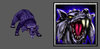
Hi fellas! i just want to share some sketches i made a while ago, hope you like them!
View attachment 146440
View attachment 146441
View attachment 146442
View attachment 146443
lovely.
...like a french girl?
woaa....
Nein! Nein! Draw me with a tuxedo and behind me is the corpse of Rodrigo Duterte! D:<
 1+
1+
Last edited by a moderator:


- Joined
- Nov 12, 2007
- Messages
- 2,340
Great stuff! I really dig the style of the Felíz 2012 dinosaur angel and that demon thing you made a fan art.
- Joined
- Sep 17, 2010
- Messages
- 2,737
XD yeah, i miss that style too, I made that doodle because in that year people get nuts with that mayan prophecy of the end of the world .
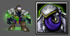
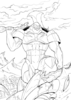
The first two of the fan arts for the Spawn comic, two of the aspects of the creature, the Nightmare Spawn and the Raven Spawn, and the third one is Antivenom, a character from Spiderman
.The first two of the fan arts for the Spawn comic, two of the aspects of the creature, the Nightmare Spawn and the Raven Spawn, and the third one is Antivenom
, a character from Spiderman- Joined
- Oct 20, 2016
- Messages
- 344


- Joined
- Oct 20, 2016
- Messages
- 344
your welcomeThanks Trebla!

- Joined
- Nov 12, 2007
- Messages
- 2,340
Heh, cool work stein! I like her expression.
Kyrbi0
Arena Moderator
- Joined
- Jul 29, 2008
- Messages
- 9,492


Good luck!Let's see if i can do it this time :'(
- Joined
- Jul 26, 2004
- Messages
- 1,481
Man, I am totally in love with your art style! So rough, yet so detailed at the same time. Kinda get a Metzen's Warcraft II concept art vibe from some of your sketches, so badass! Hope to see more from you
- Status
- Not open for further replies.
Similar threads
- Replies
- 17
- Views
- 2K