• 🏆 Texturing Contest #33 is OPEN! Contestants must re-texture a SD unit model found in-game (Warcraft 3 Classic), recreating the unit into a peaceful NPC version. 🔗Click here to enter!
  • It's time for the first HD Modeling Contest of 2024. Join the theme discussion for Hive's HD Modeling Contest #6! Click here to post your idea!

Icon Contest #15 Poll

Icon Contest #15


  • Total voters
    79
  • Poll closed .
Status
Not open for further replies.
Level 50
Joined
Mar 22, 2016
Messages
588
upload_2017-7-1_2-0-51.png

upload_2017-7-1_2-1-4.png
upload_2017-7-1_2-1-9.png
upload_2017-7-1_2-1-14.png
upload_2017-7-1_2-1-21.png
upload_2017-7-1_2-1-27.png

upload_2017-7-1_2-1-50.png

upload_2017-7-1_2-2-4.png

Unit Corresponding Icons
upload_2017-7-1_2-2-45.png

  • Each user can only vote once in the poll.
  • You cannot vote for yourself. If a voter has the same IP as the author then the vote will not be counted and it may result in the disqualification of the entry.
  • You cannot create multiple accounts to vote for an entry in the poll. If a voter has been found to be using multiple accounts none of the voters votes will count in the final result.
  • You cannot bribe users for votes. Contestants who break this rule will be disqualified and given negative reputation.
upload_2017-7-1_2-3-27.png


First Place: 45 reputation points and your entry on the award icon
Second Place: 30 reputation points and an award icon
Third Place: 15 reputation points and an award icon
Other Participants and judges: 5 reputation points

upload_2017-7-1_2-4-14.png


Participant
Base Icon and EntryLink to Final Entry Post

Abovegame
upload_2017-7-1_2-11-15.png
--
upload_2017-7-1_2-10-19.jpeg
upload_2017-7-1_2-10-33.jpeg
upload_2017-7-1_2-10-44.jpeg
upload_2017-7-1_2-10-52.jpeg
Click

Arowanna
upload_2017-7-1_2-12-0.png
--
upload_2017-7-1_2-12-26.jpeg
upload_2017-7-1_2-12-33.jpeg
upload_2017-7-1_2-12-40.jpeg
upload_2017-7-1_2-12-47.jpeg
Click

Edge45
upload_2017-7-1_2-13-12.png
--
upload_2017-7-1_2-13-39.jpeg
upload_2017-7-1_2-13-46.jpeg
upload_2017-7-1_2-13-53.jpeg
upload_2017-7-1_2-13-59.jpeg
Click

~Nightmare
upload_2017-7-1_2-14-28.png
--
upload_2017-7-1_2-14-51.png
upload_2017-7-1_2-14-59.png
upload_2017-7-1_2-15-24.png
upload_2017-7-1_2-15-32.png
Click

San
upload_2017-7-1_2-17-3.png
--
upload_2017-7-1_2-17-25.jpeg
upload_2017-7-1_2-17-32.jpeg
upload_2017-7-1_2-17-39.jpeg
upload_2017-7-1_2-17-48.jpeg
Click

upload_2017-7-1_2-7-26.png

  • The Panda
  • PeeKay

upload_2017-7-1_2-8-5.png


Consistency of the icons in pack
Do four drawn icons compliment each other well?10%

Blizzard style
Do icons fit with chosen melee unit's icon? Is the style used similar to other standard icons?10%

Theme and creativity
How quality is the concept, how unexpected and creative is the idea? Originality and uniqueness of icons are judged. Are abilities logical for chosen unit?25%

Technical note
Technical quality of icons.55%
  • 75 % of the winner shall be determined by the contest's appointed judge(s).
  • 25 % of the winner shall be determined by the results of a public poll.
upload_2017-7-1_2-8-41.png

Inviting your friends to vote for you, bribing random members with rep and otherwise cheating with the VB poll system will get you DISQUALIFIED, BANNED from future contests, -REPPED, and possibly INFRACTED. So don't do it!

This includes, but is not limited to, sending PMs out to various users, getting other people to send those PMs, advertising this contest on other sites with the intention to gain more votes (whether it is explicitly stated or not), and so on. If you are suspected of cheating, the staff will notify you and interrogate you (hopefully) over PMs.
 
Last edited:
Level 18
Joined
Jan 12, 2011
Messages
1,512
These type of icon packs for units were something we were missing back then, waiting patiently for jngp to be fully operational again


Nightmare's third icon has phenomenal quality, however the one who chose the coolest looking design for their icons by far is Edge45.
 

Moy

Moy

Level 49
Joined
Jan 25, 2011
Messages
2,382
Abovegame

I know that you’re a newbie. So I suggest to look at some icons not only here at hive but to other sources as well. Hive has some pretty well tutorials or in deviantArt. Nice effort but will be glad if you’d try practicing and upload some in the icons section for other people to give you advices/criticisms.

Arowanna
- The scales needs to have its shading adjusted. It looks like leaves atm.

- The devour icon in the set is the best. What I can suggest is to have some nice background or a rim light for a better atmosphere. Highlights could be better. Details lost on icon size sadly.

- The cracks could be better – it looks out of place. The nail could be adjusted too, it looks pretty weird tho. Nice shading here, could use some highlights but still acceptable.

- I don’t know the reason why you chose this breath of fire instead of the first two wips on your workflow image. It looks like a lightning that came out from a UFO.

Edge45
- Looks great! However, the flesh could be more like flesh. As of now, it looks like thick blood cloud.

- Quality is great, it is too dark however. A hide ability (like hiding from leaves in Warcraft) is not something new, but was well executed. I suggest to add more leaves or enlarge it and then lighten it. It will have problems when this icon is imported ingame.

- You know that this looks a mess. It has the same pose with your first icon when it is rotated and flipped. The effect was good but is unsaturated. The snout is weird.

- At first sight I was confused what the icon represents. The blood could also be better.

Great overall. The fur color could have been the same in each icon tho, but it doesn’t matter

PrinceYaser
- Well it looks pretty weird that the icon has the same pose with different angle which is very similar with the unit’s icon. Heavy referencing? The icon suffers a lot from shadows. It doesn’t look like it is raging – it’s like he’s blinded by light.

- The boots looks pretty flat. The effect could be more vibrant or saturated. Different shading.

- The handle is bent. The shading is different from the first 2 icons. Great effect. I suggest to make the blade more sharper with highlights.

- Different style with the other icons. And in my opinion your best icon in your set.

Great job! I can see improvement tho. But you should stick to one style as your set suffers from different styles.

San
- Generic devour but well executed. The colors were vibrant. The saliva was a nice touch.

- The slime was awesome could use more highlights to make it look more slimy tho. The blade is really in need of work.

- It looks like an octopus. :xxd: Nice effect. You could try fixing the shape of the body.

- The best icon in the set. I am lost in words.


Well for me, it is between San, Edge45 and Arowanna. They portrayed their unit’s abilities pretty well even with some flaws. But for me San got it in the bad with his creative ideas. So my vote goes to him.
 
Last edited:
Level 26
Joined
Oct 2, 2011
Messages
2,482
upload_2017-7-1_2-17-39-jpeg.272401
upload_2017-7-1_2-17-32-jpeg.272400

My vote goes to Sanpai. Real nice icons, and the poor sludges could use some attention! I especially like the toggled one. The second one with the sword seems a little bit blurry compared to the rest though?

Arowannas second icon is also really good looking!
upload_2017-7-1_2-12-33-jpeg.272379
 

San

San

Level 32
Joined
Sep 23, 2012
Messages
1,307
Much thanks for the kind words and vote guys, very appreciated.

@Rufus
I get what you saying, it also looked blurry for me in the first glance just now. Thing is I already increased the contrast very much, the blurriness is gone after I stares at it for some time...no idea why. :confused:

@Arowanna
The scale is well drawn although it seems pretty plain in my eyes.
I know you said you have problem making things looks POP but I will say it anyway.
Same thing goes to the claw, it would be really great if you added a devastating effect!

@~Nightmare
-I didn't intend to make it looks really slimy, just wanted to bring out the sticky idea.
-tHe bLaDe iS rEaLlY iN NeEd oF WoRk, at least it looks like a sword already!!! WANT ME TO DRAW A TOOTHPICK INSTEAD?!?!?
Jokes aside, I took reference from footman's sword, I think it ended up too thick and some of the part covered in slime seems just disappeared.
Thanks for your feedback nevertheless.

My vote goes to Nightmare, I like the first and third one.
Although the first and second one seems kinda repetitive(two bullets),
The blood looks kinda like Heinz ketchup, I think it can be more realistic.
The red hawk effect is very clean (and simple compared to the effects of other 3) except for the feathers(?) behind its head, it made the bird looks like a bald in my opinion. ;p
 

Shar Dundred

Community Moderator
Level 72
Joined
May 6, 2009
Messages
5,870
San or Arowanna... San or Arowanna..... Fuuuuuuuuuuck.
Shouldn't have told Arowanna to finish his entry ASAP, then it would be easier to decide, damnit...
I like PrinceYaser's and ~Nightmare's entries too...

Gotta be San, his icons are just too sick.
Arowanna's breath is just still too unfinished, I know it is because of the time, but sorry man. :/
 

Deleted member 247165

D

Deleted member 247165

My vote goes to San. I love what he did :D
 
Level 24
Joined
May 15, 2013
Messages
3,782
Vote goes to ~Nightmare, it's frickin killin' and bloody blimey awesome!
However, I was kinda reconsidering to San's or Arowanna's since those they have an actually nice quality (plus Nightmare may have those "things" below the reputation points a tad many XP)

San had the closest to being Warcraft-ish, the slimy =sh*t= had those cool looking abilities now. The first icon reminds me of Starcraft, it kinda looks like a stranger with the other icons however. The second one's purple may have been too saturated that I see it too bright to be fitting with the sword (did the Footman got scared enough to pee himself?). Third one has a wanker-kind of action, but damn the effects look good. Last one is the best, releasing all those =sh*ts= from the =sh*t= itself.

Arowanna had a nice concept, colors, and quality. The scales look plain however, focusing solely on one direction and lacks some variations. The Devour looks sick and hadn't much any comments regarding it but great. The stomp may have a lot of black backround instead of showing a crazy foot wreck, in otherwords, the cracks need more attention since the black overcomes them. The last one turned me off unfortunately, it looked a bit rush, plainy, and the light looks odd.

PrinceYaser's looks good. But, the metals somehow loose me. The first one doesn't look like it had anything special other than (releasing energy?). Second and third had a nice quality except the metals. Last one is the best. All in all, the icons had good effects, especially the gauntlet.

Abovegame would need to improve his detailing, the icons doesn't look fitting with Warcraft. But you did good and tried, and you had a nice pick with the Salamander. Good work mate ^^

Rushed undetailed comments perhaps but anyway. Nice work everyone. My vote goes to ~Nightmare (oh and thanks for the critic ^^ much appreciated, however, I'm not updating it ;P)
 
Level 28
Joined
Nov 12, 2007
Messages
2,340
Voted for ~Nightmare. His works are the most polished and professional looking there, he really nailed the volumetric shapes and colors.

If I had two votes, it would also be San. Interesting, eye-catchy icons, showing a good use of composition in the limited space the icons have. Color scheme is beautiful and fits Blizzard style. If I could complain about something it would be the teeth on his devour ability: they look too flat/2d, a better shading could be used so the viewer could feel like they're real teeth.

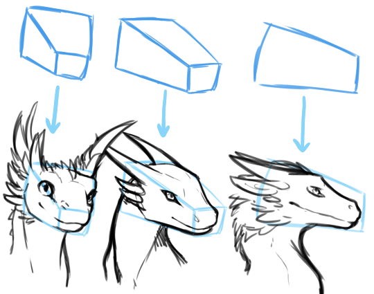
If I had three, then Arowanna. That's an amazing debut, with no major flaws and definitely featuring the Blizzard style. The only thing is that he was too strict to the desaturated green: the icons are well drawn but look rather bland/dull because they mainly consist of shades of a kinda dead green over a black background. You could have contrasted it with a dim purple light illuminating the background or something else from the chromatic circle, it would surely stand out to the eyes of the viewer. Also, the screaming dragon face looks a bit 2d, you could make its 3d aspect more evident by doing a dramatically different shade to each side of the head (the cheeks and the front), so we could clearly see the boxy shape of the dragon head:
tumblr_inline_nvqcrrDQUK1rtqb70_540.png
Other than that, the lightning icon is simple but has a superb design imo, and the dragon foot is so well executed it can indeed be mistaken for a Blizzard icon, good job!
 
Last edited:
  • Like
Reactions: San
Well that thread (Feb 2016) was created before Hive 2 (Jun 2016). I really think they can edit the poll in XenForo.

No, it is not possible. However, we can add additional options to vote on it. Besides that, we can also hit the option to allow people to change their votes. That's about what we can do as staff.

Edit: Sorted.
 
Last edited:

Kyrbi0

Arena Moderator
Level 45
Joined
Jul 29, 2008
Messages
9,502
Only five entries now, it's kinda sad to look at.
Eh, I've seen a lot worse. 5 is still pretty solid; you get a Top 3 and there are at least 2 left behind (with 4, after the Top 3 there's just one 'loser'; 5 gives him company. xD)

In fact, I'd go so far as to say that 3 is a strict minimum, and 5 is an ideal minimum. More is nearly always better, of course, but yeah.
 
  • Like
Reactions: San
Texturing Contest #23 has only 3 contestants, and I placed last :xxd:
I am pretty sure that it had 4 final entries. I should know since I hosted it iirc :]

Still, even that was worth it given that the follow ups were more successful in quality and overall final entries.
It's just that some themes are more attractive than others. Hence the pending number of entries per. finished ones. It's all a mater of timing and interest.
 

Kyrbi0

Arena Moderator
Level 45
Joined
Jul 29, 2008
Messages
9,502
Well, there were definitely some excellent icons in this Contest. Nightmare probably had some of the best, most intricate artwork on his, closely followed by San & Edge45. Arowanna had a certain desirable simplicity to his icons, though, and in many ways achieved a greater 'Blizzard feel' than most.

I had to go with San in the end, though. I found his more Warcraft-y than the other two, and more useful (how many 'gun' or 'wolf' icons do we have, compared to 'slime' icons...). I particularly like the sword-goo one, though the Autocast is very pretty.

Good job to all!
 
Level 6
Joined
Jan 13, 2013
Messages
129
@Abovegame Good on you for entering, those show potential though obviously they aren't on the same level as the others. If you develop your skills and spend some time on them though they could be quite good. Needs Work/10

@Arowanna These are very proficiently made though they are a little uninspired. Something more needs to be happening in the scales, maybe a gleam of light or a slightly different composition? They are well made but its just a bunch of slightly differently coloured scales in one direction. Maybe if one was broken, or they were curving over a muscle it would be more interesting. Devour is quite good, I don't like all the black space but its similar to the blizzard devour in that way so I'll give it a pass. Stomp again seems like its design isn't finished, the foot looks good and I like the choice to go with two toes but the black space really doesn't do it for me and the posing of the foot doesn't really convey a powerful stomp to me, it more looks like it just stepped on a bug in the void. Lastly like the others said the lightning is a weird choice, your WIPs were much better in my opinion. Its well executed but boring and doesn't really look like a green dragon's attack. 6/10

@Edge45 I really like these icons, they are thematic, fit with blizzard and just look great. The second icon looks a little odd due to the perspective, it looks like the nose is in the bottom left but it looks strangely flat. The leaves also look odd and it almost looks like there is some colour artifacting around their edges.The third is a little busy looking with the circles going around the wolf's snout though I do like the depth they add. Its definitely a great icon, I love what you did with the perspective. The fourth is a great looking icon too, but the way the claws are shaped looks like a hand, not a paw. It would work great on a werewolf or something else to that effect but it just doesn't fit on a wolf. Honestly in retrospect I think I should have voted for this one. 8/10

@~Nightmare I'm on the fence about your designs, they look awesome but they just don't click for me. The first one looks pretty good, though the top right of it looks perspectively flat compared to the rest of it. The bullet looks very accurate to a full bullet, casing and all, but then the effects around it are very Warcraftish looking to me. I wouldn't use it in a tactical military game because it looks too cartoony and I wouldn't use it in a normal Warcraft map because it looks too realistic to me. The second icon has the same problem of the bullet looking real (plus with the casing still attached) but the blood looking cartoony. This one isn't as clashing, but the perspective aslo looks a little odd to me, I can't really pinpoint why. Still pretty good though. The third icon I think is the best out of the bunch, the problem to me though is that it looks good fora dark wizard that turns into a hawk or summons one. The colours are different and it looks sinister compared to the goofy rifleman. Thematics aside, its awesome. The last one looks good but it doesn't have the instant readability I look for in Warcraft icons. The smoke rolling around in the front of the canister obscures it in a way that I think detracts from readability and without a cylindrical steal canister model existing already it also doesn't communicate what it is fast enough. Is that an ectoplasm container leaking out a ghost? Is it a a batter overloading? Etc. Basically it looks great but it doesn't do the job of an icon for me. 7/10

@San I voted for this one, partially because I have a soft spot for slimes :D. The first icon, devour, looks somewhat flat. I'd like to see a suitably understated but still visible inside to its mouth, as well as a little better shading on the middle 3 teeth (top and bottom). Maybe adding a lip to the top of the gums? I'm not sure what would be best, but the top of the icon doesn't look right to me either. Second one looks quite good to me, but two little areas could use a touch up. The goo on the top left of the sword looks odd, like its continuing up a longer sword even though the tip of the blade as already angled. It could be changed to be dripping off more or follow the angle better, either way would make it look less odd. Honestly that is a pretty nitpicky detail though. The bottom left of the icon also looks not quite right for the slime, the whole section appears to be on the same plane, whereas slimes are rounded generally speaking. I love the texture of it, it just doesn't make sense to me the way it looks though. The third icon is designed really well, for a slime/shadow person/demon. the visual profile of the figure in it doesn't match the slime, too humanoid for me. Making its neck a little thicker might make it perfect. Finally the last icon. I think it may be the most technically proficient icon, but the slime's face just keeps making me think of a monstrous hairy spider instead for some reason. Otherwise its basically perfect. All of your icons fulfill the most important job of an icon to me as well, the instantly communicate some sort of concept or ability. 7/10

Overall I should have voted Edge45, for the right blend of Warcraft aesthetics, solid design, and proficiently created. ~Nightmare and San are basically tied for second in my mind, I like San's designs more, they look more like Warcraft to me and I think they work slightly better as icons but ~Nightmare's are extremely polished and don't do a bad job as icons. Arowanna's icons all look like fairly fitting in Warcraft and do very well as icons but they all need design changes (except that awesome devour/roar). Lastly Abovegame, again I'm really glad you took the time to make your icons and enter. Its a step on the road to making great art.
 
Status
Not open for further replies.
Top