- Joined
- Aug 20, 2011
- Messages
- 4,141


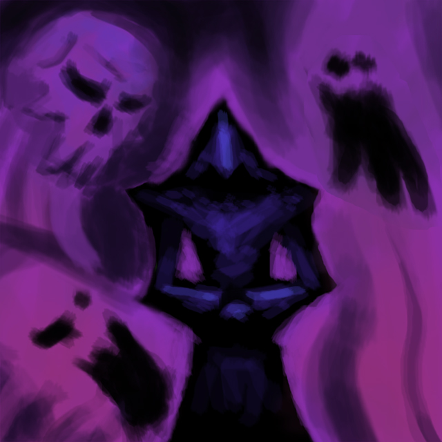
Actual state:


Feedback is appreciated!
Feedback is appreciated!
Last edited:


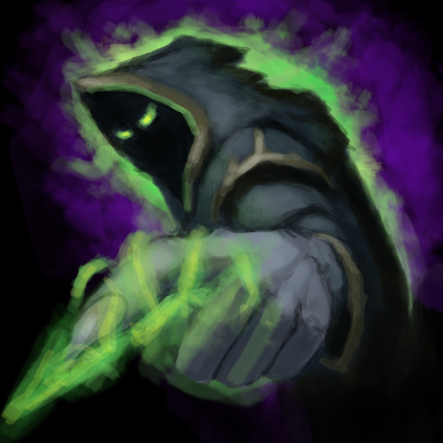
Actual state:
Feedback is appreciated!


Actual state:
Feedback is appreciated!

Finals. Tomorrow BLPs.
LOOKS NICE BRO
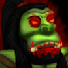
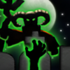
lack of detail results in outlined dull style.


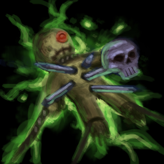
") I know they're blurry but it's not in-game.
I know they're blurry but it's not in-game.

lack of detail results in outlined dull style.
A Void, before you defend yourself saying that 'you're just critiquing' or whatever, recognize that 'tone' and 'balance' are equally as important as the words you say (especially on the Internet). You're post contains no positive advice or encouragement to counter-balance the negative, and is written in a style the borders on rude.Please give some positive comments too, atleast I TRIED making some FREEHAND, and I give my all and this is what you will say? You're so negative. Being your icon not allowed here will not mean you can insult other people.
Nice to see another contestant... contesting!
Definitely some interesting ideas you have there, Chen; many of them seem to struggle with a certain 'fuzzy' or 'blurry' quality, but I'm not quite sure I can put my finger on it. Anyway, good luck!
A Void, before you defend yourself saying that 'you're just critiquing' or whatever, recognize that 'tone' and 'balance' are equally as important as the words you say (especially on the Internet). You're post contains no positive advice or encouragement to counter-balance the negative, and is written in a style the borders on rude.
Consider the effect your words have on others.


Thanks!
Please give some positive comments too, atleast I TRIED making some FREEHAND, and I give my all and this is what you will say? You're so negative. Being your icon not allowed here will not mean you can insult other people.
EDIT:
Finals:
Get them in the Icon Section while they're hot
Here:
http://www.hiveworkshop.com/forums/icons-541/btngromberserk2-256299/
http://www.hiveworkshop.com/forums/icons-541/btnarthaslifedrain-256300/
http://www.hiveworkshop.com/forums/icons-541/btnmountaingiantpulverize-256301/
http://www.hiveworkshop.com/forums/icons-541/btnnecromanceranimatedead-256302/
And, on this page, you should upload a .png version of your icons instead of a .jpg, they won't look blurry this way.
I was just criticizing his style of icons, this is after all appropriate theme to do this or I cant even do that? I am helping him understand his mistakes rather than secretly lie to him that his icons are detailed and excellent. Apparently it is otherwise and I am just stating my opinion about it. You can ignore the opinion if you need to. And please don't pretend that I insulted you, when I haven't even included any slightest insults.
Edit: His final icons look rather worse, they look blurred and dumped-out. <My Opinion, as always>.
First of all, good job on completing your first contest entry
As for the icons, they are good but I have a few tips for you. Drawing heads is no easy task, try using a reference picture to help you get the proportions right. This should also give you hints on where to apply shades and where to apply lights (depending on the light source that you personally chose). Also, when shading or highlighting a surface, try using a different color to create a realistic look. For example, if you want to apply shadow on a yellow surface, you might want to use a dark orange or even red-ish color. Let's talk about the backgrounds now, for the mountain giant icon, the glow/effect that you made on the ground could be a bit more dramatic/dynamic/eye candy/(whatever!!), don't let us see the end of the spikes, make them more colorful, make them less opaque etc. The red glow on the orc icon has the same flaws...
I could go on, but damnit, it's getting late and I'm tired XD Anyways, keep on drawing and all that stuff I just said should naturally come to you.
EDIT: Looking at your big sized drawings on the last page, your not making it easy for yourself, you should draw in a bigger size like 350x350 so you can detail your work easily (i personally prefer 512x512). Of course, if you feel comfortable to draw at this size, go on, but you can always make your image at a bigger size and zoom-out to draw and zoom-in when necessary.


Probably Final Entry:
Charm for Priestess of the Moon:
Fan of Knives for Harpy:
War Stomp for Naga Royal Guard:

Critical Strike for Sylvanas Windrunner:

Download: http://www.hiveworkshop.com/forums/pastebin_data/dsrp7w/_files/Icon Contest 12 Entry.zip
Sorry to keep complaining, but now the horns' angles make them seem to be converging. Demons' horns are usually diverging, though satyrs horn angles are a bit less pronounced.Reworked horns and overall more sharpen
I like all of them. I believe the complaints you have received on the naga royal guard's war stomp is that the tail makes a strange angle. It's as if the naga was leaning forward or the side (really much) and the connection of that posture to the act of war stomping is unclear.Probably Final Entry:
Charm for Priestess of the Moon:
Fan of Knives for Harpy:
War Stomp for Naga Royal Guard:

Critical Strike for Sylvanas Windrunner:
Download: http://www.hiveworkshop.com/forums/pastebin_data/dsrp7w/_files/Icon%20Contest%2012%20Entry.zip
Nice, Sin'dorei! I suggest you put some dark aura to that arrow. You can't easily say it's sylvanas'.


It's not for dark Sylvanas, it's for Sylvanas when she was High Elf.