Initial playthrough:
Noticed a typo in the loading screen ("finnished", which probably means something like "made it Finnish").
I decided not to skip the intro cinematic. In the first few seconds, it was already clear you abused cinematic doodads, to my horror.
Since I wanted to test out some options, I decided NOT to pick "Full Game" and set some of my own options.
I wanted a better income, but the text did not change, so I clicked more rapidly and bugged the dialog. I was unable to do anything and had to restart the game.
However, before restarting I decided to check out the quest-page.
Too much colors. They were everywehere. Trying to hurt my eyes.
You failed at your own name though, as I think one of the color codes did not work (or your name really is Josh_Youc007EBFF1_Are123).
Speaking about that: you shouldn't colorize text like that. It only adds to the 'noobishness' of your map. Try using normal colors, everywhere.
Use only a few color codes in your map (example: dark orange for all names, ocean blue for all values, ...). Your colors are random and flashy, which I hate.
Another color fail in "Noobs - Here" (there's an |r visible).
And yes, more color fails in CREDITS. I can hardly believe you didn't even
try checking the quests for any typo's or unreadable text (because there's plenty of both).
Color fail in a quest title (fortifying the above statement).
Second playthrough:
Wanted to skip the introduction now, but couldn't. Now I see [0 / 0] probably means "I'll just put some numbers here to confuse everyone into thinking they can skip this".
Hey wait, it turns into [1 / 2] now. Perhaps because I added a computer player? Come on! Lame!
Okay, I really want my own options! I'm doing my best to click really slowly now.
What's this? A new option appears! ap0calypse uses click! (meaning I first had 4 options, but after I clicked something a fifth appeared, which I clicked)
Yup, bugged again. I'll have to restart. Did you test this? I mean, when I click any of the dialog buttons, nothing happens. And when I click 2-3 of them, it bugs you into restarting the game.
Third playthrough:
I am forced to use "Full Game" now... after waiting until the introduction is finally done being stupid.
My hero options: a Blood Mage with a tinker-icon, Mountain King, Mountain King, Mountain King, Lord Oakroot and a Paladin.
The tooltips were even sexier than their names, with either no tooltips or really crappy ones.
So yeah, I picked the Blood Mage. Turns out it really was a tinker, not a Blood Mage. Silly names! (It does have the Blood Mage voice though, not very fitting).
Awh, the first spell has a color code bug. It appears you love color code bugs, there are so many of them!
Obviously I picked Omnislash, Final Fantasy ftw. Oh wait, I got an item, not a spell. Okay, my ultimate ability got bugged, not good.
Next area: Banish' tooltip is bugged. No name and the text goes out of the text area. Same goes for at least 1 spell in every other spell tavern.
Ooohh, "Gladiator", flashy, let's enter. Okay, I'm dead, that... certainly didn't work (no warning either?)
I only noticed now how bad the command icons fit each other and the map. You'd better left them standard, this looks (and IS) just a bunch of random icons which do not look good together.
It is also now that I notice the incorrect tooltip of the attribute bonus (it says +10, but gives +5).
Oh, great! A duel! (funny note: "Please wait while the game selects a random duel mode", and it showed a dialog asking me which duel mode I wanted).
Wait, it actually started? Doesn't the game notice that the other player is a COMPUTER and doesn't do anything? You didn't even try to block computers out?
I will end my own torment here.
Summary:
- An excessive amount of cinematic doodads, even a single cinematic doodad is a sight for sore eyes, let alone millions of them.
- Terrain is bad, even without the cinematic doodads. Too much cliffs, monotone tileset etc.
- A lot of colors. Too much colors. Random colors. Everywhere (unless the color code bugs, which happens quite often for you actually).
- Even though I played for a very short time, the amount of bugs was... stunning. Skip intro bugs a little, the option dialog bugs heavily and nearly always requires your ro restart the game, the ultimate spell didn't work, ...
- Incorrect/missing tooltips.
- The hero names? Seriously... you can't call this a finished map if half of the heroes have the same name and most of their description is standard.
- Useless imports. Everywhere I look, I see models that do not fit the map and I hear music that I'd prefer to turn off.
- Missing DISBTN's (the flashy green icons when they're not available).
I cannot possibly approve this. I've given enough reasons.
This map just radiates noobishness with the preview screen, random imports, flashy colors and cinematic doodads.
 Approved
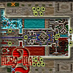


 ).
).