 Approved
Moderator
M
Moderator
14:59, 5th Oct 2009
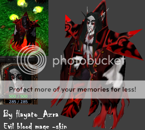
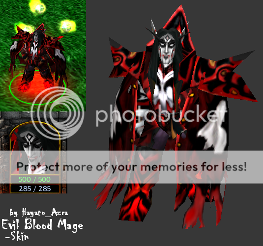
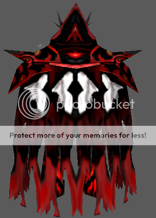
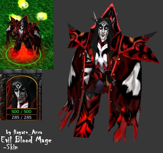
67chrome: This is to messy and lacks refinement in just about every portion of the skin. Red and black seem to be overused, not being shaded also makes the red especially to look obnoxious. I would advise looking through the skinning tutorials on this site to gain some new techniques, and look at approved skins on this site that look similar to the way you want your skins to look.
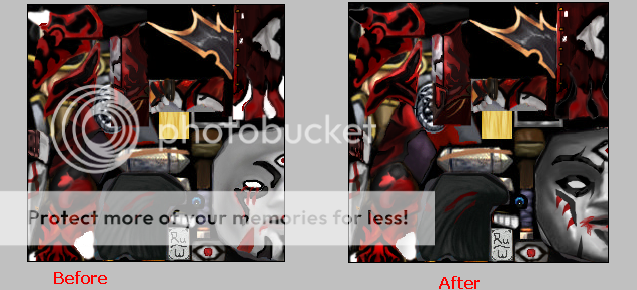
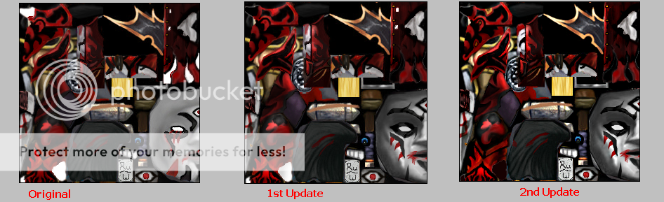
Work on the changes I talked to you about")
67chrome: This is to messy and lacks refinement in just about every portion of the skin. Red and black seem to be overused, not being shaded also makes the red especially to look obnoxious. I would advise looking through the skinning tutorials on this site to gain some new techniques, and look at approved skins on this site that look similar to the way you want your skins to look.
Work on the changes I talked to you about